React Native Course - 2
React Native
Welcome to the part-2 of our React Native Course. You can find the part-1 here. In this part we will continue to learn React Native. This project and post have been inspired by this YouTube video.
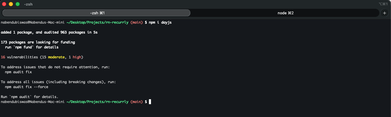
First, we will install the dayjs library in our project to handle date and time parsing and formatting easily.
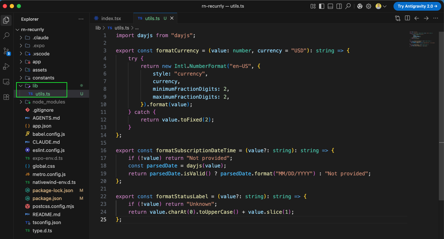
Next, we will create a lib directory inside our project and add a utils.ts file. In this file, we will define formatting helper functions to format currency into US Dollars, format dates using dayjs, and capitalize status labels.
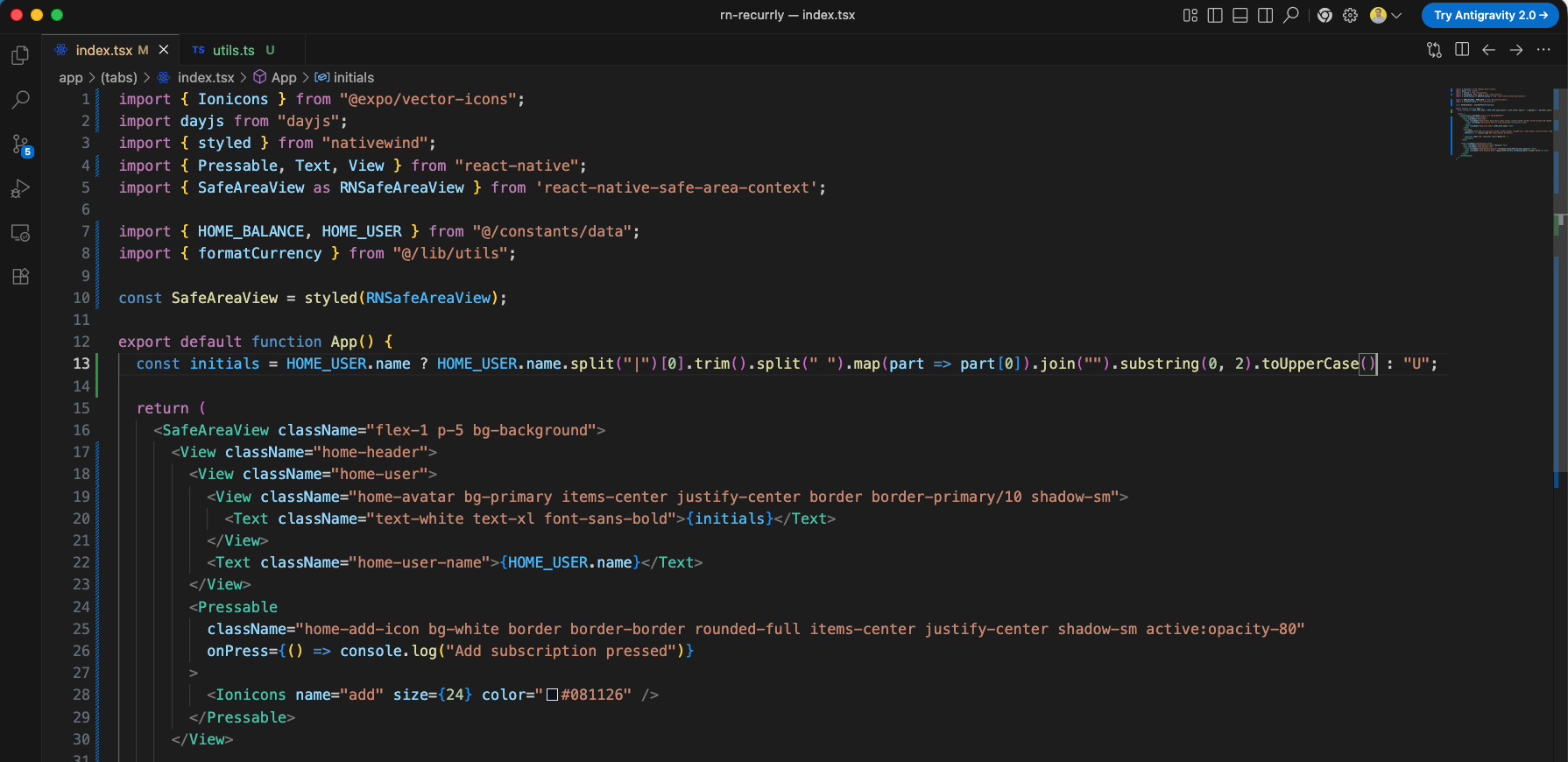
Now, we will update our main Home screen component in app/(tabs)/index.tsx. We will style the SafeAreaView wrapper with NativeWind, extract the user's initials dynamically from the name data, and design the header section containing the avatar, the user's name, and a pressable action button to add a new subscription.
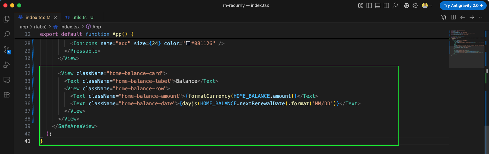
Next, we will continue updating app/(tabs)/index.tsx to add a balance card component (home-balance-card). This card displays the balance amount formatted with our currency helper, and the next renewal date formatted via dayjs.
Once we save the files and the development server reloads, our app displays the beautifully styled header and balance card. The custom tab bar navigator remains floating at the bottom.
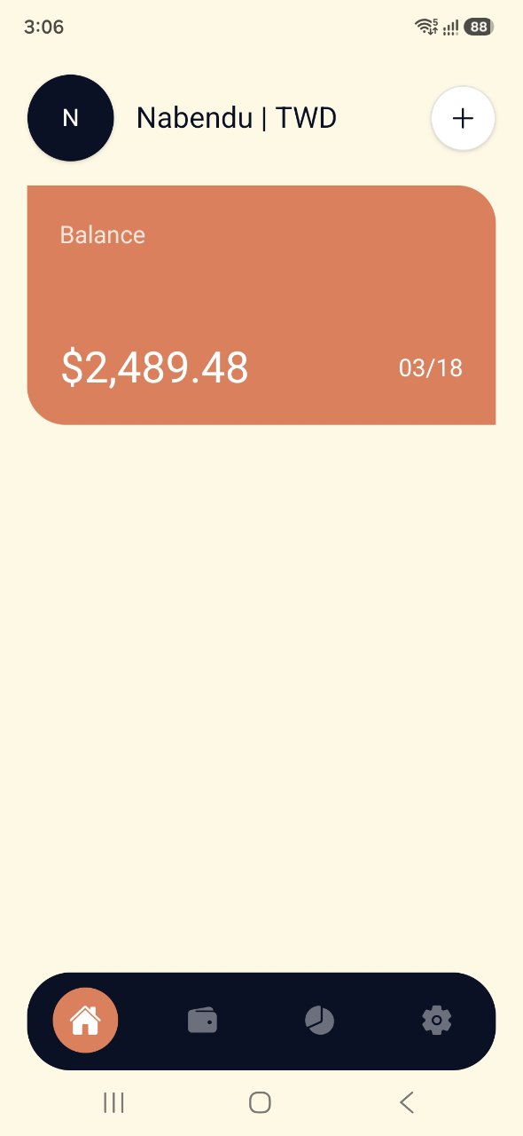
Next, we will create a new directory named components in our project root. Inside it, we add a reusable ListHeading.tsx component. This component takes a title prop and displays it alongside a 'View all' action button.
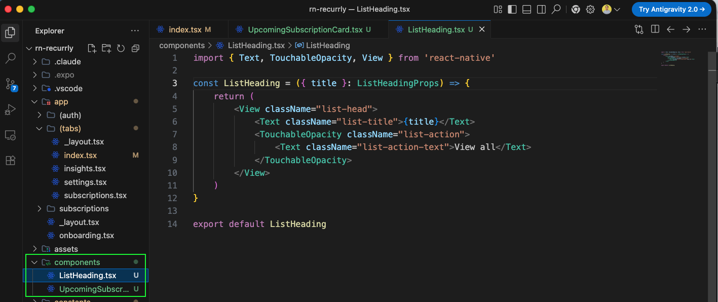
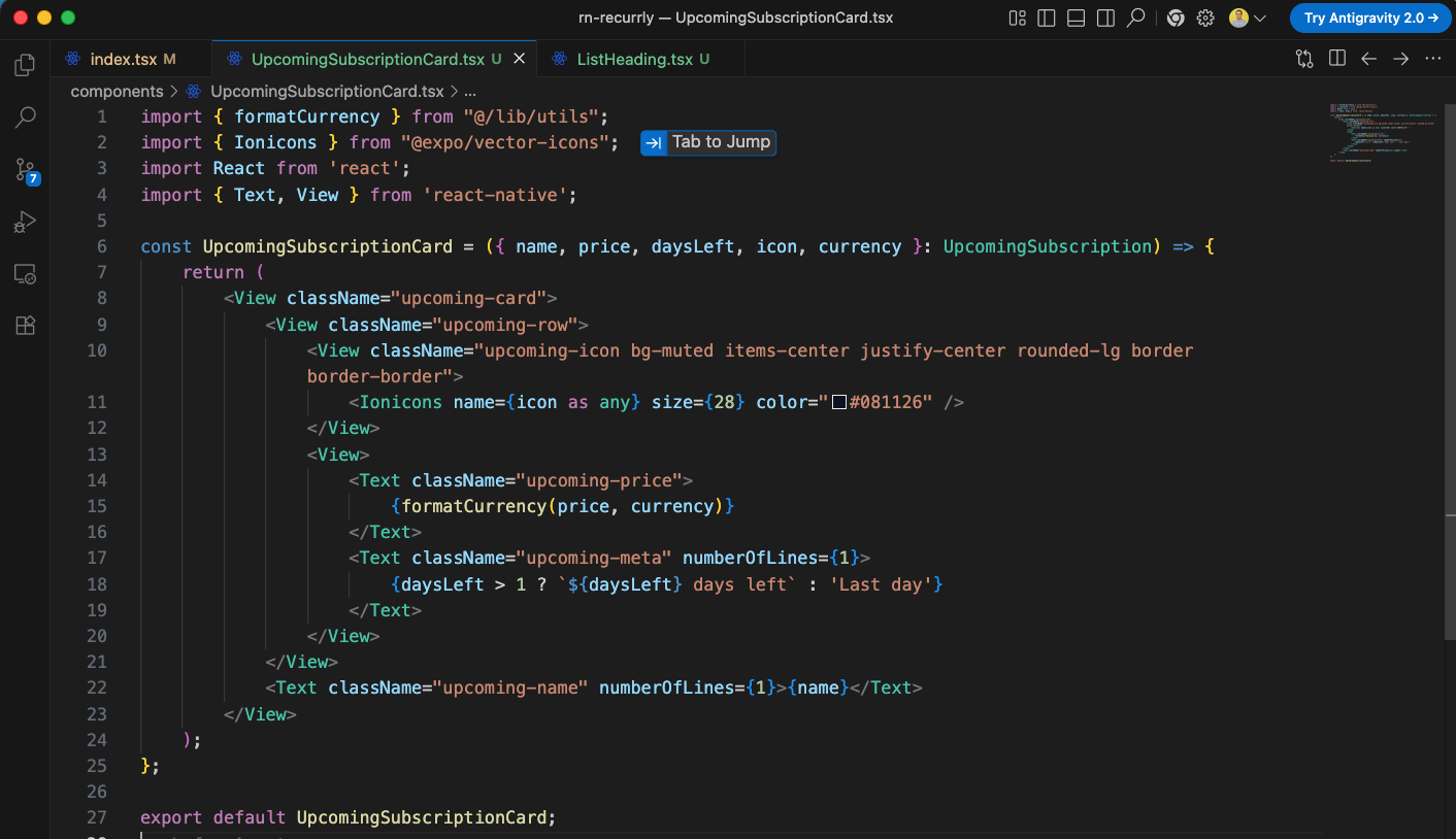
Inside the components directory, we also create the UpcomingSubscriptionCard.tsx component. This component takes subscription details (name, price, daysLeft, icon, currency) and displays a card containing the formatted price, remaining days, and the subscription name.
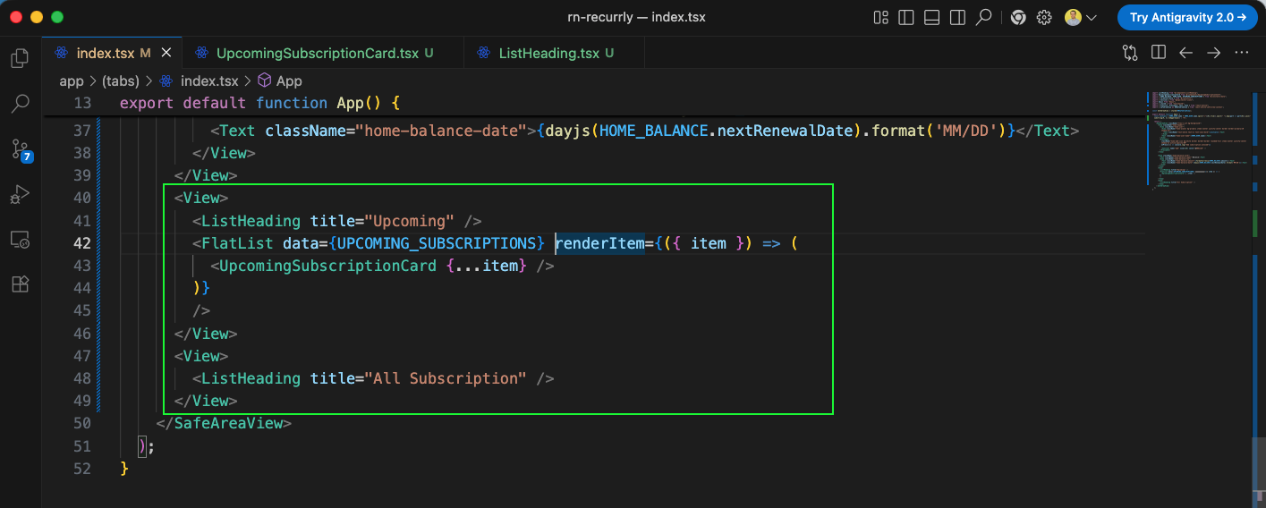
Next, we will update the Home tab screen app/(tabs)/index.tsx to include the upcoming subscriptions section. We use ListHeading with the title "Upcoming" and a FlatList to render each upcoming item dynamically via UpcomingSubscriptionCard. We also add a placeholder header for "All Subscription".
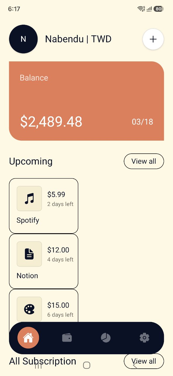
Upon running this, the upcoming subscriptions appear, but they are arranged vertically rather than in a horizontally scrollable list.
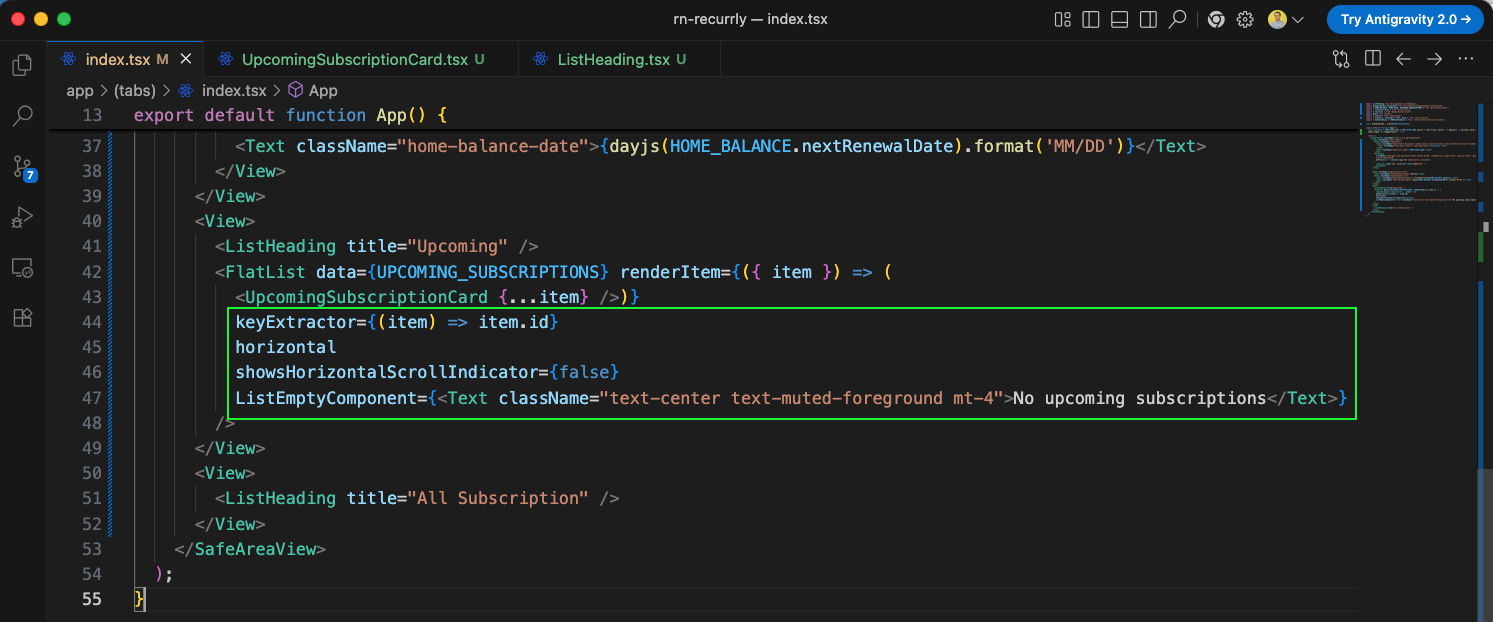
To make the upcoming subscriptions list scroll horizontally rather than stacking vertically, we configure the FlatList props. We add horizontal, hide the scroll indicator with showsHorizontalScrollIndicator={false}, add a keyExtractor, and define a ListEmptyComponent fallback.
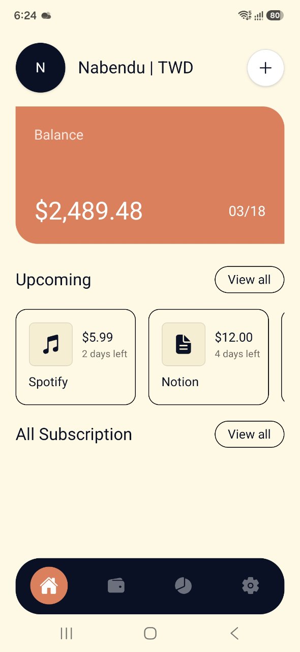
After making these changes, the "Upcoming" subscriptions list now scrolls horizontally as expected, displaying Spotify, Notion, and other cards in a clean side-by-side layout.
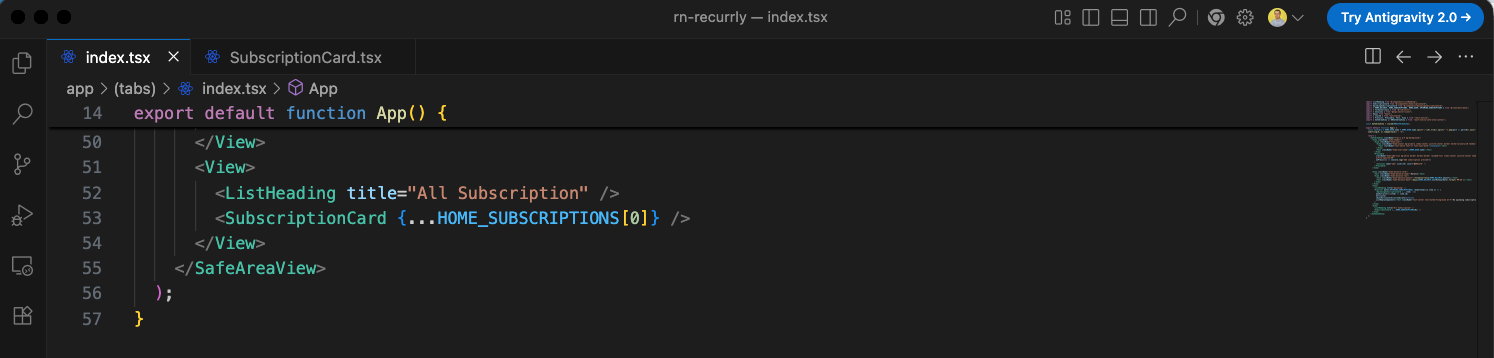
Next, under the "All Subscription" heading, we want to render the subscription list. For initial testing, we will render a single SubscriptionCard component passing the first item of HOME_SUBSCRIPTIONS ({...HOME_SUBSCRIPTIONS[0]}).
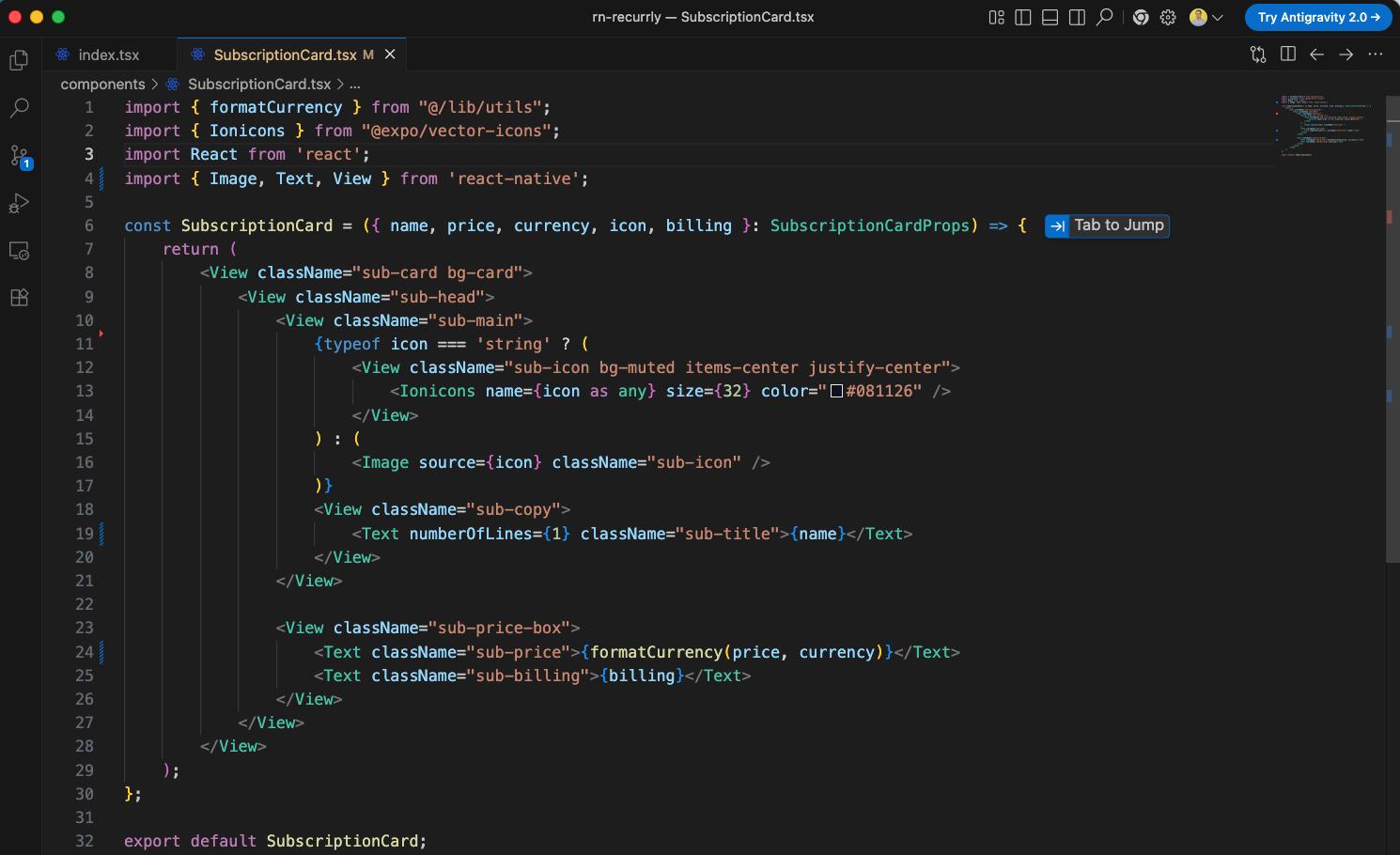
To support this, we create the SubscriptionCard.tsx component inside the components directory. This component dynamically renders either a vector icon (using Ionicons) or a custom image (using the Image component) depending on the type of icon provided. It also shows the subscription name, the formatted price, and the billing cycle details (e.g., Monthly).
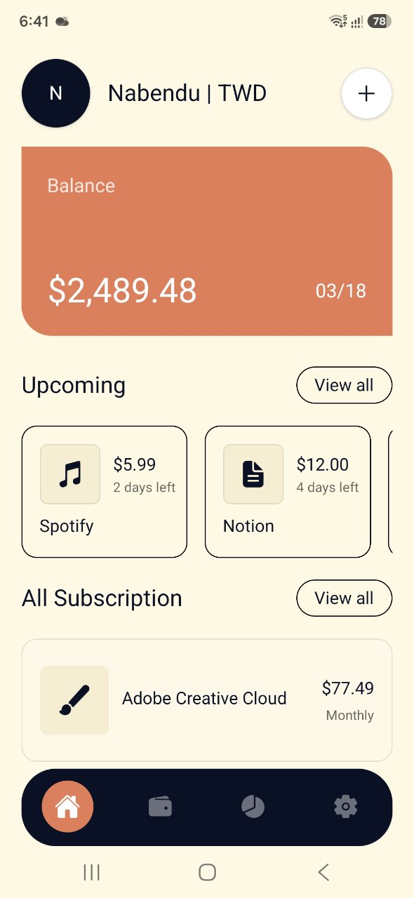
When we check the simulator, we can see the single SubscriptionCard rendering perfectly under the "All Subscription" heading, displaying the Adobe Creative Cloud details.
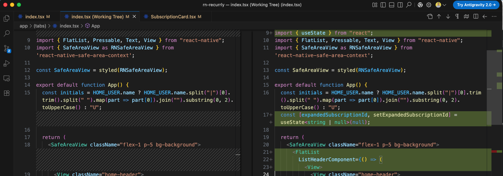
Next, to prepare for rendering the full list of subscriptions smoothly, we refactor the layout of app/(tabs)/index.tsx. Instead of rendering scrollable sections inside a plain container, we introduce a master FlatList. We define a state expandedSubscriptionId to manage expanded cards, and move our header, balance card, and horizontal upcoming list into the ListHeaderComponent of this master list. This avoids nested scroll views and guarantees smooth performance.
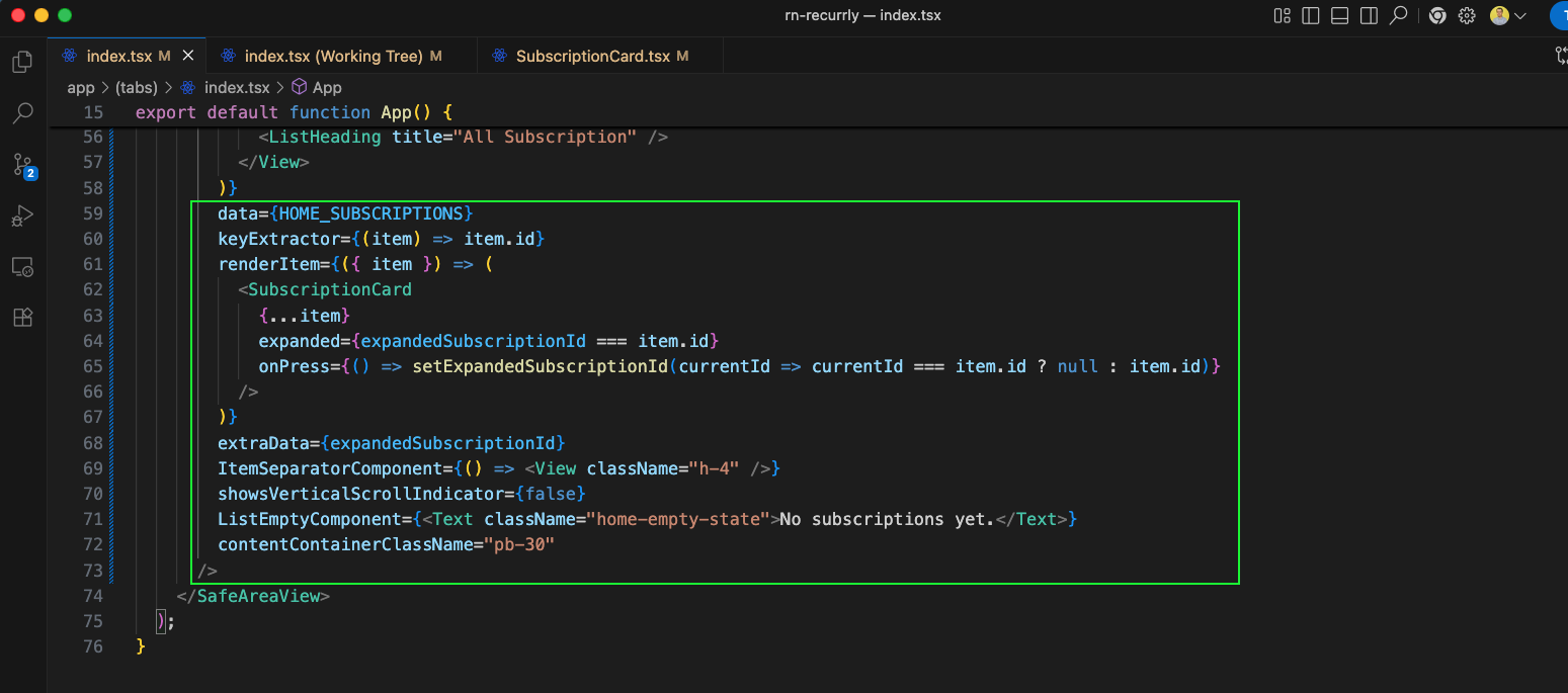
Next, we configure the master FlatList parameters in app/(tabs)/index.tsx. We feed it HOME_SUBSCRIPTIONS data, implement the SubscriptionCard renderer (which receives expanded status and a toggling callback for expansion on click), set extraData to react to state updates, specify spacing with ItemSeparatorComponent, hide scrollbars, and apply bottom padding.
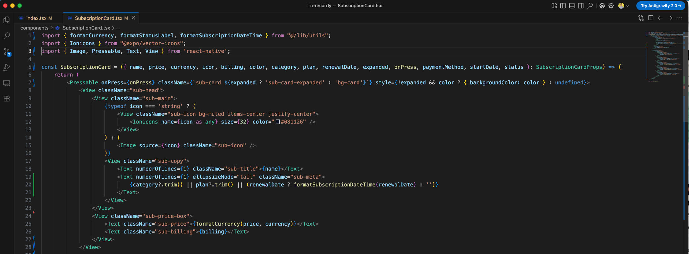
Now, we will update the SubscriptionCard.tsx component to handle the expansion state and display additional metadata. We wrap the card in a Pressable that triggers onPress and conditionally apply an expanded class or a dynamic brand background color when not expanded. We also add a subtitle displaying the category, plan, or next renewal date.
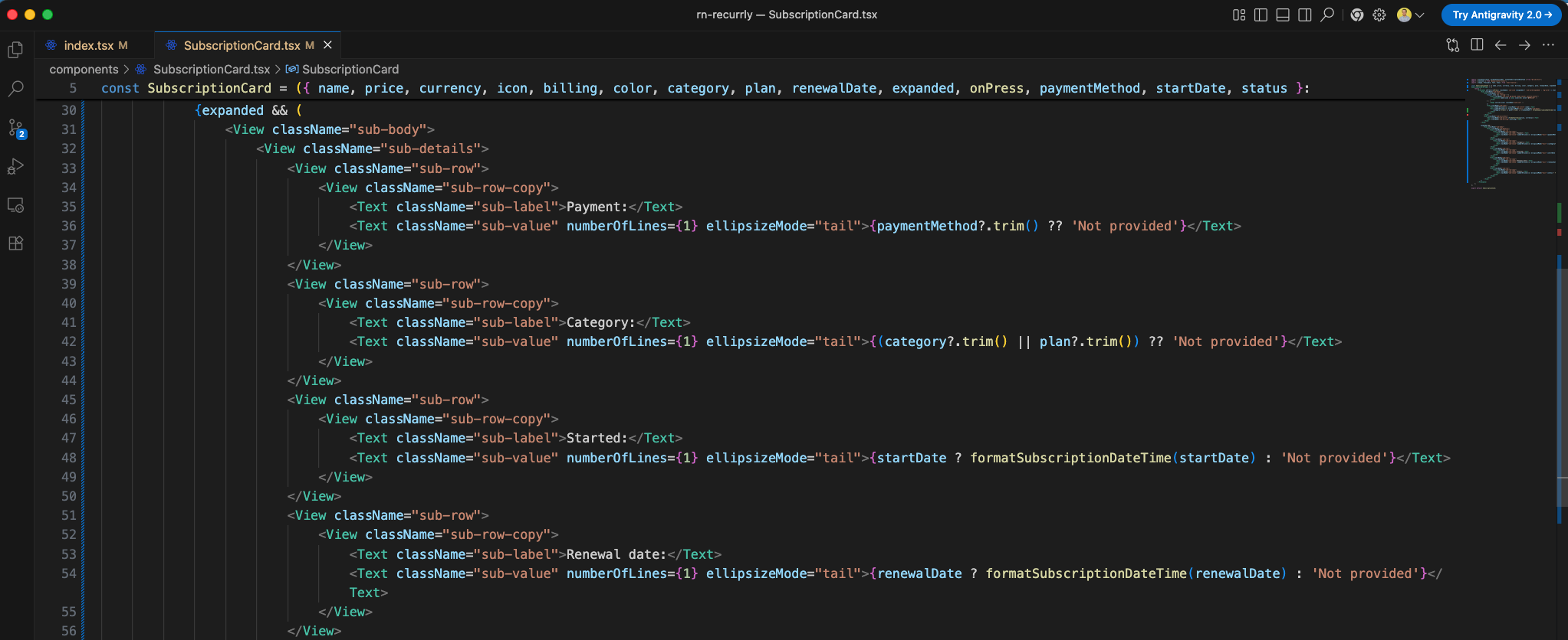
Inside the expanded block in SubscriptionCard.tsx, we build the sub-body containing full subscription details: Payment Method, Category/Plan, Start Date, and Renewal Date, each formatted cleanly with our date utilities.
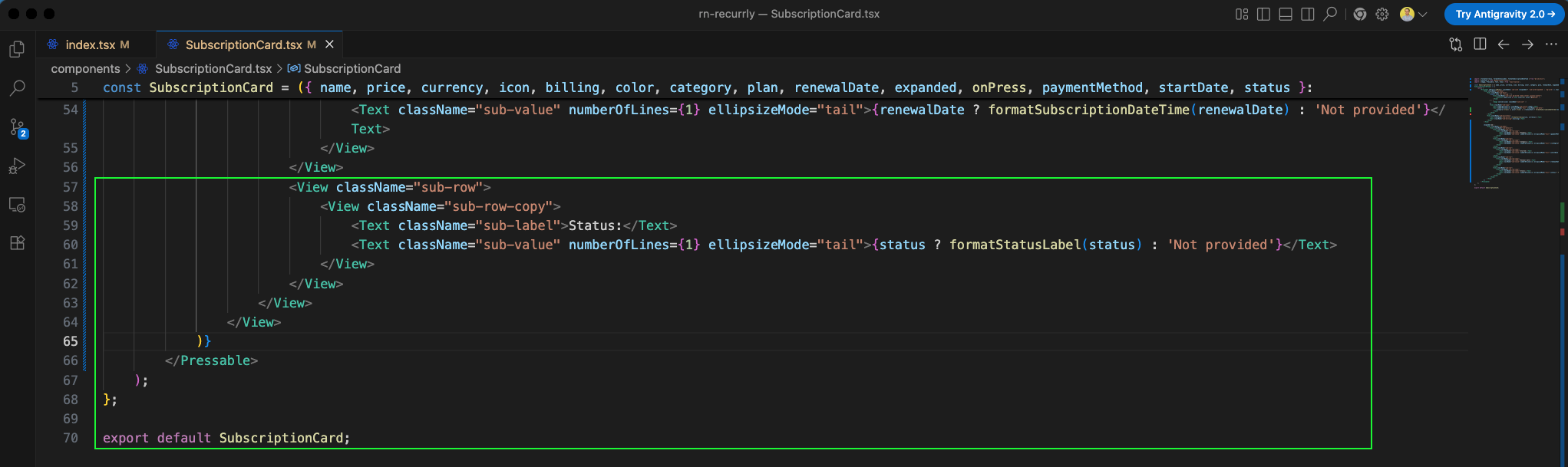
We also render the subscription status in the last row of the detail layout, using formatStatusLabel to ensure it is capitalized and formatted correctly.
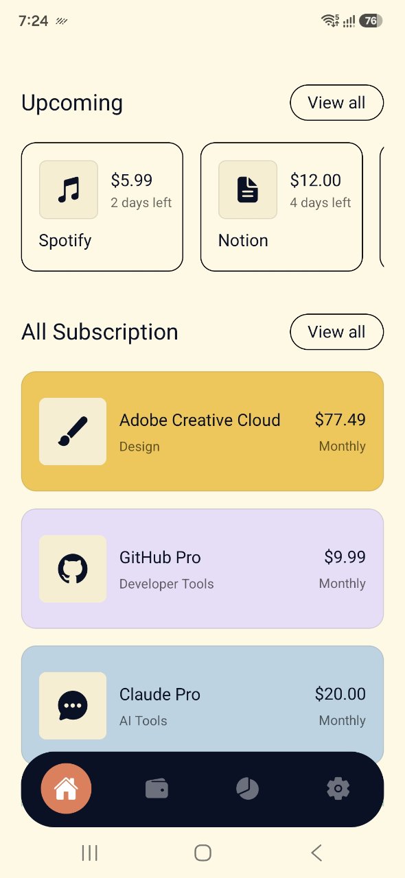
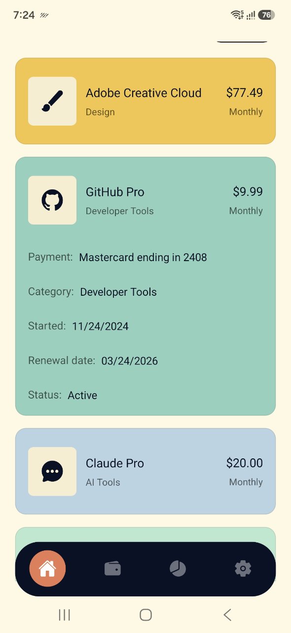
When we open the app in the simulator, we can see the full list of subscriptions under the 'All Subscription' section. Each card has its respective brand color applied, showcasing Adobe Creative Cloud (yellow), GitHub Pro (purple), and Claude Pro (light blue) with clean category labels and icons.
Clicking on any subscription card (like GitHub Pro in this screenshot) expands the card downwards to reveal its detailed metadata—such as payment details, category, start date, next renewal date, and active status—using a smooth state transition.
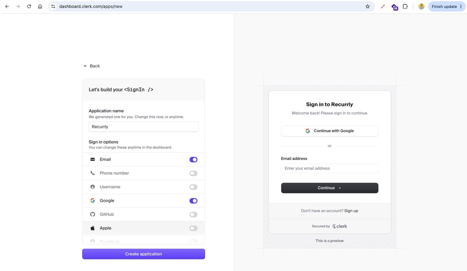
Next, we will implement user authentication using Clerk. We go to the Clerk Dashboard and start by creating a new application named 'Recurrly' with Email and Google Sign-in options enabled.
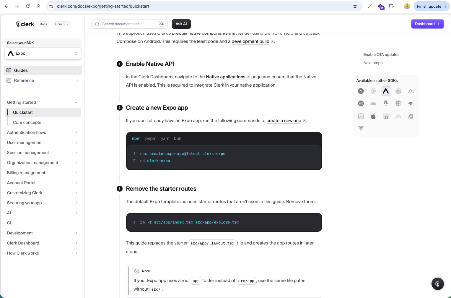
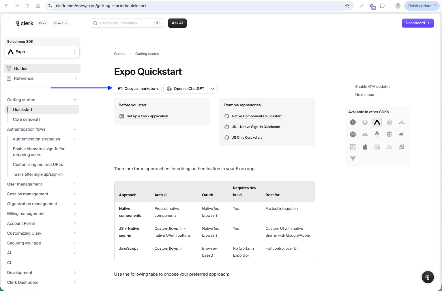
We consult the Clerk documentation for Expo SDK to follow the correct setup steps, which include enabling the Native API and installing Clerk dependencies in our Expo app.
According to the quickstart guide, we need to install the SDK packages @clerk/clerk-expo, expo-secure-store, and expo-dev-client. We will also add the Clerk Publishable Key in a .env file and register the config plugins in app.json.
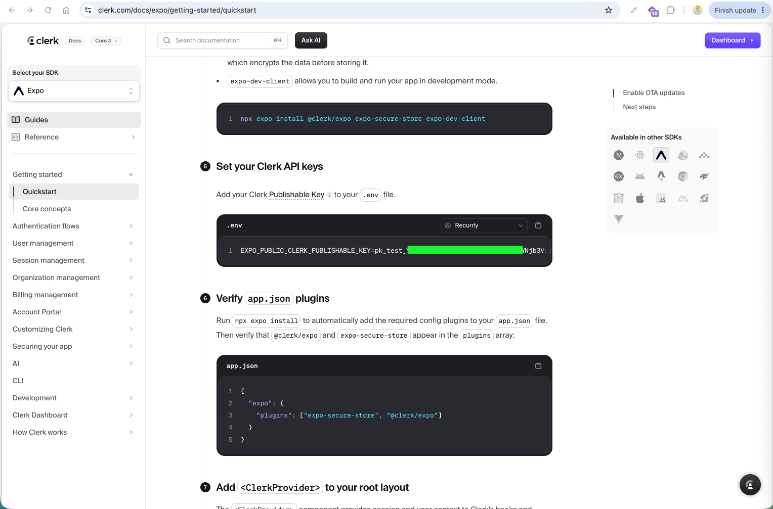
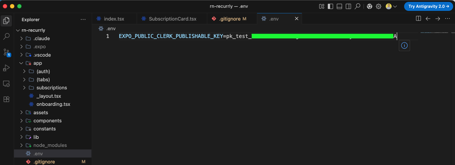
First, we create a .env file at the root level of our project and insert our Clerk publishable key.
We just copied the Copy as markdown, which have the complete prompt for cleark installation in our project.
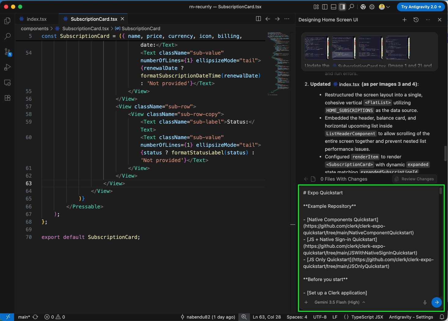
We have pasted that in our Antigravity and asked our AI to do all the steps.
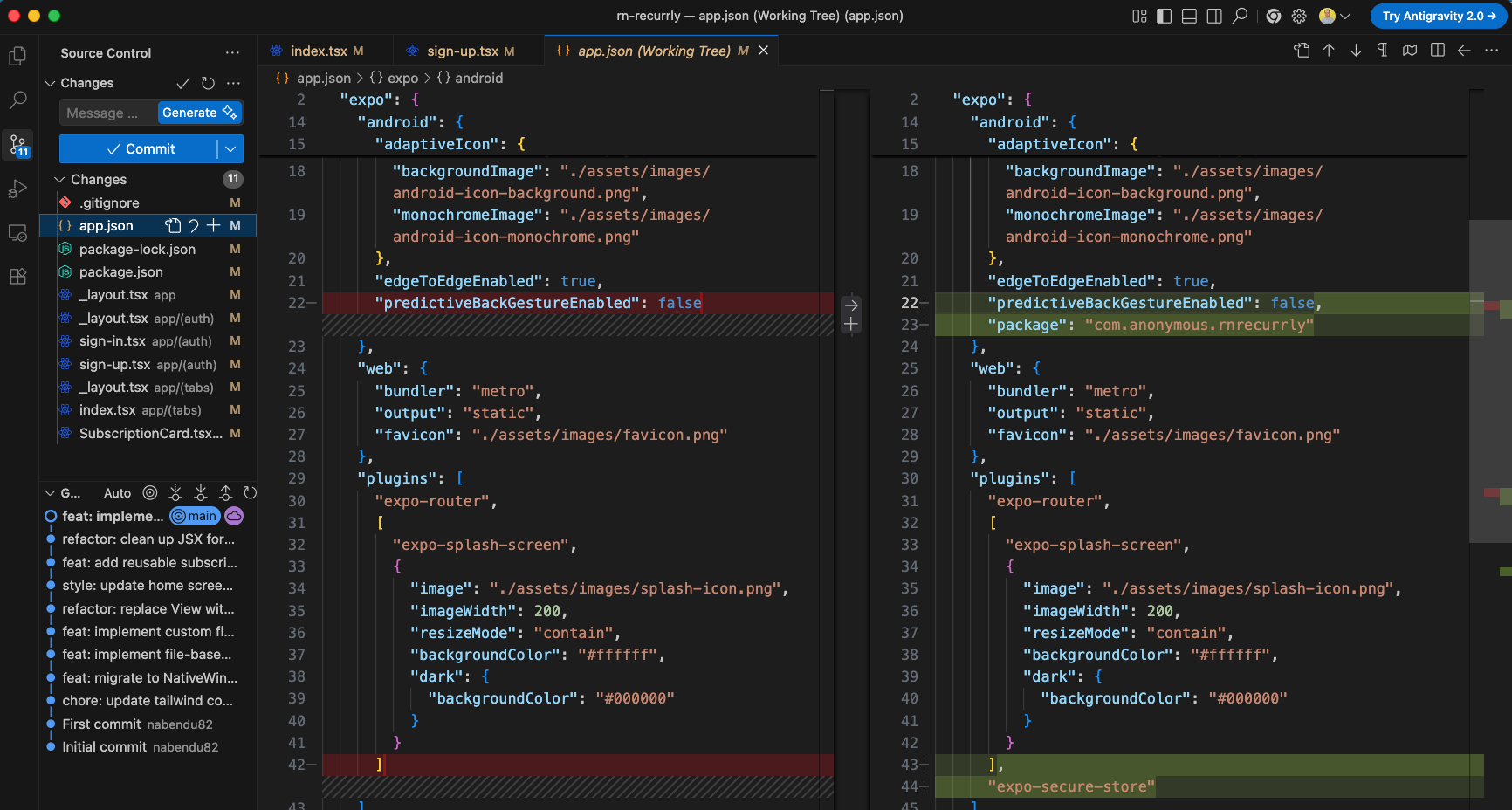
Next, we configure app.json by adding the Android package identifier "com.anonymous.rnrecurrly" and registering "expo-secure-store" under the "plugins" array to support secure key storage.
We also check our package.json to confirm that @clerk/clerk-expo, expo-crypto, and expo-secure-store dependencies are correctly installed.
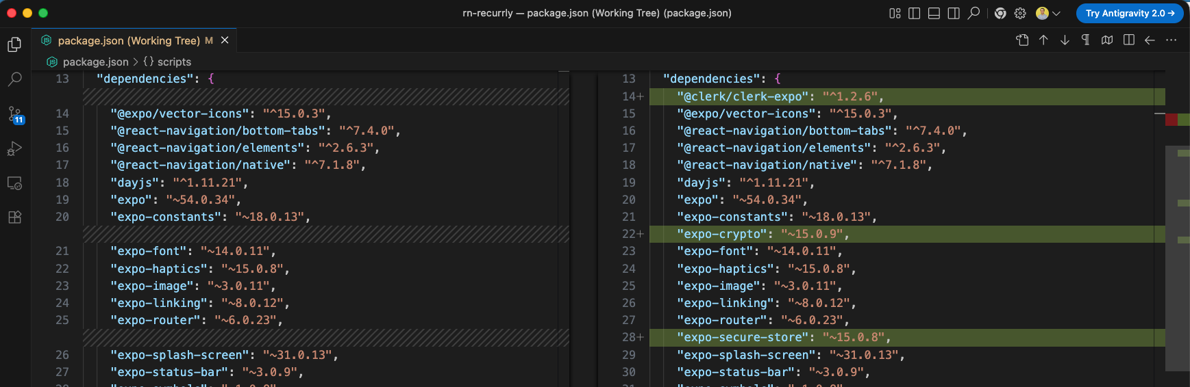
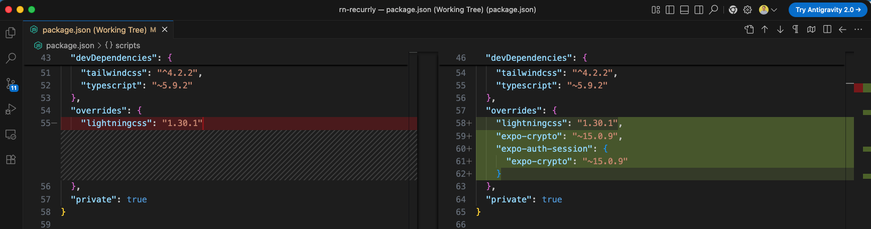
Additionally, to resolve dependency version conflicts, we add package version overrides for expo-crypto in the overrides section of package.json.
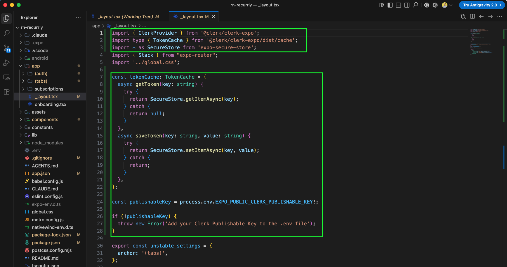
Now, we will update the root layout file app/_layout.tsx to set up the Clerk integration. We configure a secure token cache (tokenCache) utilizing expo-secure-store to safely save and retrieve tokens on the user device, and load our publishable key from environment variables.
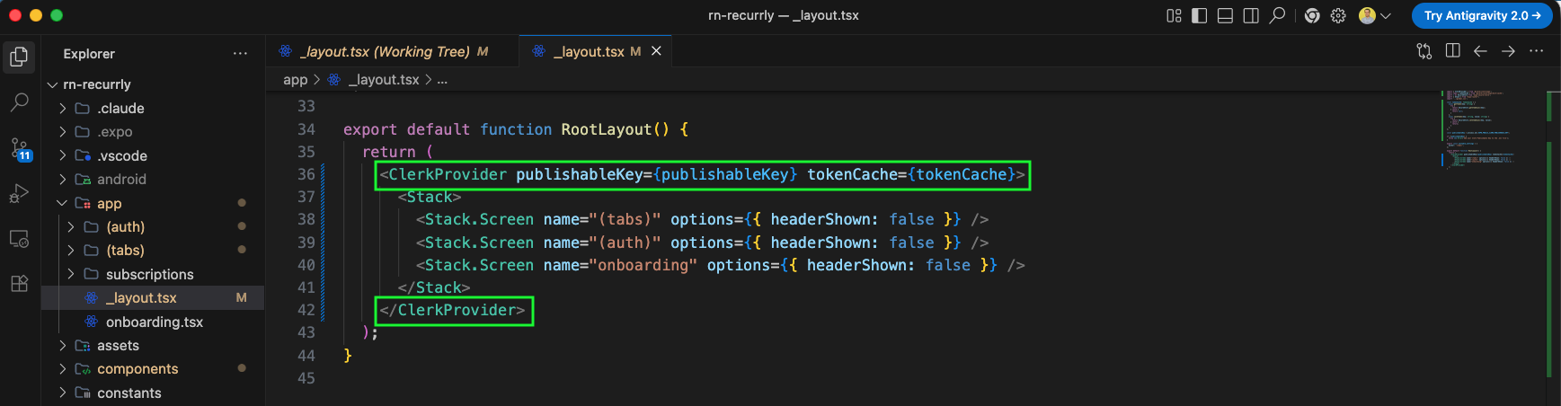
Next, we wrap our root <Stack> navigator inside the <ClerkProvider> component, passing the publishableKey and tokenCache we configured.
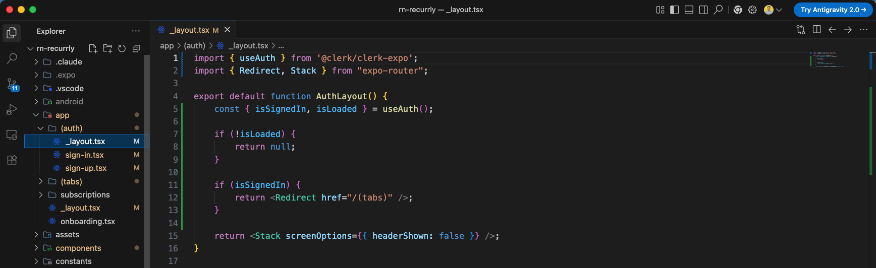
We also update app/(auth)/_layout.tsx to handle authentication routing. If Clerk has loaded (isLoaded is true) and the user is already signed in (isSignedIn is true), we redirect them directly to the main app dashboard under (tabs). Otherwise, we show the authentication stack screen.
Next, we update the app/(auth)/sign-in.tsx screen to implement the sign-in flow. We use Clerk's useSignIn hook to handle the authentication logic, set up local states for inputs and error handling, validate forms on the client side, and build a submission handler (handleSubmit) to sign the user in with their email and password.
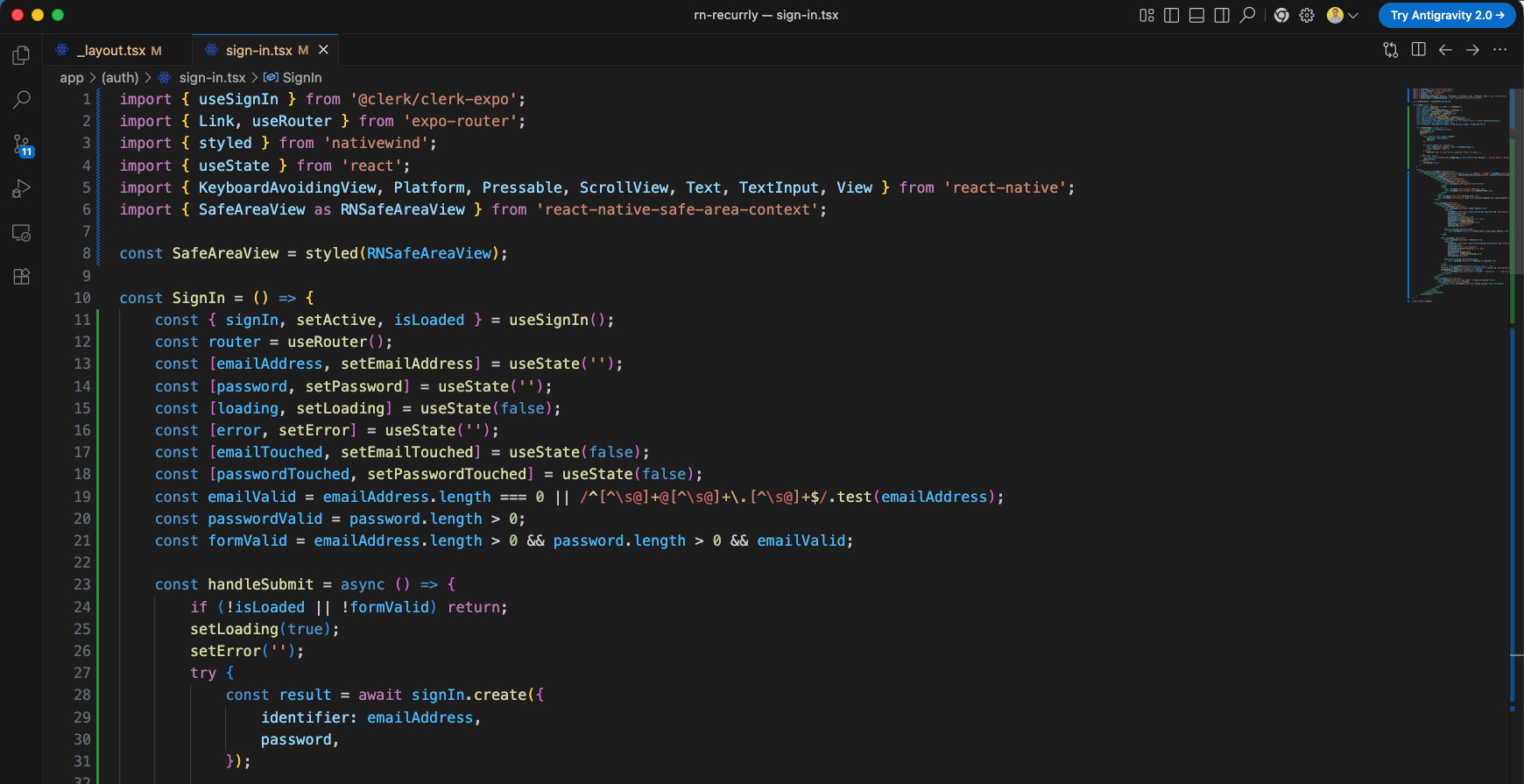
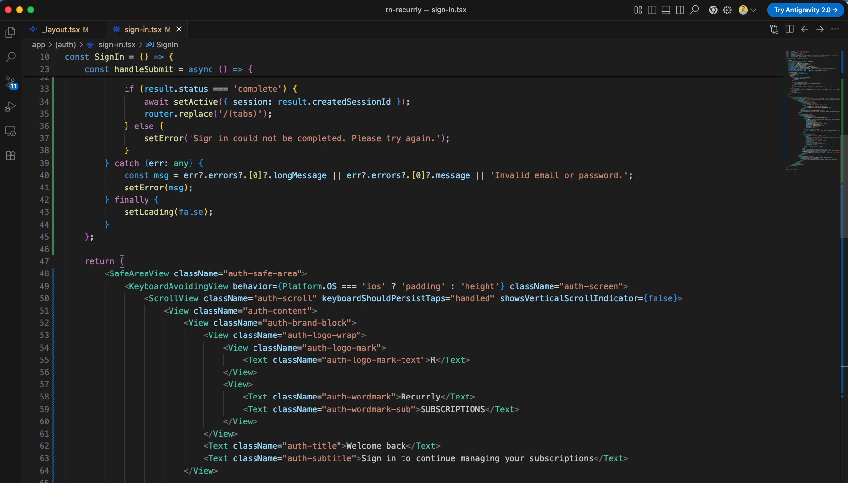
When the sign-in form is submitted, we call signIn.create using the user's credentials. If the result is complete, we register the active session via setActive and route them to /(tabs). If it fails, we handle any errors thrown by Clerk dynamically. In the JSX, we wrap the form in a KeyboardAvoidingView to handle layouts smoothly when the virtual keyboard is open.
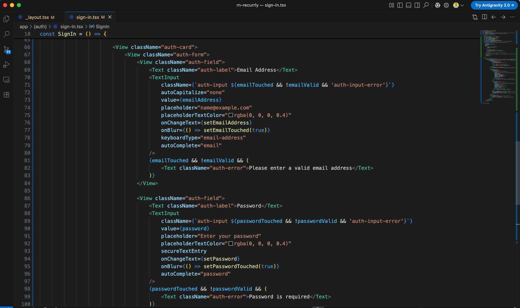
Next, inside the card container (auth-card), we implement form input fields (TextInput) for Email Address and Password. These inputs feature real-time focus (onBlur) tracking to dynamically show validation error messages if the user enters invalid formatting or leaves fields blank.
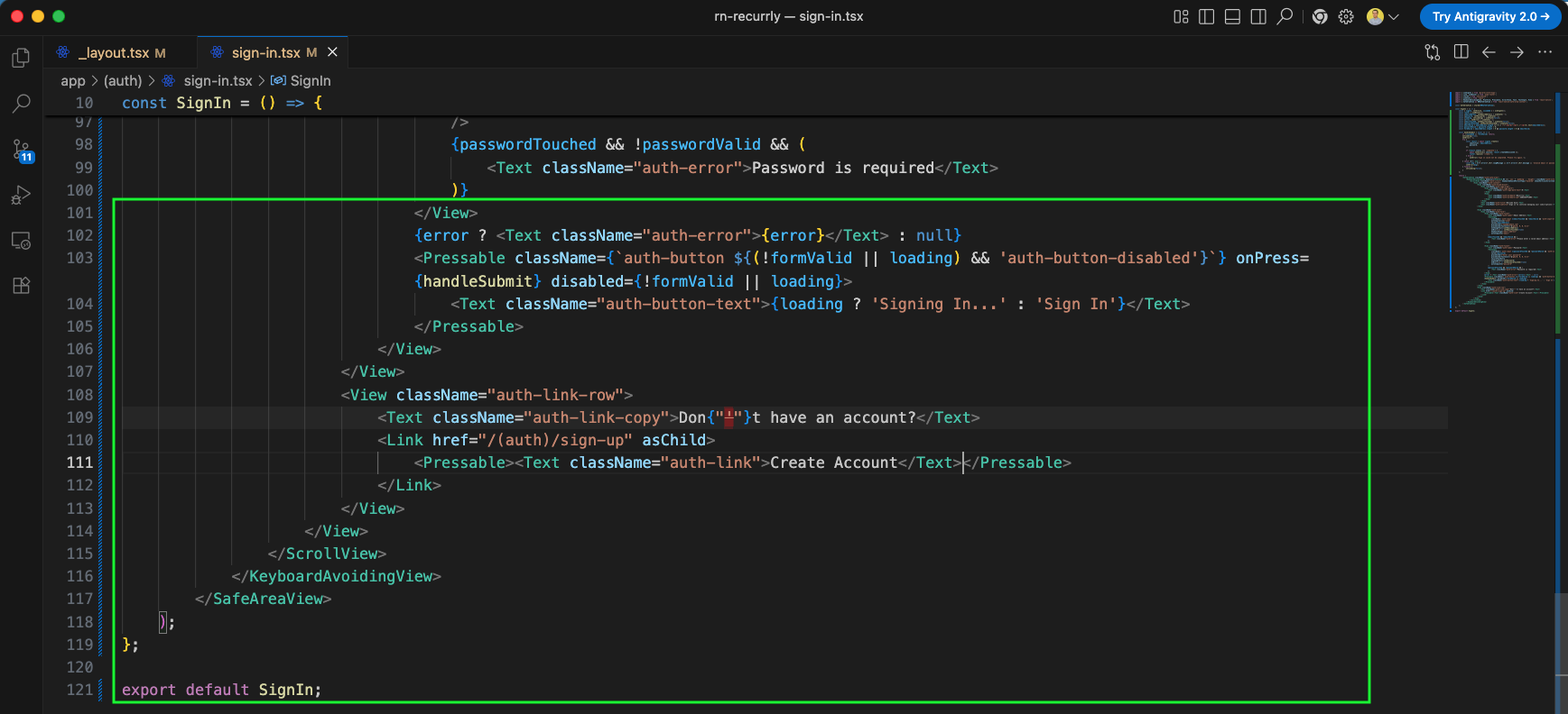
Below the input fields, we add the submit button which dynamically renders disabled states (auth-button-disabled) during active API requests or if form validation fails. Underneath the button, we add a navigation row linking users to the sign-up page ('Create Account') if they do not yet have an account.
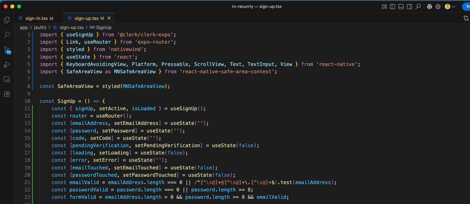
Finally, we update the app/(auth)/sign-up.tsx screen to implement the sign-up and email verification flows. We use Clerk's useSignUp hook to manage registration, adding states for input variables, form validation, and pendingVerification (which manages toggling the email OTP verification step after signing up).
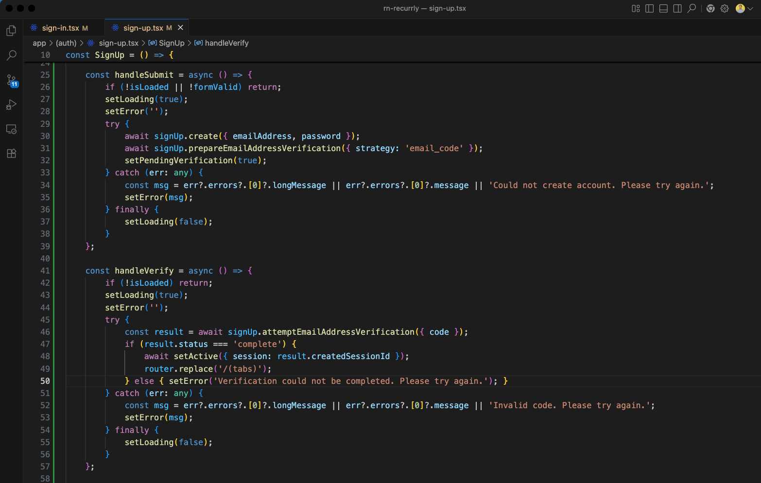
Next, we implement the submission handlers in app/(auth)/sign-up.tsx. The handleSubmit handler creates the registration request and calls signUp.prepareEmailAddressVerification to send a verification code to the user's email. The handleVerify handler submits the OTP code, activates the session on success, and routes the user to /(tabs).
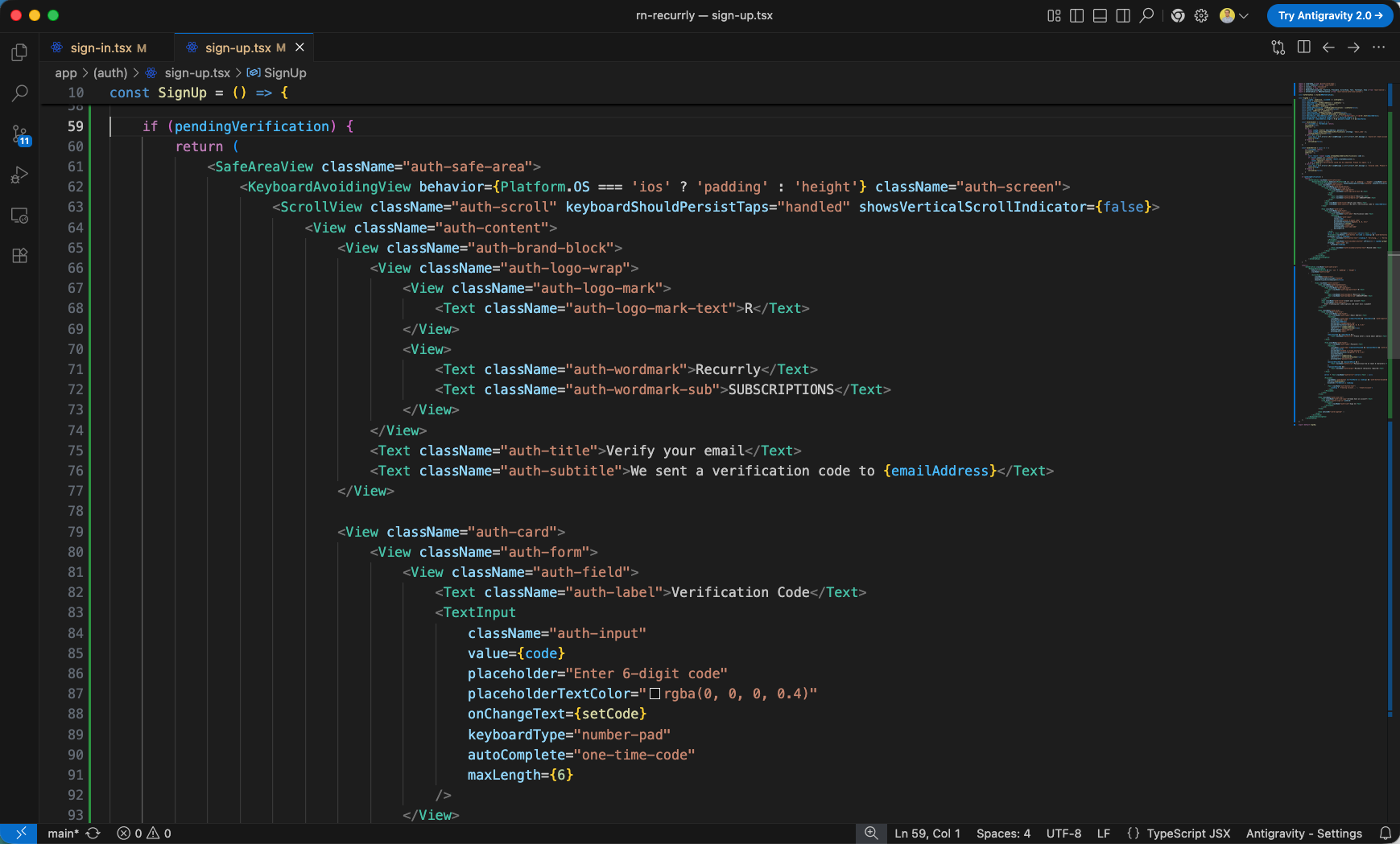
When pendingVerification is true, we conditionally render an email verification interface. It prompts the user to enter the 6-digit code sent to their email using a number-pad keyboard layout.
Below the code input field, we add a primary 'Verify Email' button and a secondary 'Resend Code' button to trigger resending the code if needed. Then we define the base return statement containing the default sign-up UI layout.
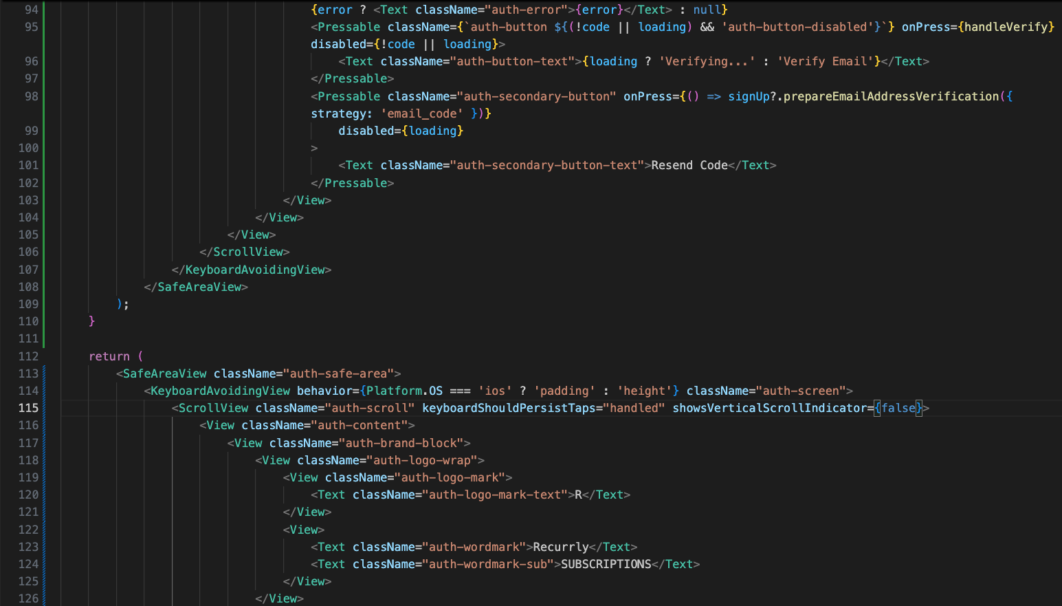
Inside the auth-card, we create text fields for Email Address and Password with inline validation, matching the style and behaviors of the sign-in form.
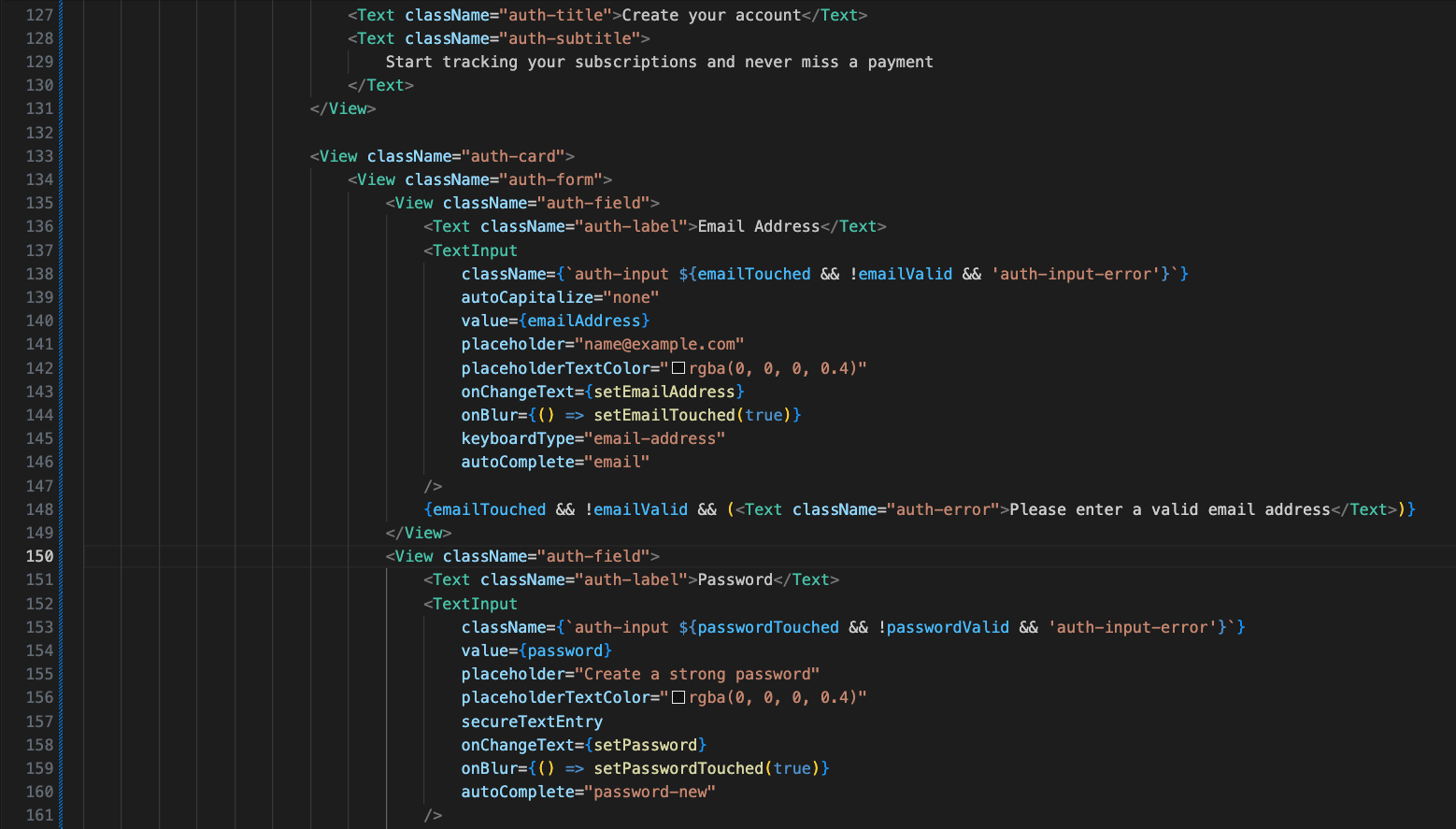
Under the password field, we display a helper text requiring a minimum of 8 characters, and render a submit button that triggers the handleSubmit process. There is also a navigation link redirecting the user to the sign-in page if they already have an account, as well as a required <View nativeID="clerk-captcha" /> element for Clerk security verification.
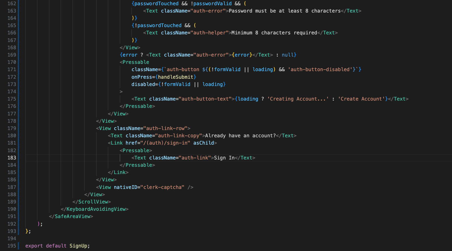
Now, we update the navigation layout in app/(tabs)/_layout.tsx. We import the useAuth hook from Clerk, import Redirect and Tabs from expo-router, and define typing interfaces for our tab navigation icons.
Inside TabLayout in app/(tabs)/_layout.tsx, we retrieve the authentication state. If Clerk is not yet loaded (isLoaded is false), we render nothing (null). If the user is not authenticated (isSignedIn is false), we redirect them back to the sign-in page /(auth)/sign-in.
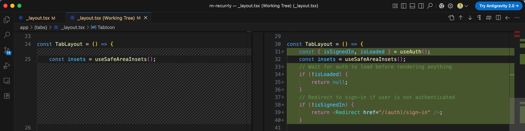
Next, we update the home screen app/(tabs)/index.tsx to retrieve the authenticated user's information dynamically from Clerk. We use Clerk's useUser hook, compute the user's displayName from their profile fields, and generate their avatar initials dynamically.
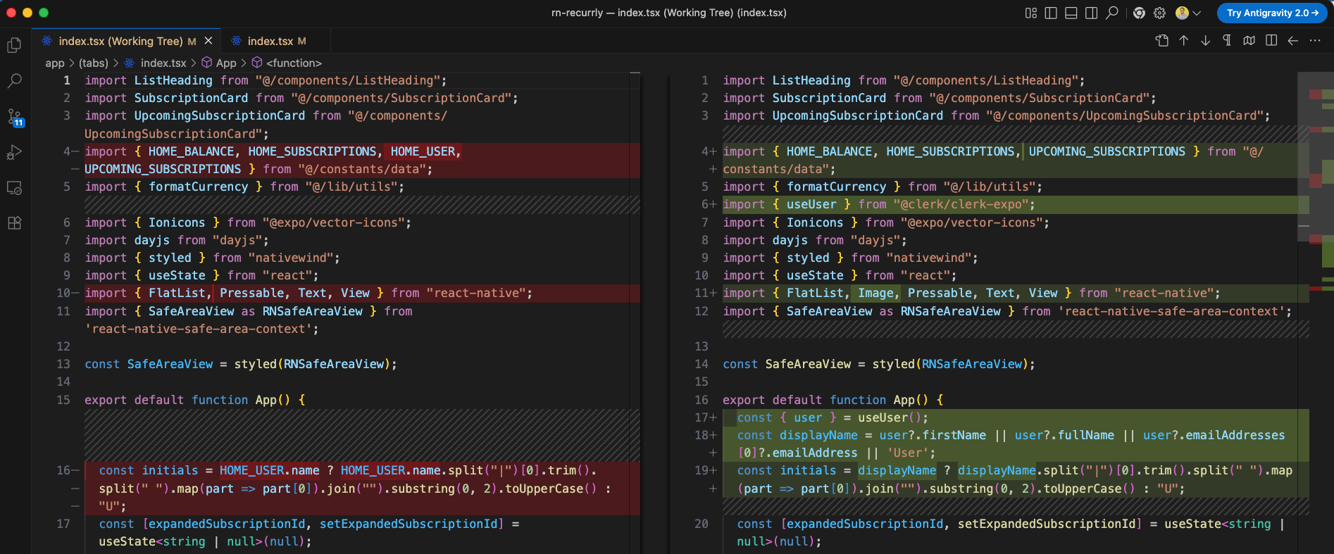
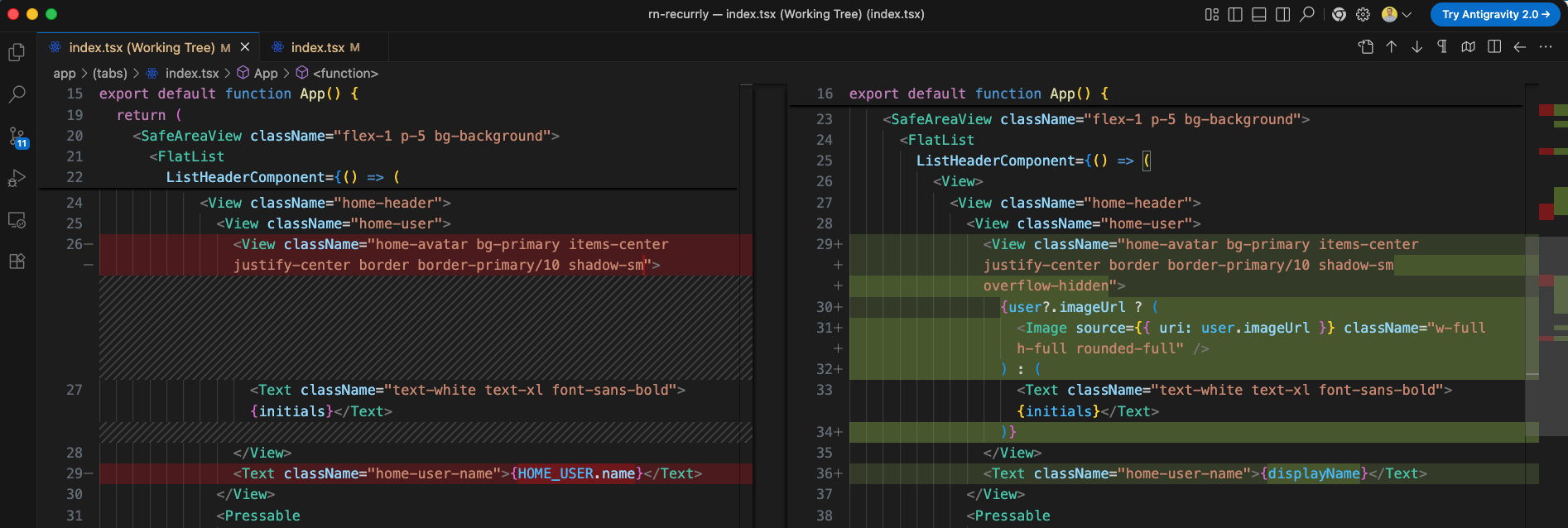
Inside the header layout, we replace the static username text with the dynamic {displayName} and configure the avatar section (home-avatar) to render the user's profile image via user.imageUrl if available, falling back to their initials text.
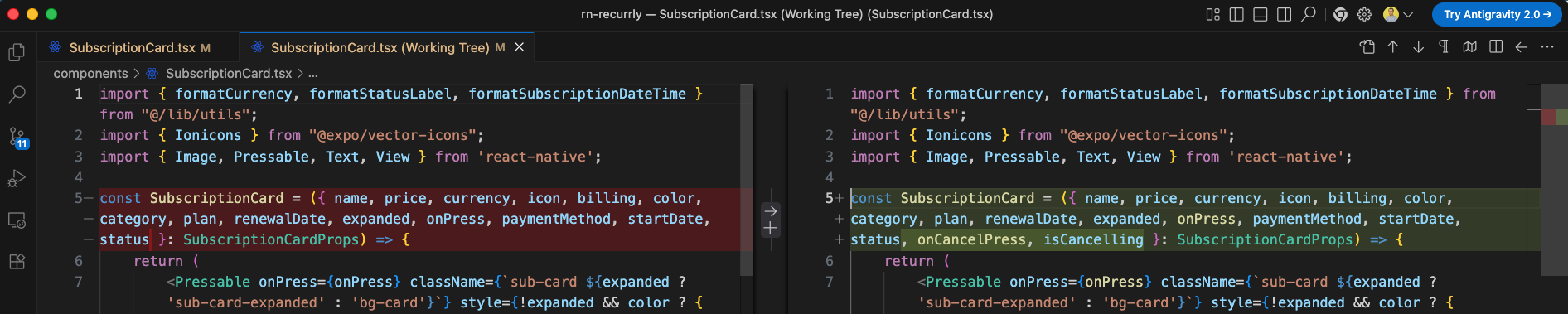
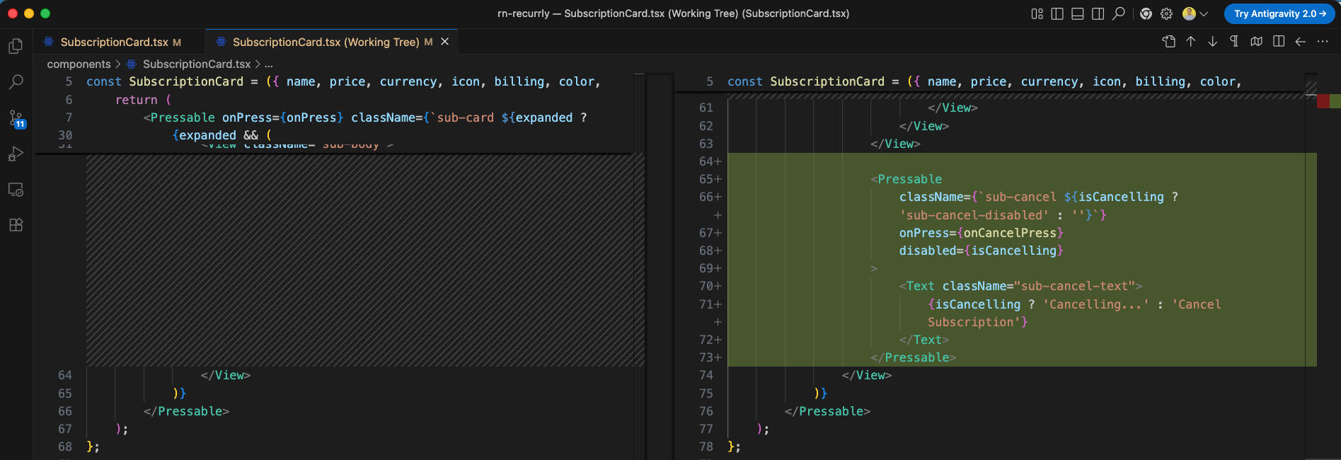
Next, we prepare the SubscriptionCard.tsx component to handle active subscription cancellation events. We add two new props to SubscriptionCardProps: onCancelPress (a callback function) and isCancelling (a loading state).
Inside the expanded card body layout, we render a 'Cancel Subscription' button. The button disables and shows a loading text ('Cancelling...') while an active cancellation action is pending.
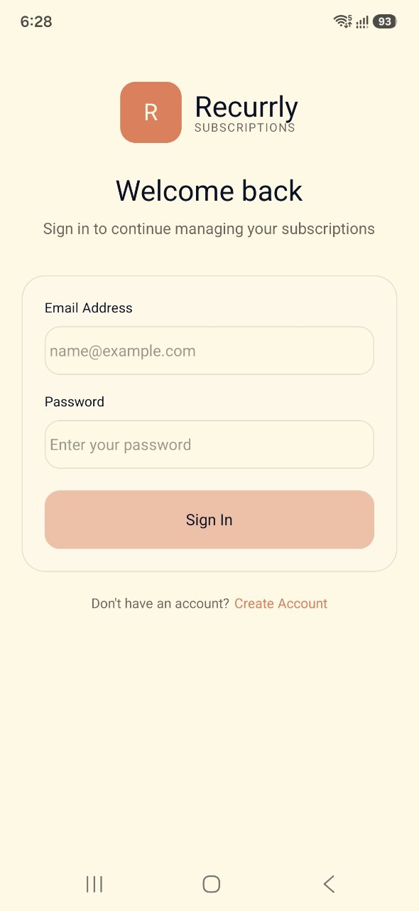
When we open the application, it successfully displays our custom Clerk-integrated 'Welcome back' Sign In screen, featuring styled logo marks, input fields, and the submission buttons.
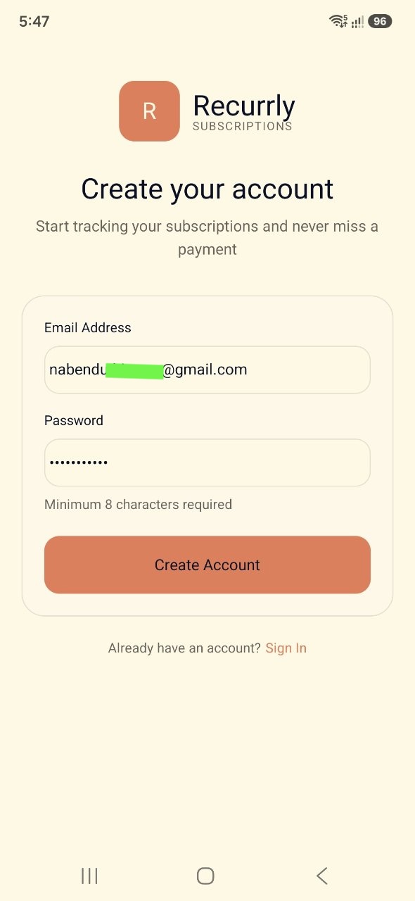
If a user clicks 'Create Account', they are navigated to the Sign Up screen. Here they enter their email address and a secure password of at least 8 characters before clicking the 'Create Account' submission button.
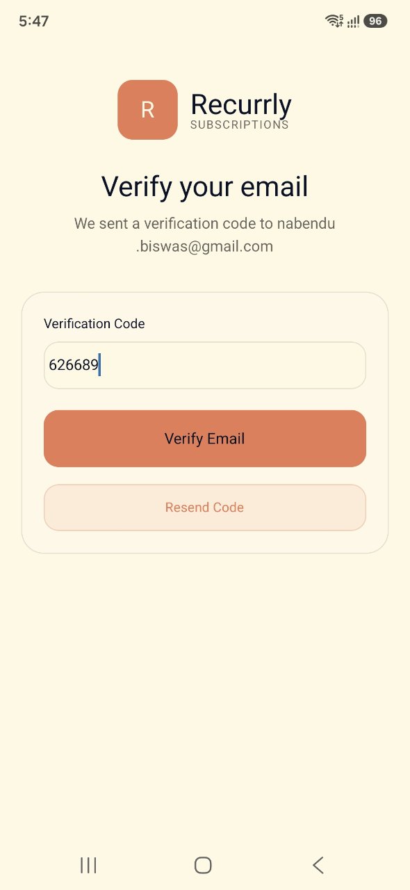
Upon submitting their registration, the user receives an OTP verification code on their email. The application shows the email verification screen where they enter the code (e.g. 626689) and click 'Verify Email' to complete the registration process.
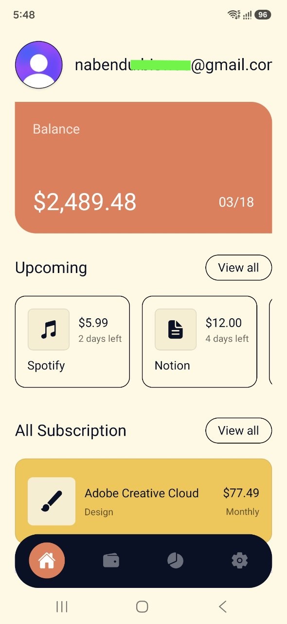
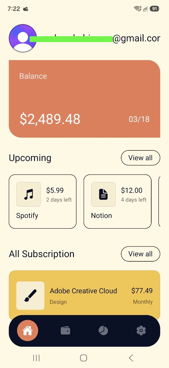
After successful email verification, the user is logged into the application and routed to the home screen. Their newly created profile email is displayed in the header next to a default avatar, and their subscription balance card and upcoming lists are rendered correctly.
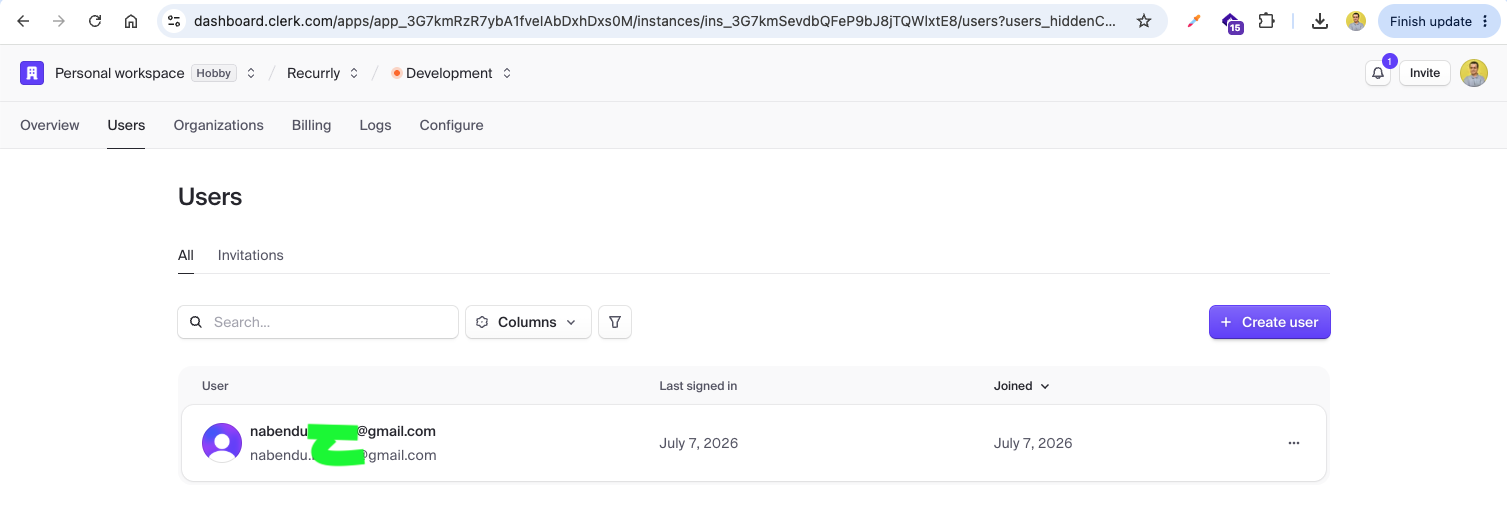
Checking the Clerk Dashboard, we can confirm that the new user has been successfully created and registered under the 'Users' tab.
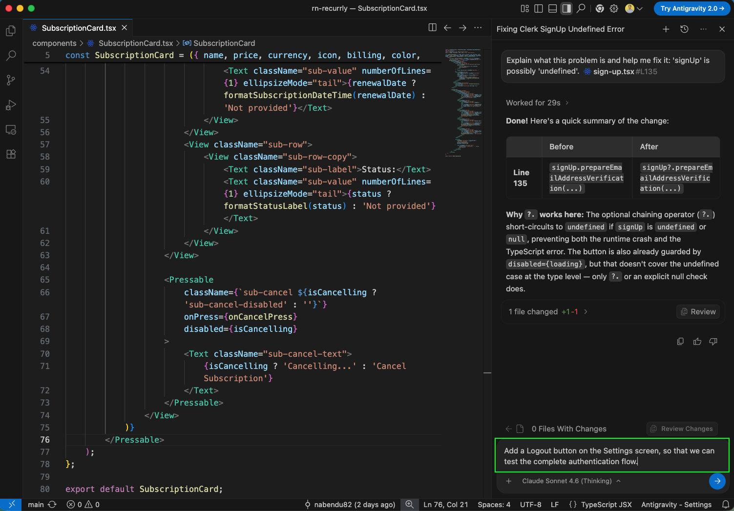
Next, to test the authentication flow completely, we decide to add a Logout button to the Settings screen. We have agin written an prompt in Antigravity to do it.
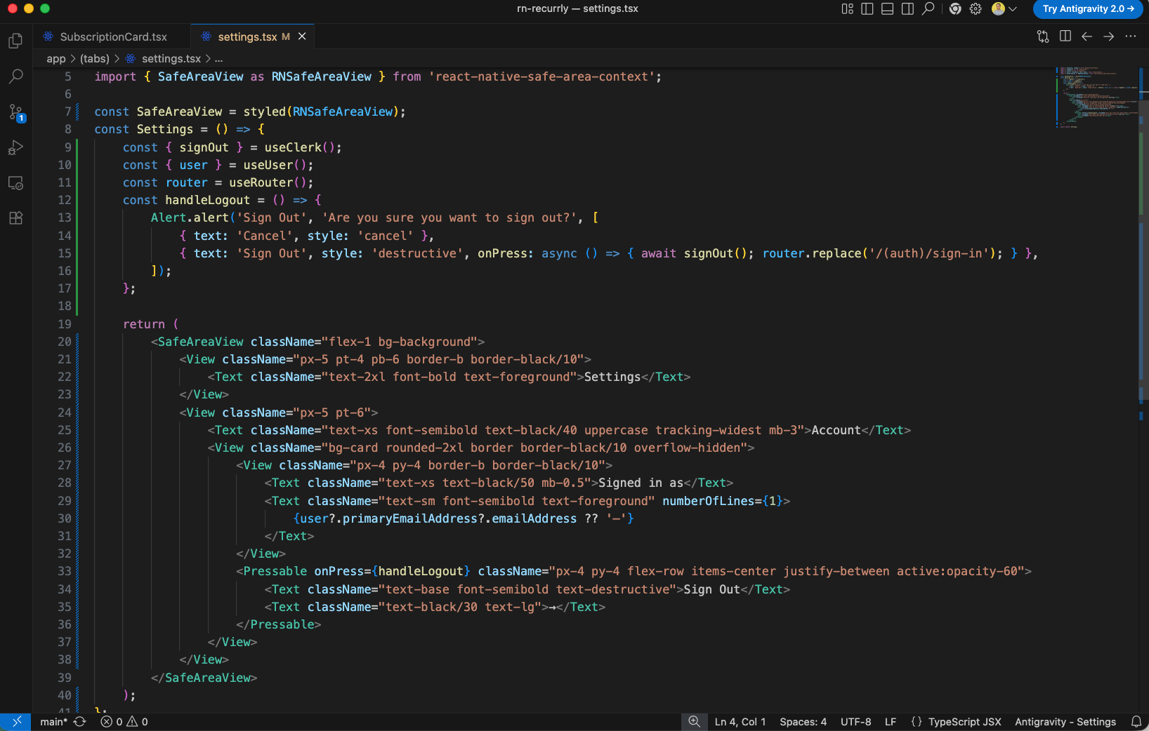
We implement the settings screen in app/(tabs)/settings.tsx. We read the logged-in user's email dynamically from Clerk and build a logout button. When pressed, it shows a confirmation popup using Alert.alert before executing Clerk's signOut() and returning the user to the Sign In screen.
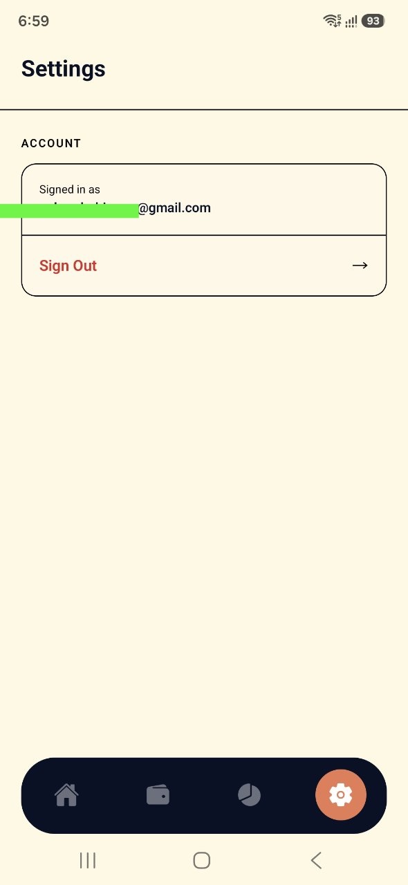
When navigated to the Settings screen in the simulator, we can see the Account info showing the user's logged-in email and the 'Sign Out' action row styled cleanly inside a bordered card.
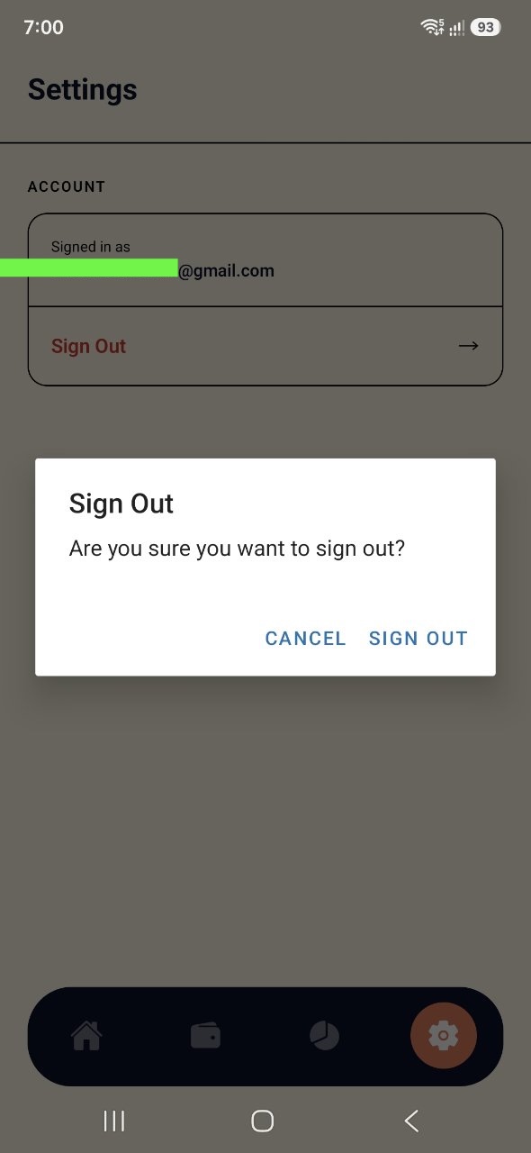
Tapping on the 'Sign Out' row triggers a native verification dialog asking: 'Are you sure you want to sign out?', ensuring users do not log out accidentally.
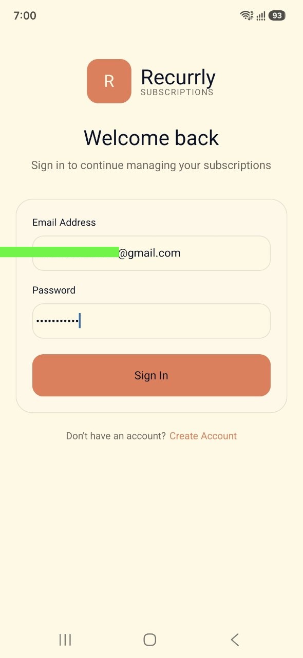
When we sign out, we are successfully redirected back to the Sign In screen, showing that the complete authentication loop functions correctly.
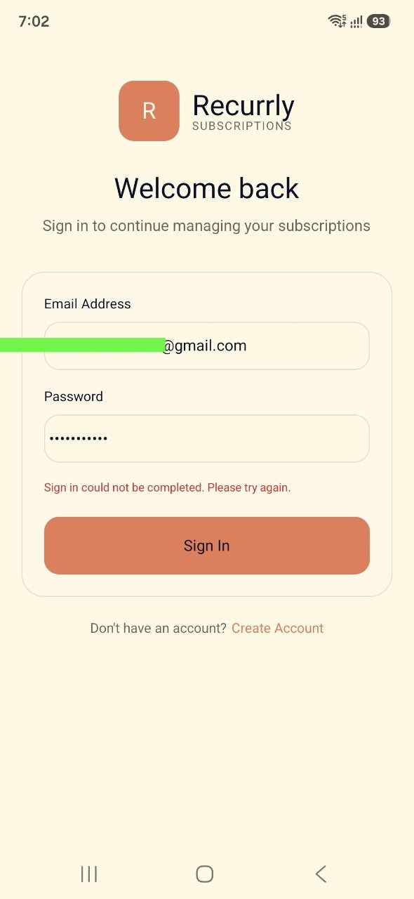
If there's an issue with the credentials or the server response, we display a clear validation message to the user: 'Sign in could not be completed. Please try again.'
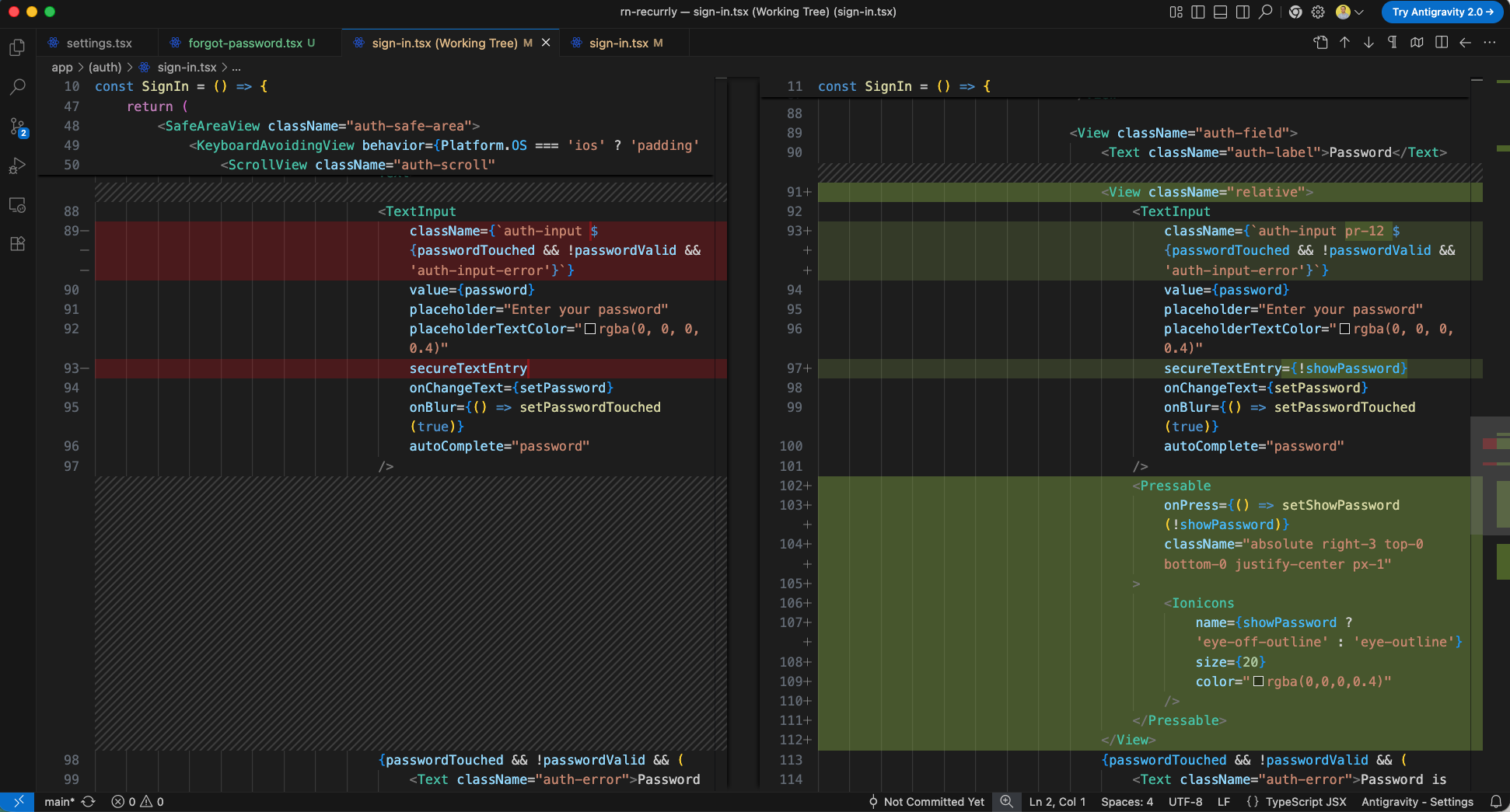
Next, we enhance the Sign In experience by adding a password visibility toggle. In app/(auth)/sign-in.tsx, we add a showPassword state variable.

Inside the password TextInput, we wrap the field in a relative container, set secureTextEntry={!showPassword}, and absolute-position an Ionicons eye/eye-off toggle button on the right to switch between plain text and obscured entry formats.
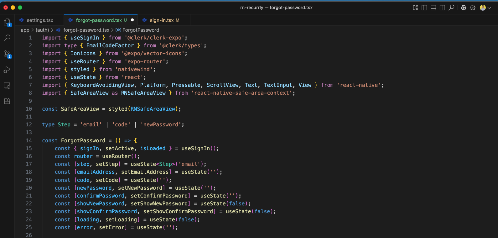
Next, we create a new app/(auth)/forgot-password.tsx screen to implement the password reset wizard flow. We define three steps in a Step type—email, code, and newPassword—and set up the required state hooks and input forms.
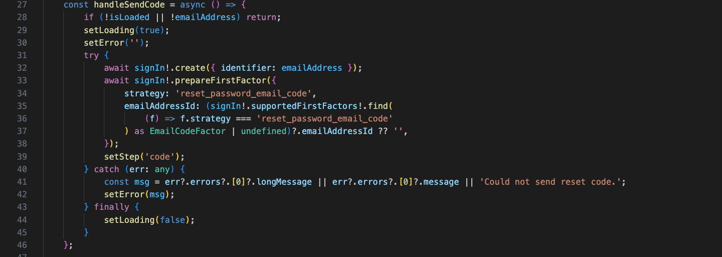
We write the handleSendCode function to initiate the reset password sequence in Clerk. It triggers signIn.create and prepares the first authentication factor using reset_password_email_code to send a reset OTP code to the user's email, then moves the wizard to the verification 'code' step.
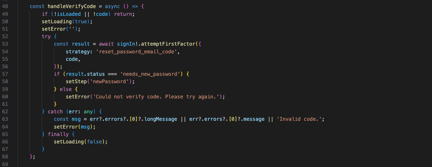
Next, we implement handleVerifyCode to verify the reset code. It executes signIn.attemptFirstFactor using the user's entered OTP. If verified successfully and Clerk flags that it needs a new password (result.status === 'needs_new_password'), we advance the wizard to the 'newPassword' step.
Then, we implement the handleResetPassword function. It validates that the two entered passwords match and meet the 8-character requirement, calls signIn.resetPassword to update the user credentials, activates their session, and redirects them to the main home screen dashboard.
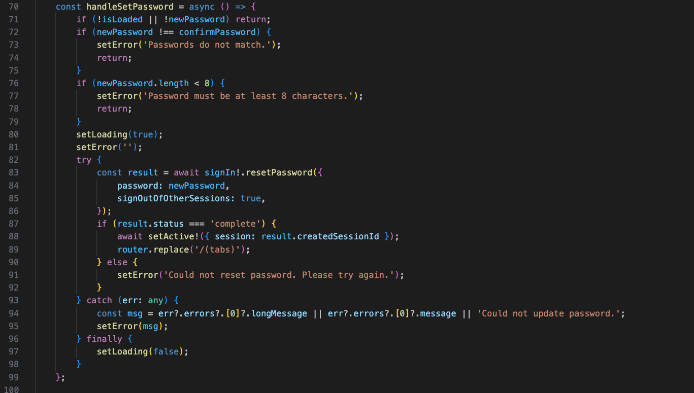
To make the UI clean and dynamic, we define a config mapping (stepConfig) that defines the title, subtitle, and icon for each wizard step (email, code, newPassword), then retrieve the matching config dynamically based on the current step state.
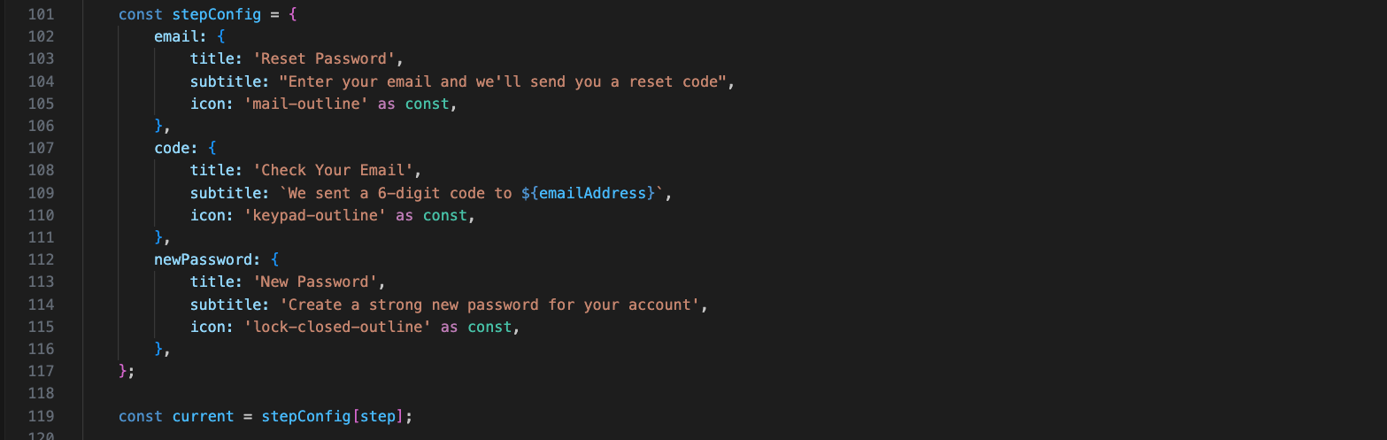
Inside the return JSX statement, we implement a custom header containing a 'Back' button that contextually resolves whether to navigate to the previous screen or revert to the previous wizard step. We also display the dynamic step titles and render a progress indicator displaying the user's current step.
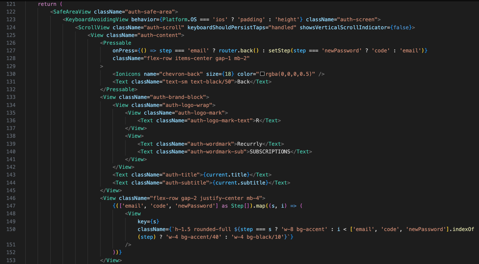
Next, inside the form card (auth-card), we conditionally render fields depending on the active step: if the step is 'email', we render the Email Address text input, and if the step is 'code', we render the 6-digit Verification Code text input.
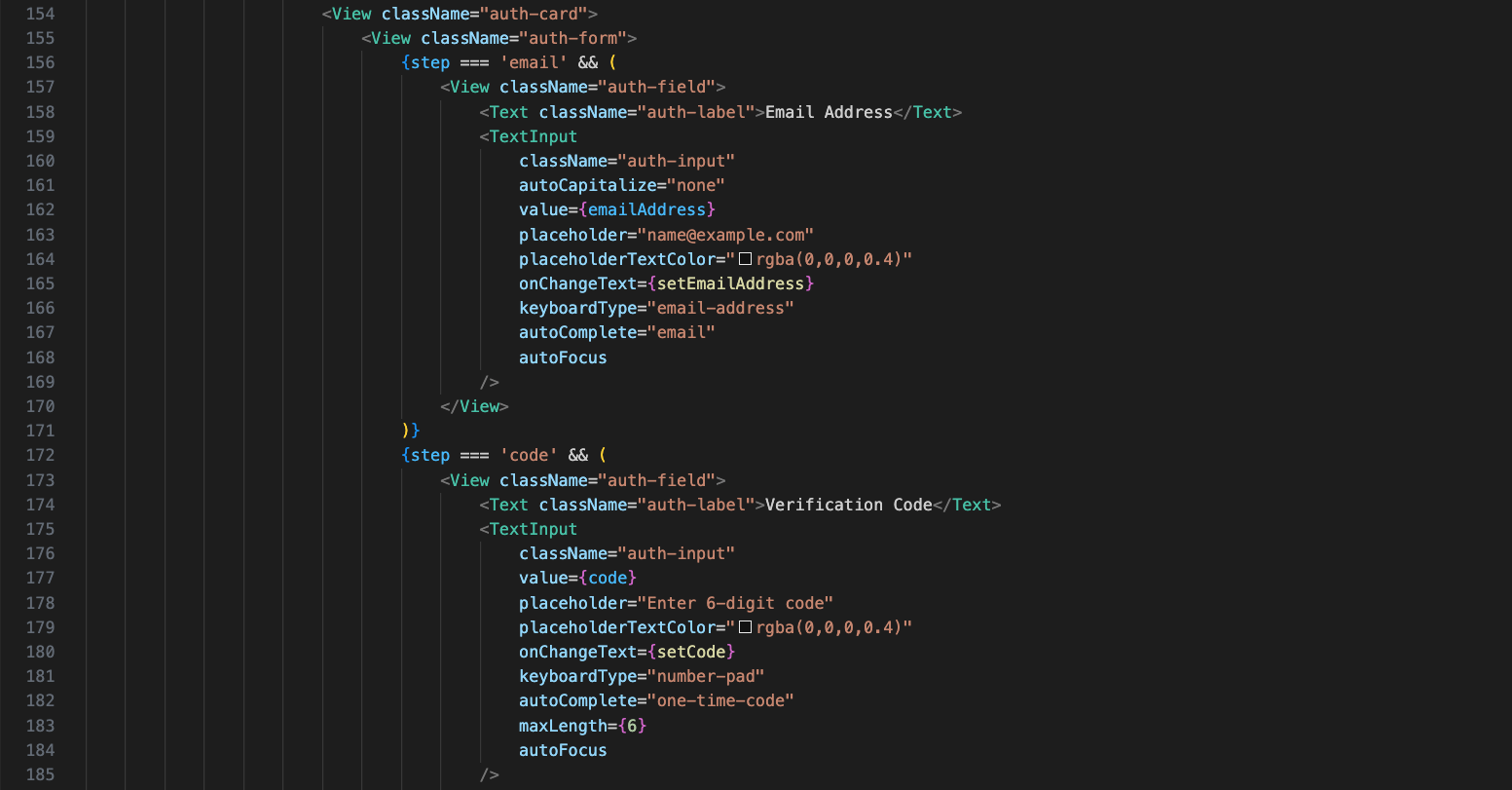
Additionally, in the verification 'code' block, we render a secondary 'Resend code' button. If the step is 'newPassword', we render the 'New Password' text input field with its own password visibility toggle icon absolute-positioned on the right.
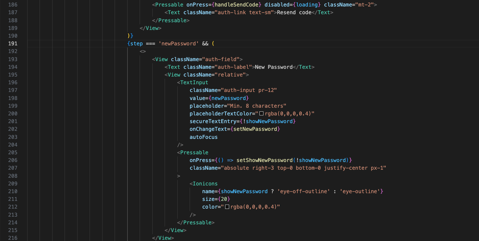
Below the new password field, we add a 'Confirm Password' input field with its own show/hide password toggle button. The primary action button at the bottom dynamically resolves its onPress callback—mapping to handleSendCode, handleVerifyCode, or handleResetPassword depending on the active step.
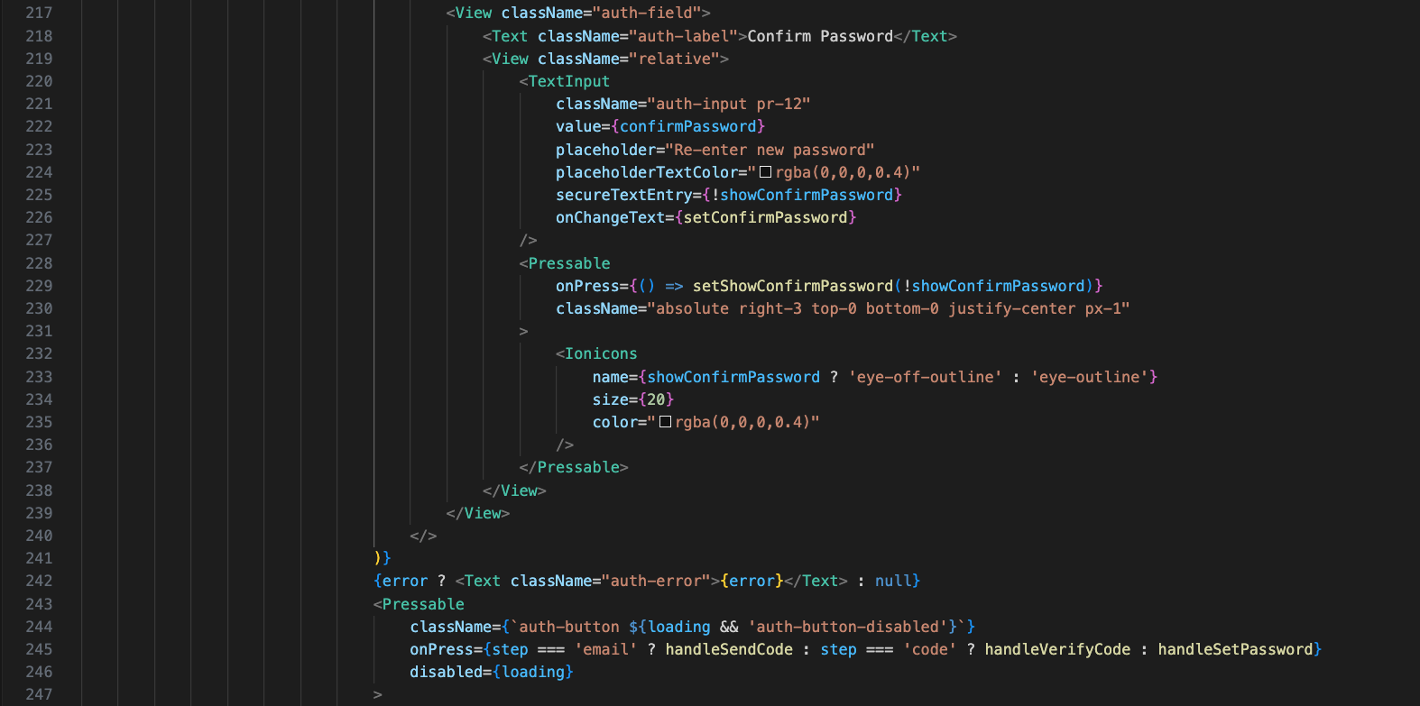
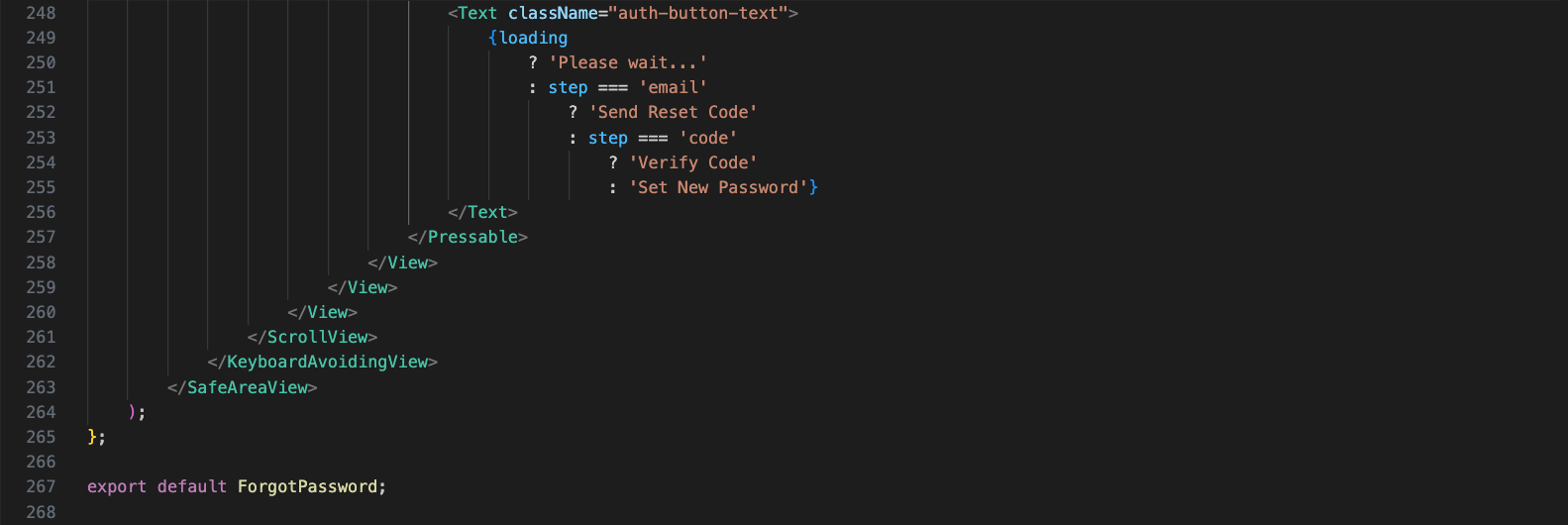
The button text is also dynamic: displaying 'Please wait...' during API requests, or showing 'Send Reset Code', 'Verify Code', or 'Set New Password' based on the wizard step.
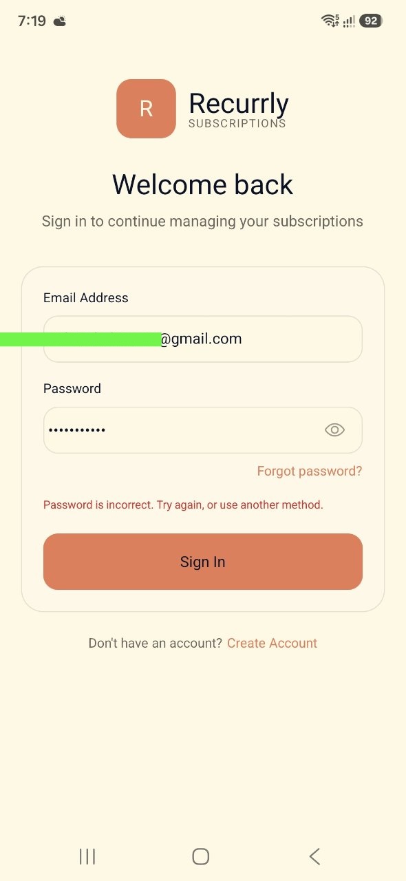
When we run the updated app in the simulator, we see the password input field now includes the eye icon toggle and we have added a 'Forgot password?' link. If an incorrect password is entered, Clerk returns an error: 'Password is incorrect. Try again, or use another method.'
Clicking 'Forgot password?' opens our password reset wizard. The first step prompts the user to enter their email address to receive a verification reset code.
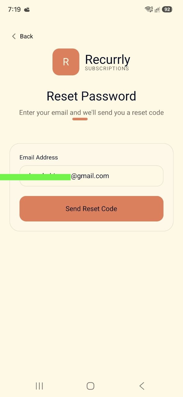
After sending the request, the user receives an OTP reset code on their email. The wizard advances to Step 2 ('Check Your Email'), where the user inputs the 6-digit verification code and clicks 'Verify Code'.
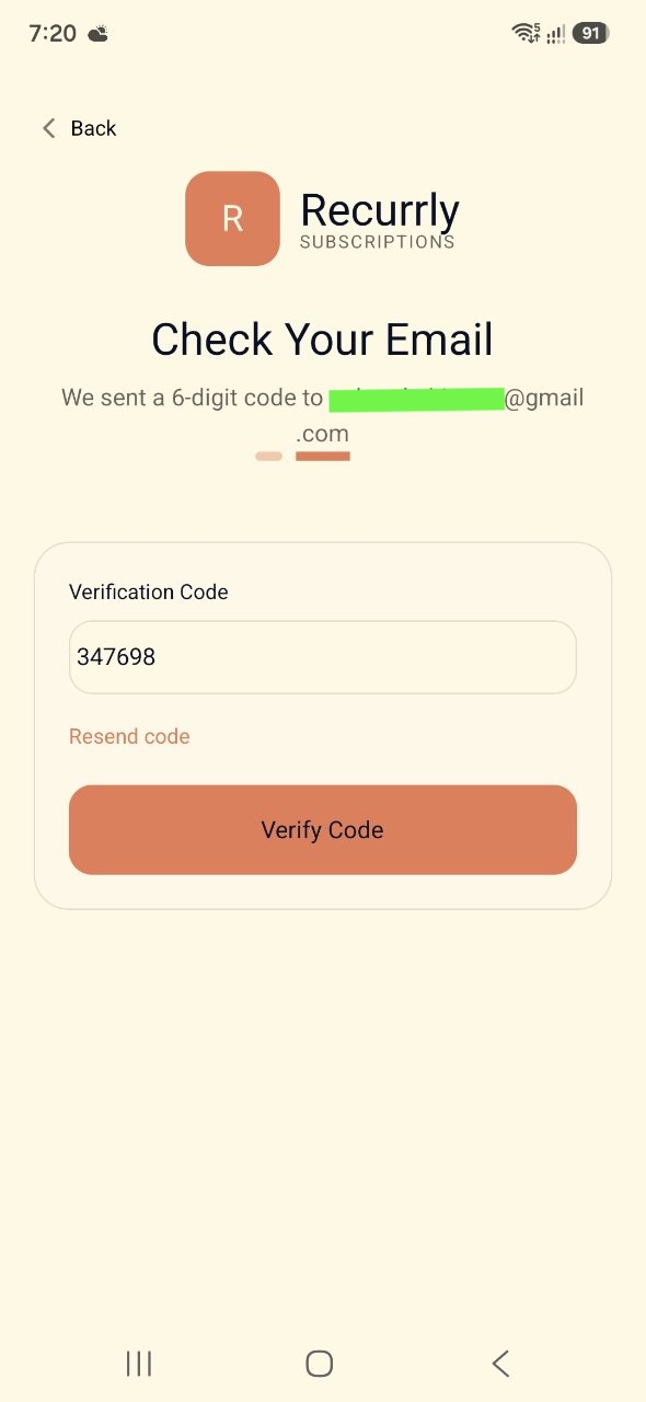
If the reset code matches, Step 3 ('New Password') is loaded. The user is prompted to enter a new password and confirm it, with eye icon visibility controls enabled for both input fields.
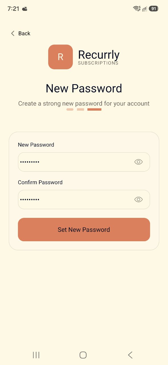
Once they tap 'Set New Password', the password is updated, their session becomes active, and they are logged straight into the Home Screen dashboard with their user details loaded in the header.
This completes the final part of the blog. You can find the code here. You can update the functionality of the app to complete the remaining screens and also add a backend to it.