Task Management System - 1
NextJS
In this post we will create a Task Management System using NextJS. This project and post have been inspired by this YouTube video.
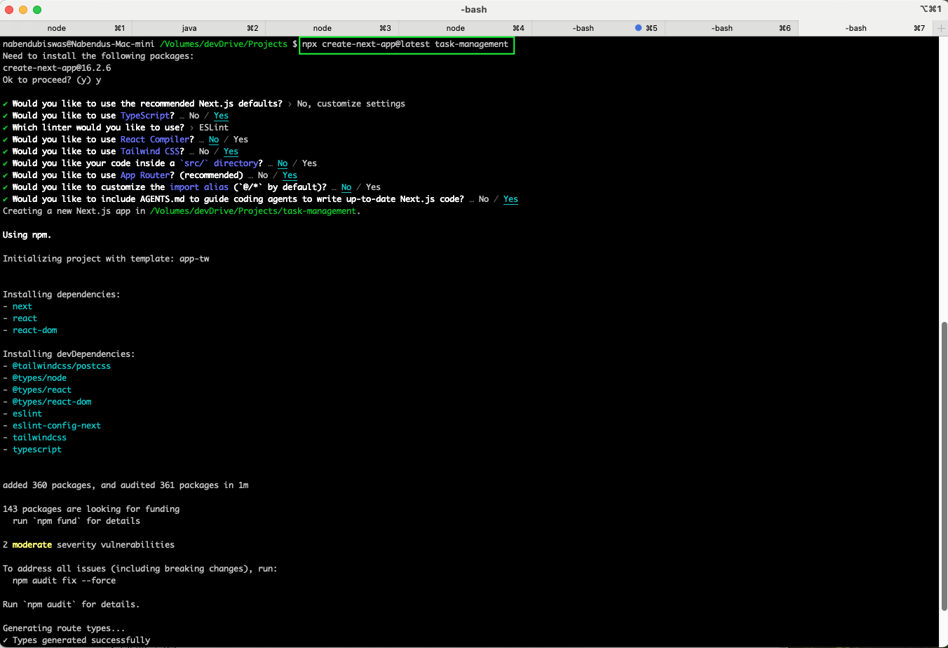
We start by creating a new Next.js project. Running npx create-next-app@latest task-management with custom settings: TypeScript, ESLint, Tailwind CSS, App Router, and the src/ directory.
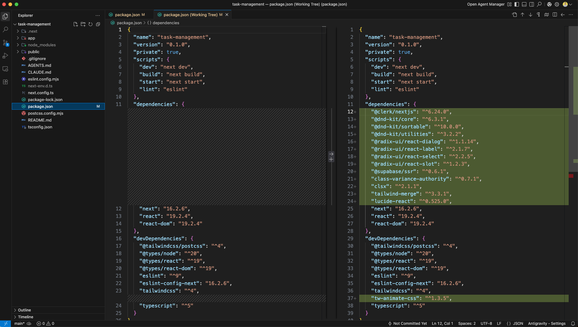
The project structure in VS Code shows the generated files and folders. The package.json includes dependencies for Next.js, React, TypeScript, Tailwind CSS, and ESLint. You need to add them manually to get the correct versions used in this project.
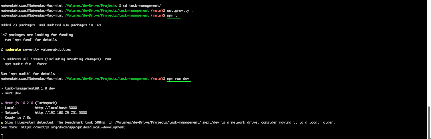
First run npm i to install all dependencies. Running npm run dev starts the Next.js development server on http://localhost:3000 using Turbopack.
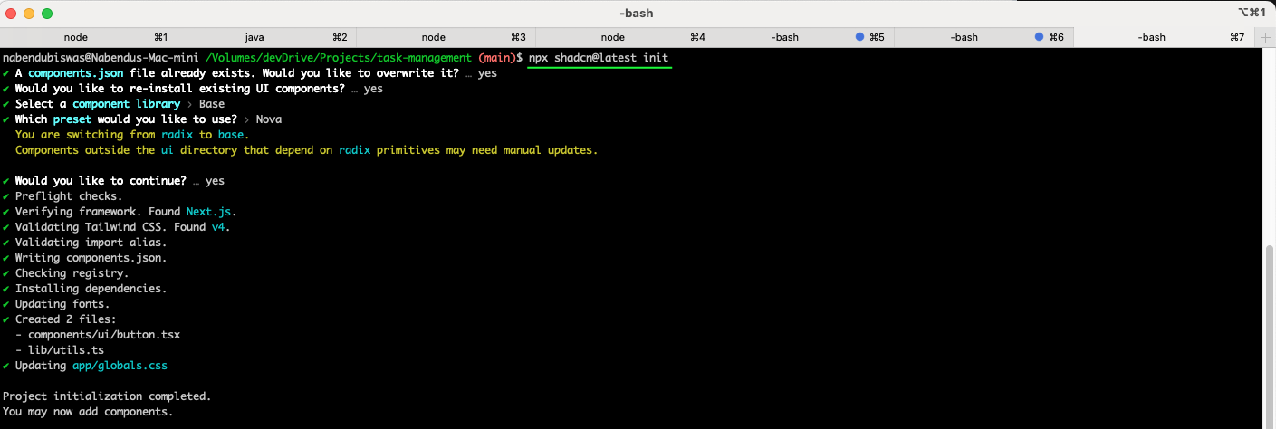
We run npx shadcn@latest init to set up shadcn/ui with the Base component library and Nova preset for UI components.
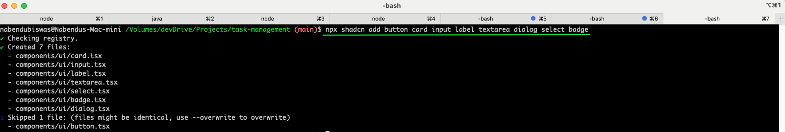
We install additional shadcn/ui components by running npx shadcn add button card input label textarea dialog select badge, which creates the component files in the components/ui directory.
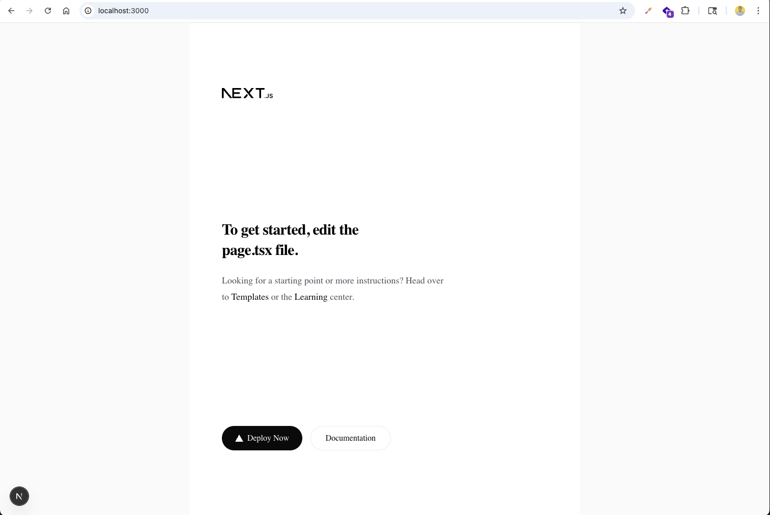
The default Next.js starter page appears at http://localhost:3000 before any customizations.
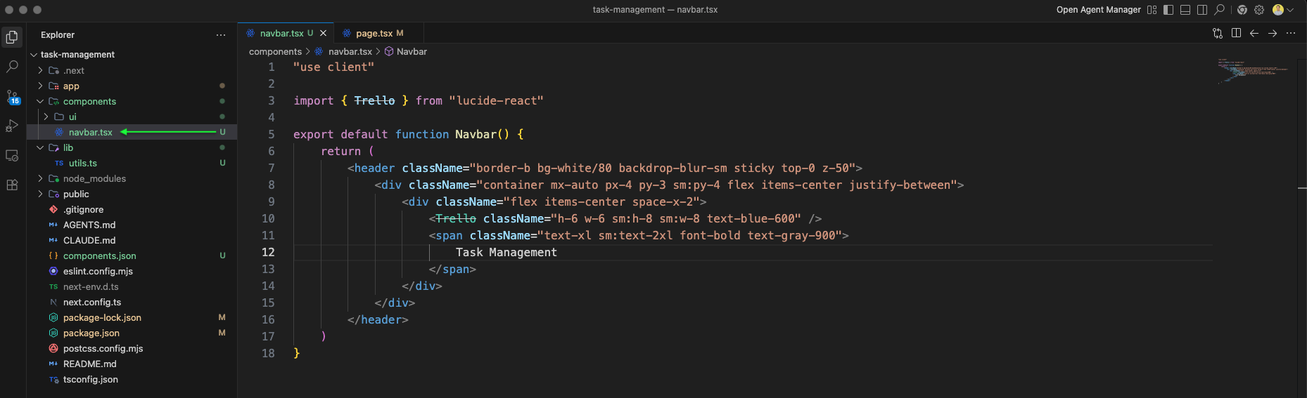
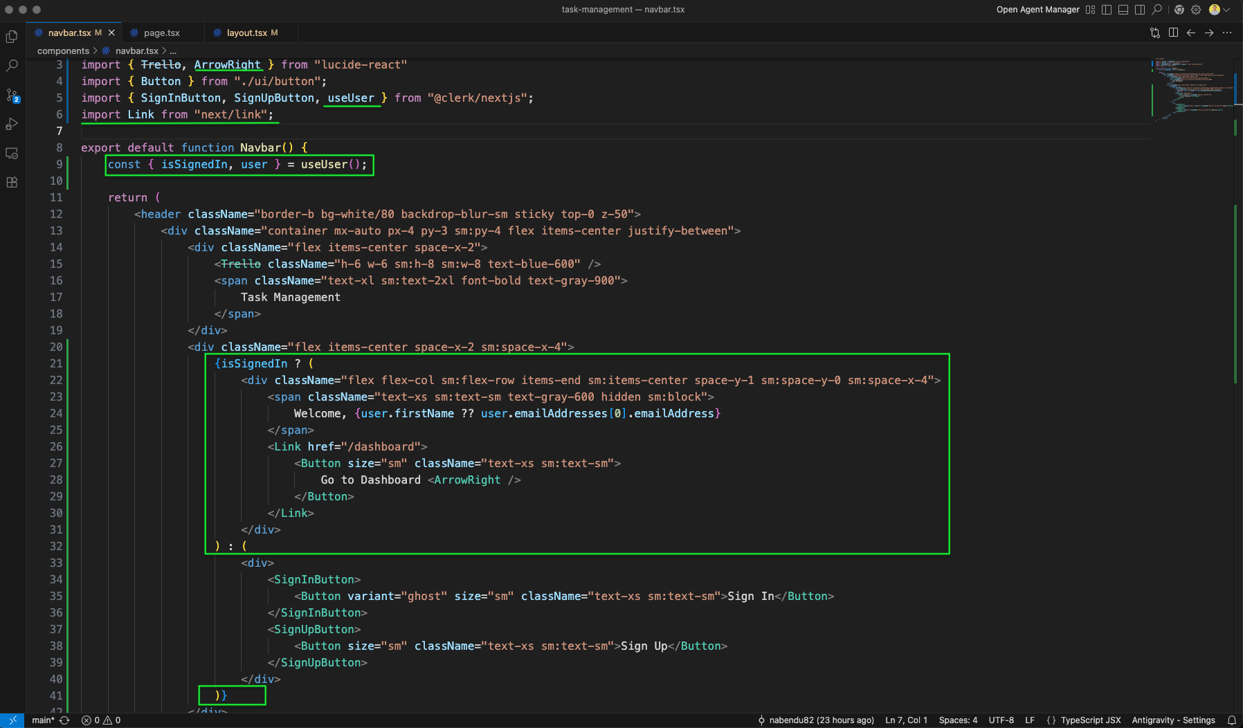
We create a Navbar component in components/navbar.tsx. It uses a Trello icon from lucide-react and displays "Task Management" in bold text within a sticky header with backdrop blur.
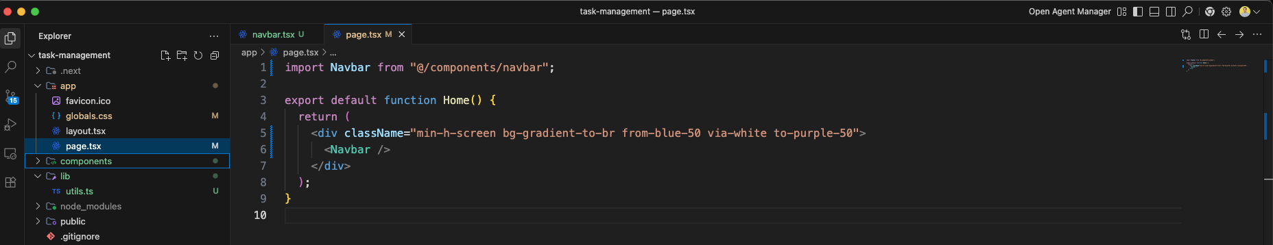
The page.tsx imports the Navbar component and wraps it in a full-height div with a gradient background from blue via white to purple.
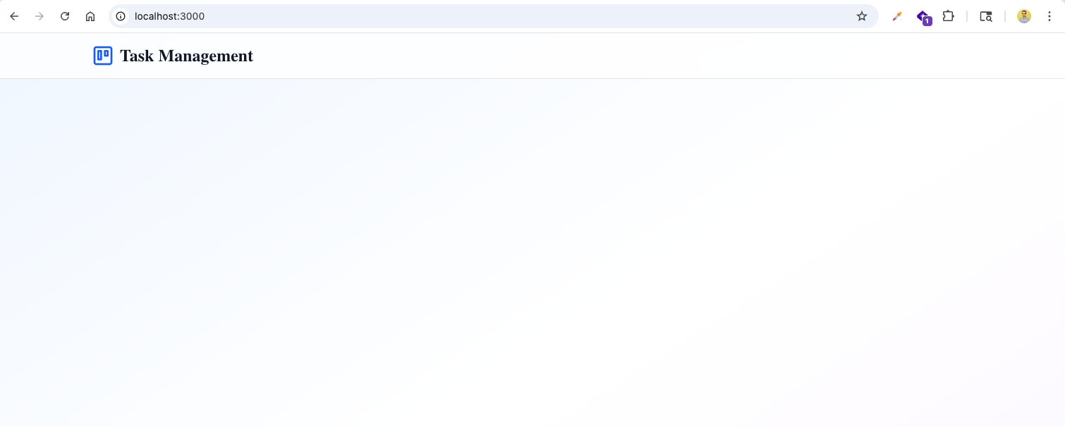
The app now shows the Task Management header with the gradient background at http://localhost:3000.
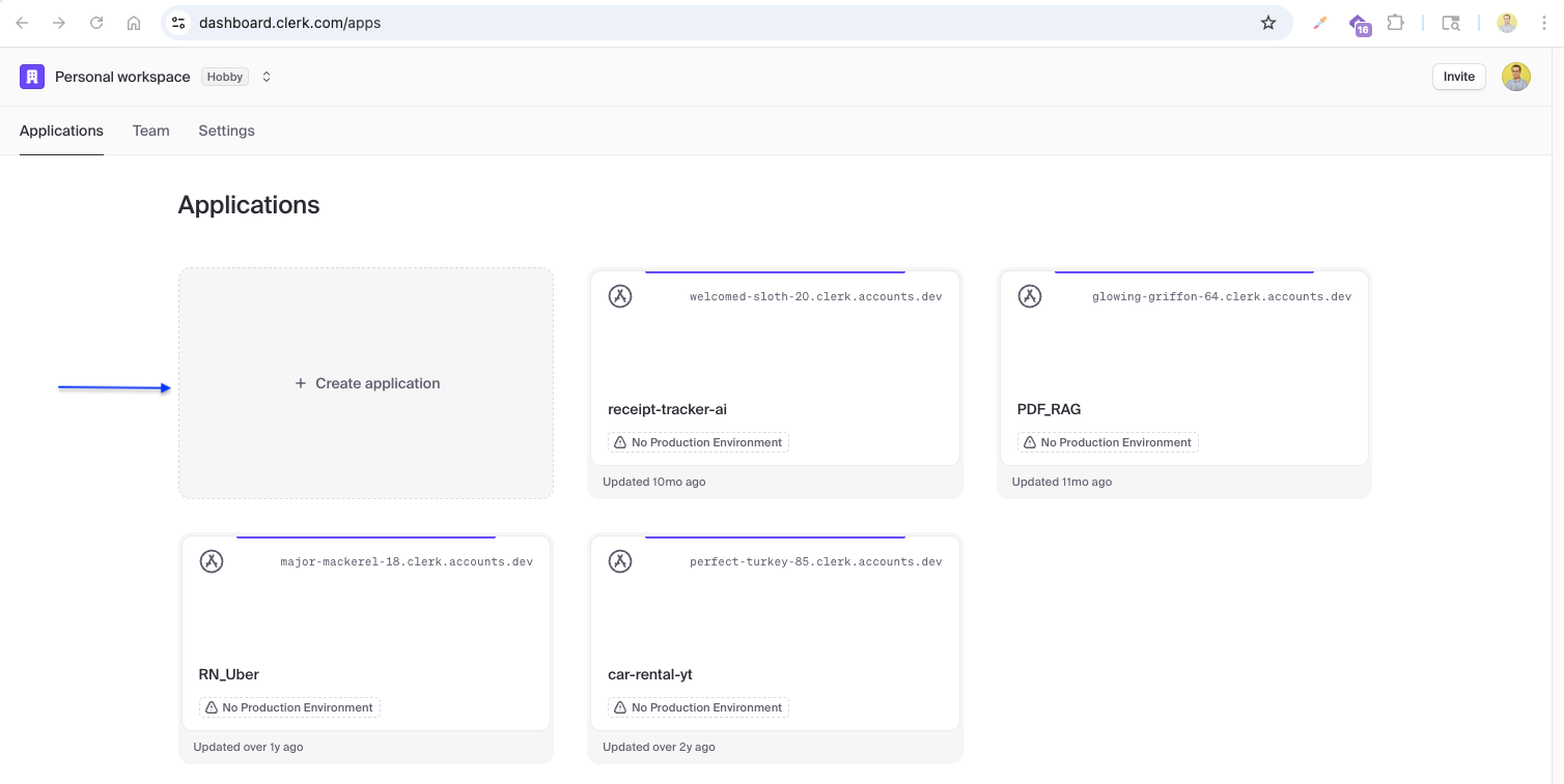
We set up authentication with Clerk. The Clerk dashboard shows existing applications where we can manage authentication for our projects. Her click on Create application
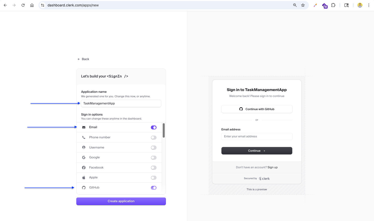
We create a new Clerk application named TaskManagementApp with email and GitHub sign-in options enabled.
The Clerk quickstart guide provides instructions to install @clerk/nextjs and copy the publishable and secret API keys.
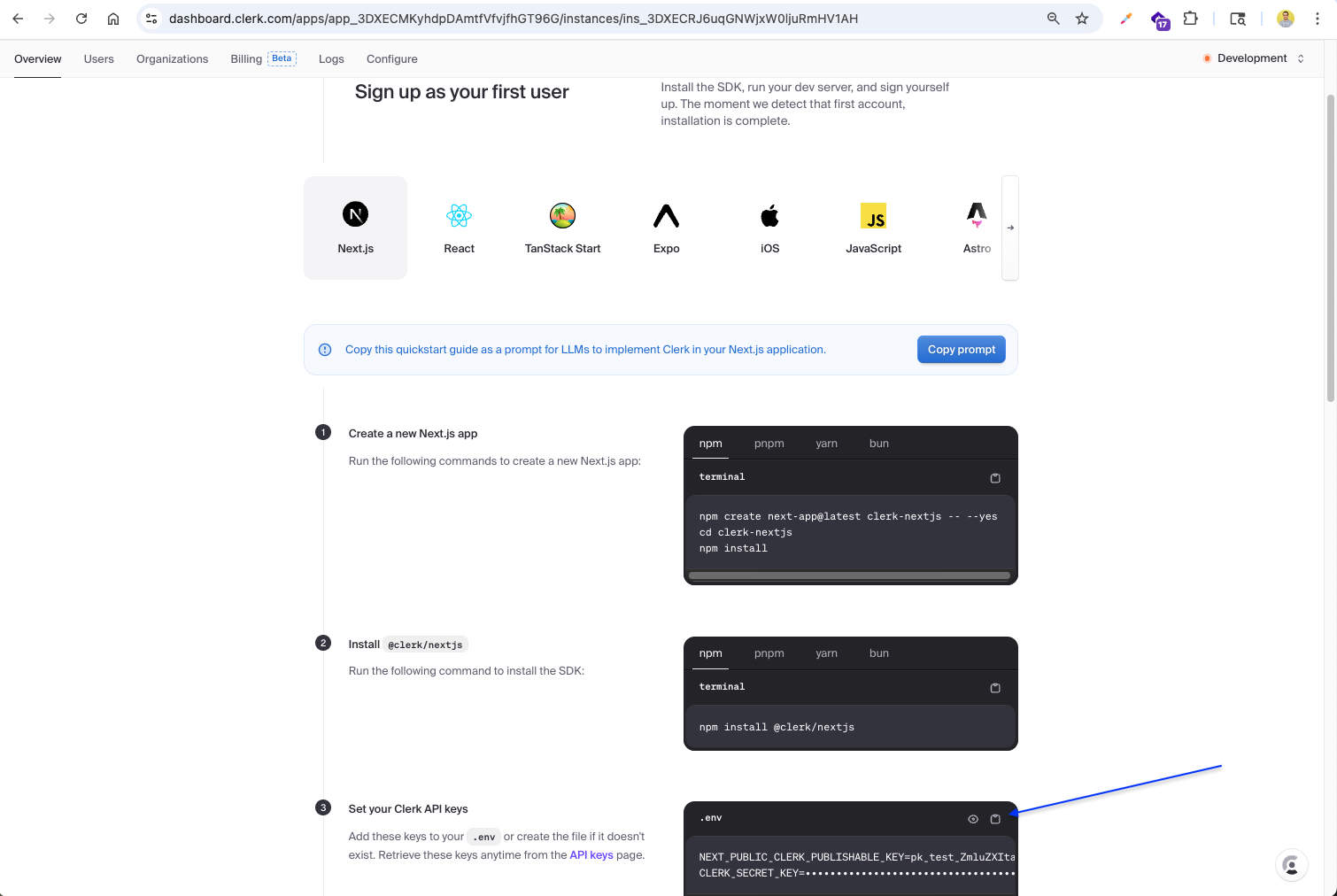
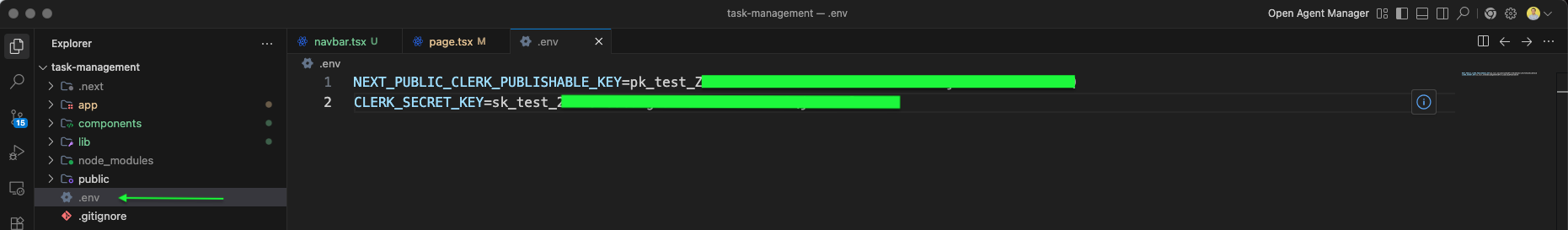
The API keys are added to the .env file: NEXT_PUBLIC_CLERK_PUBLISHABLE_KEY and CLERK_SECRET_KEY for authentication.
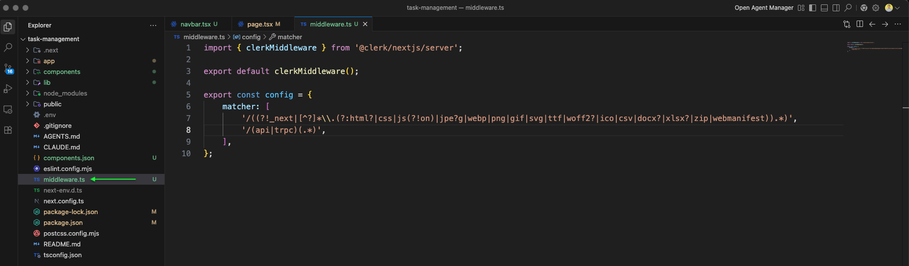
We create middleware.ts that exports the clerkMiddleware function with a matcher config to protect routes, excluding static files and API routes.
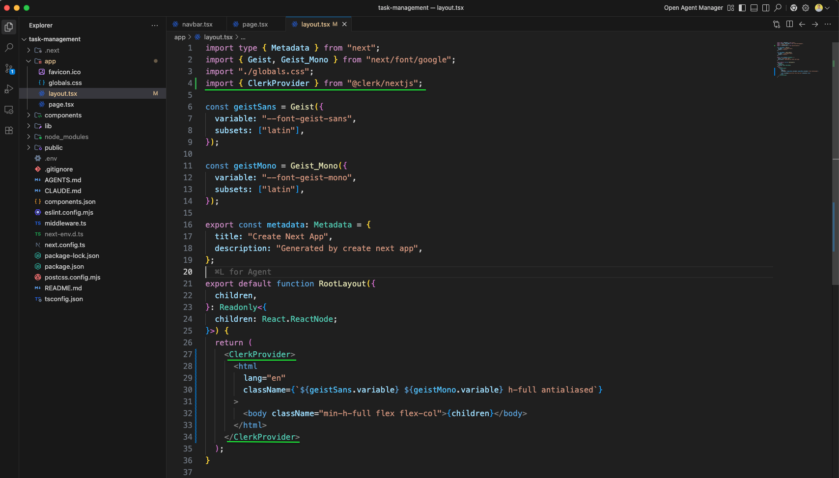
layout.tsx is updated with ClerkProvider wrapping the entire app, making authentication available to all pages. The Geist font is configured and the body uses a flex column layout.
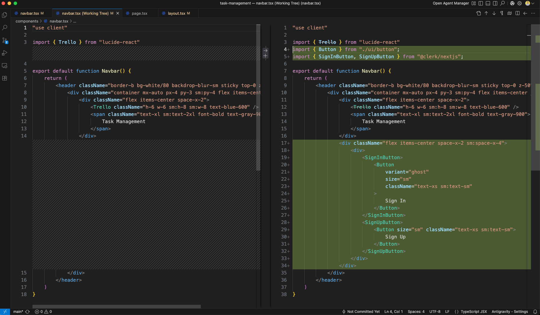
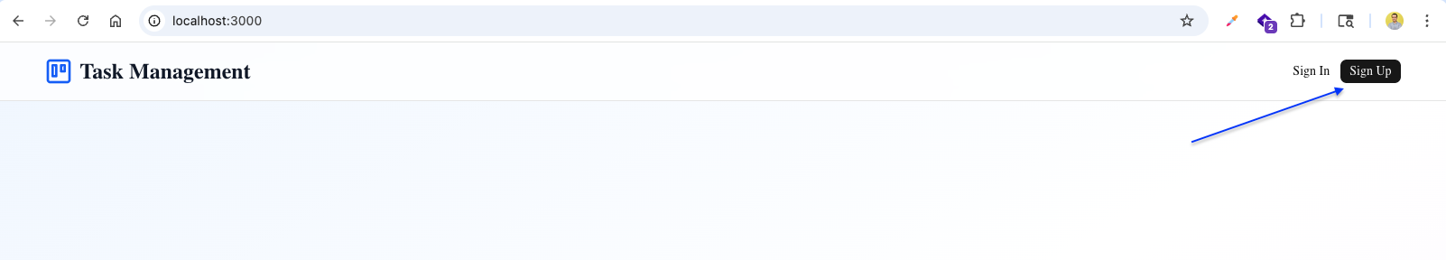
The Navbar component is updated to include SignInButton and SignUpButton from Clerk, wrapped in shadcn/ui Button components for authentication actions.
The app now shows the Sign In and Sign Up buttons in the navbar at http://localhost:3000.
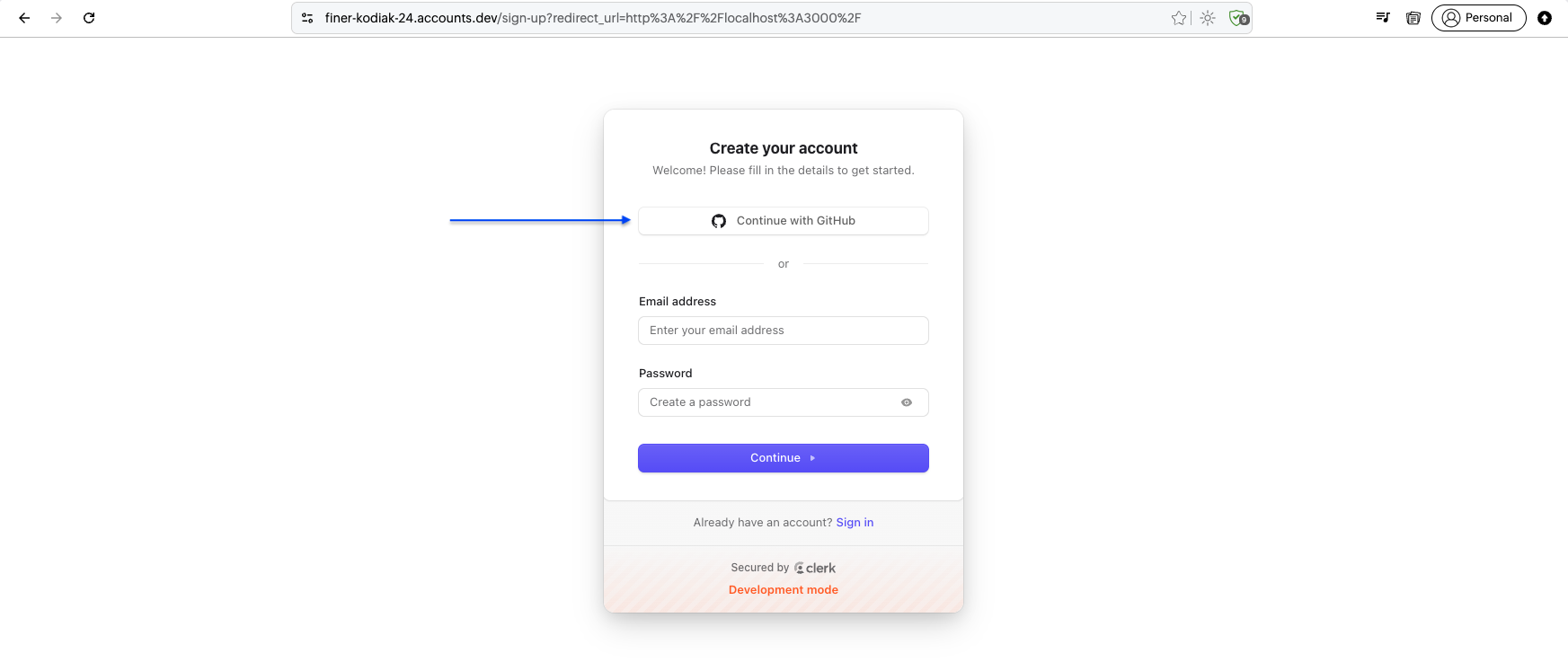
Clicking Sign Up opens the Clerk-hosted sign-up page with options for GitHub OAuth or email/password registration.
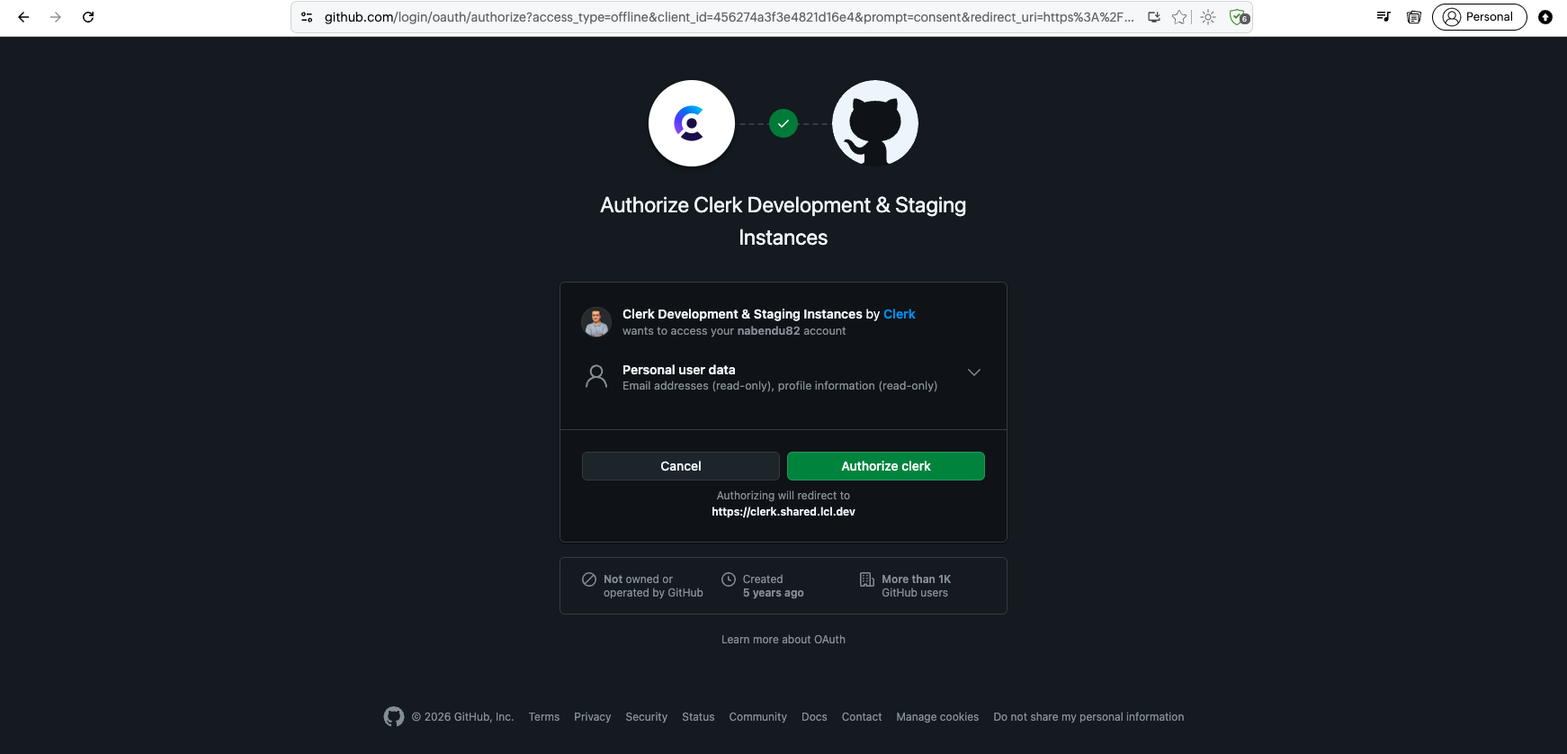
Choosing GitHub OAuth redirects to the GitHub authorization page for Clerk Development & Staging Instances to access profile and email data.
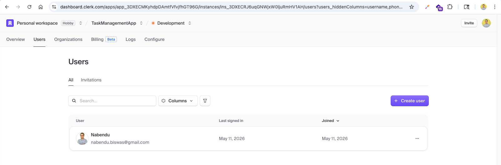
After authentication, the Clerk dashboard shows the registered user (Nabendu) with their email, last signed-in time, and join date in the development environment.
We update the Navbar component to show signed-in user state. It imports useUser from Clerk, checks isSignedIn, and displays a welcome message with the user's first name and a Go to Dashboard link button when signed in, or Sign In/Sign Up buttons when not.
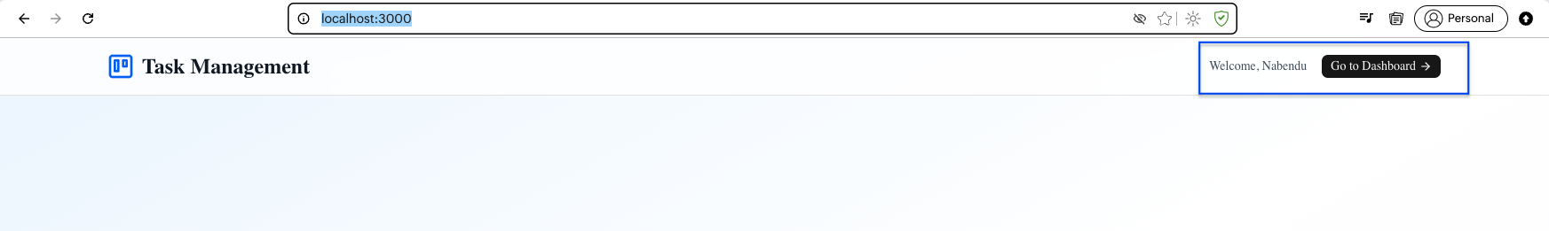
After signing in, the app shows "Welcome, Nabendu" in the navbar with a Go to Dashboard button containing an arrow icon, navigating to the protected dashboard route.
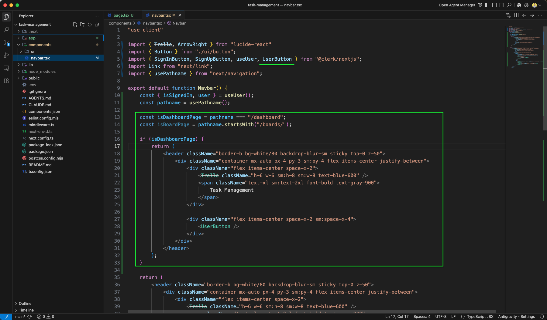
The Navbar component is further updated to conditionally render different layouts. It now imports UserButton and usePathname, checks if the current page is /dashboard or /boards/:id, and shows only the UserButton on those pages instead of the full nav.
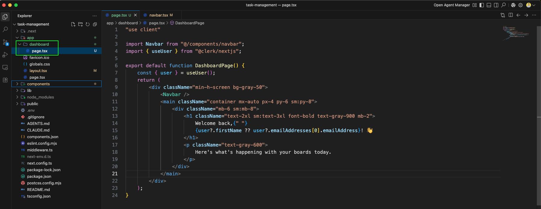
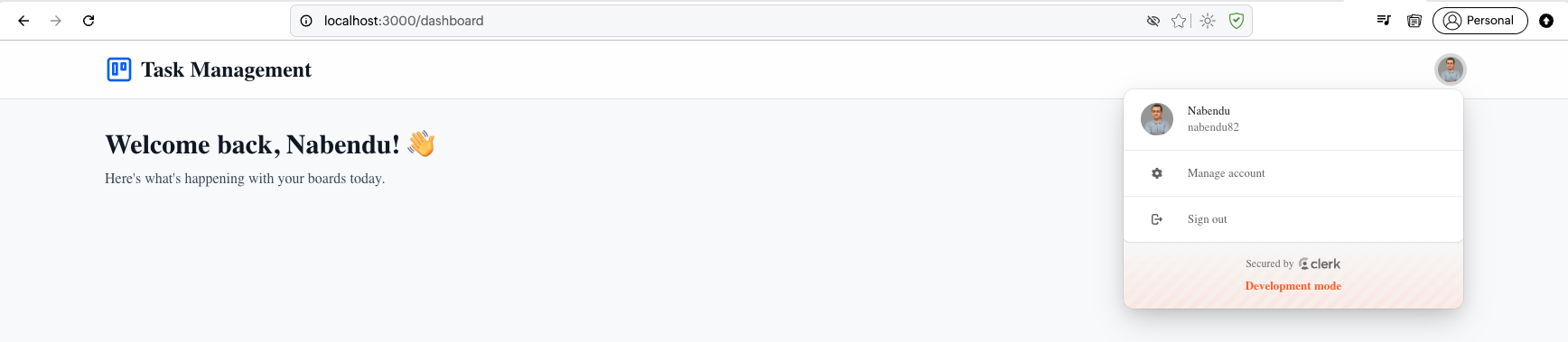
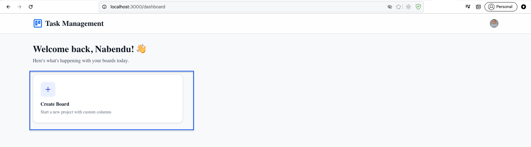
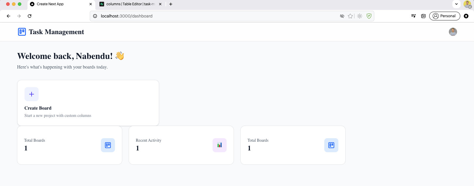
We create the DashboardPage in app/dashboard/page.tsx. It imports useUser and renders a welcome message using user.firstName with a "Here's what's happening with your boards today" subtitle, wrapped in the Navbar and a gray background container.
The dashboard page at http://localhost:3000/dashboard shows "Welcome back, Nabendu!" with a description, and the navbar now displays the UserButton dropdown with the user's avatar and sign-out option.
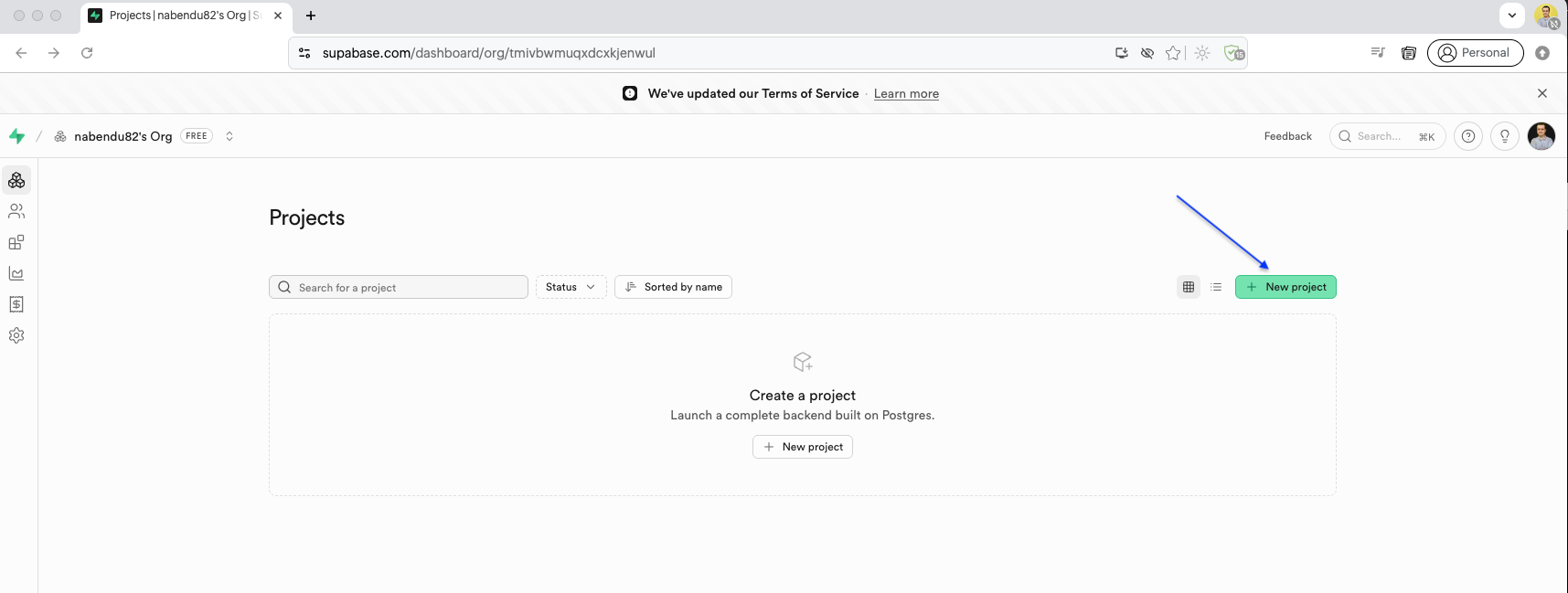
Now we set up the database with Supabase. The Supabase dashboard shows the Projects page where we can create a new project for our task management app.
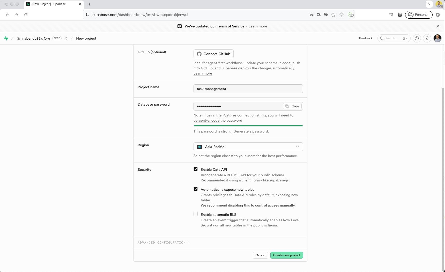
We create a new Supabase project named task-management with a database password, region set to Asia-Pacific, and Data API enabled for RESTful access.
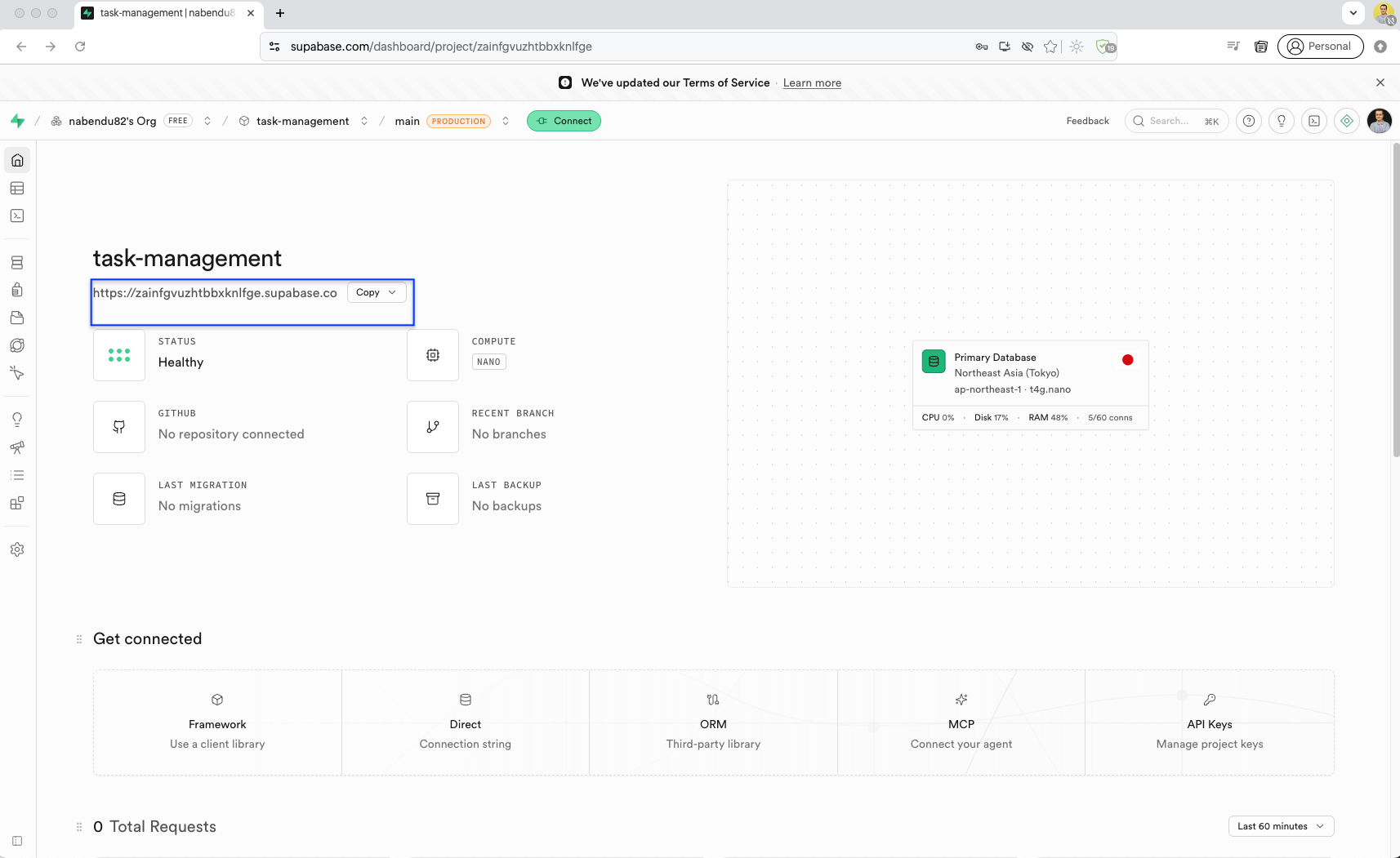
The Supabase project dashboard shows the project overview with the connection string, compute status (Healthy), region (Northeast Asia / Tokyo), and resource usage metrics. Here copy the url.
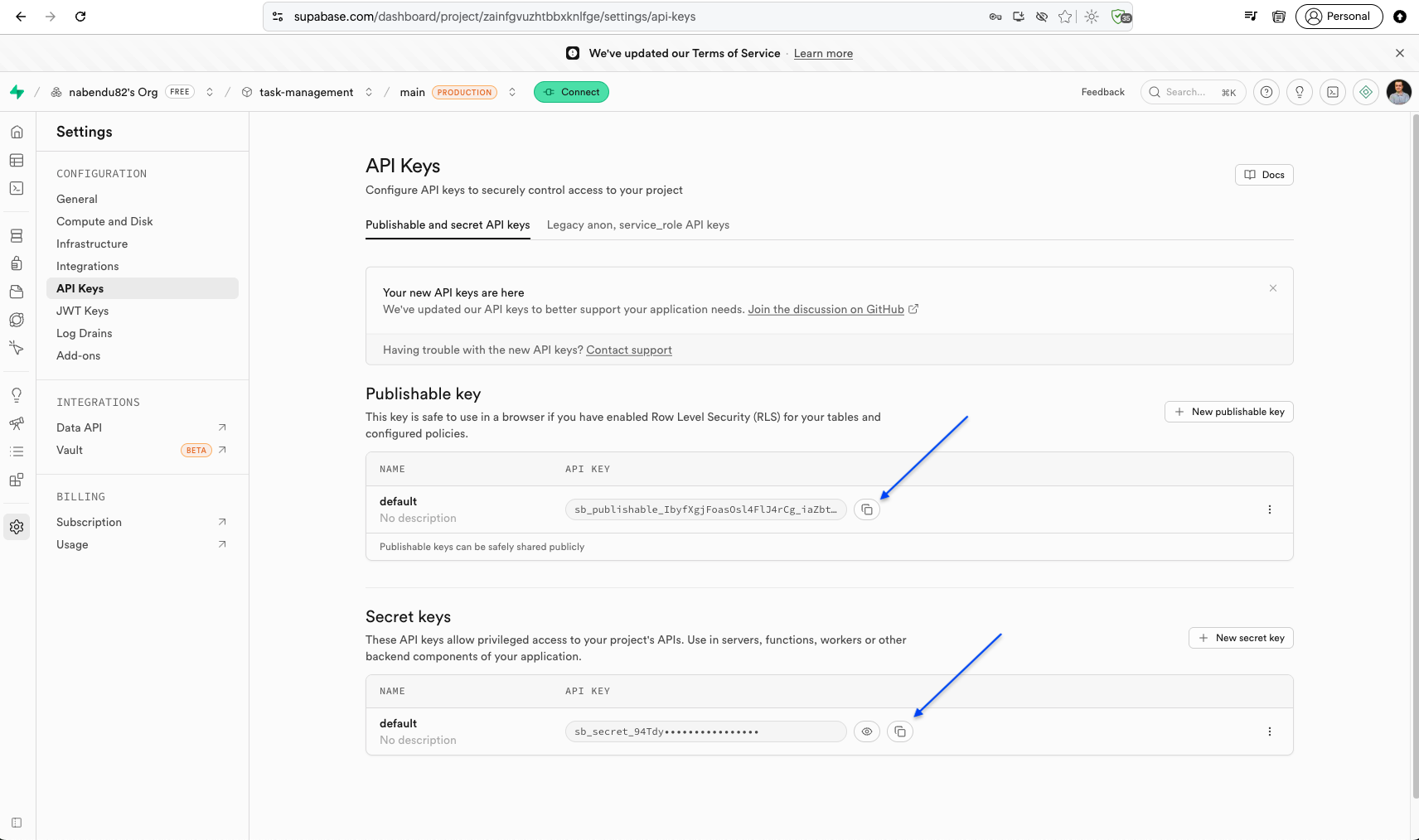
In the API Keys settings page, we find the Publishable key and Secret key needed to connect our Next.js app to Supabase.
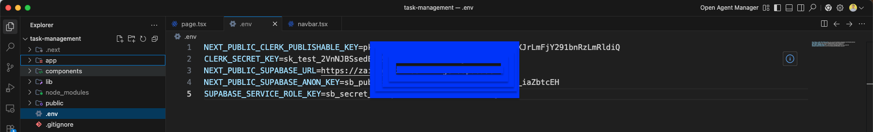
The .env file is updated with Supabase credentials: NEXT_PUBLIC_SUPABASE_URL, NEXT_PUBLIC_SUPABASE_ANON_KEY, and SUPABASE_SERVICE_ROLE_KEY alongside the existing Clerk keys.
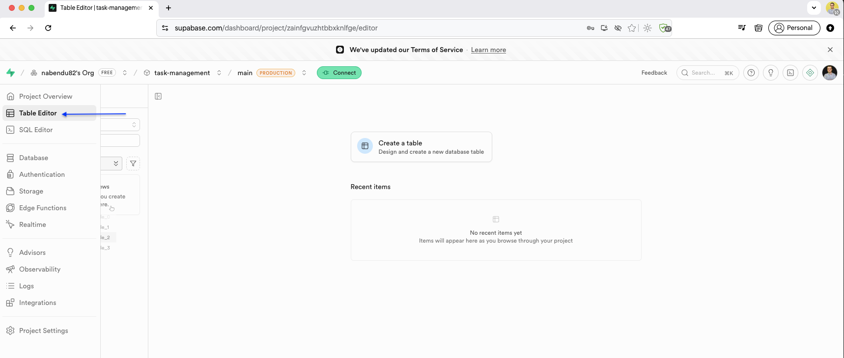
The Supabase Table Editor shows the interface for creating database tables. We can design tables with columns, set primary keys, and configure Row Level Security.
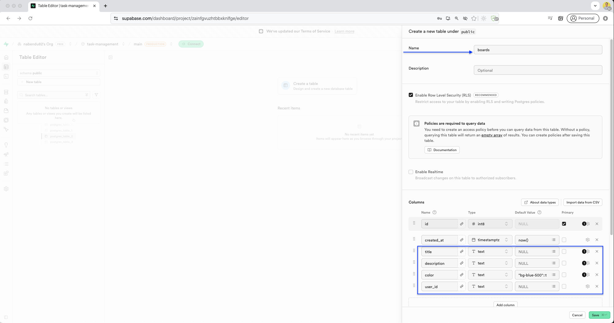
We create the boards table with columns: id (int8, primary key), created_at (timestamptz), title (text), description (text), color (text, default "bg-blue-500"), and user_id (text). Row Level Security (RLS) is enabled.
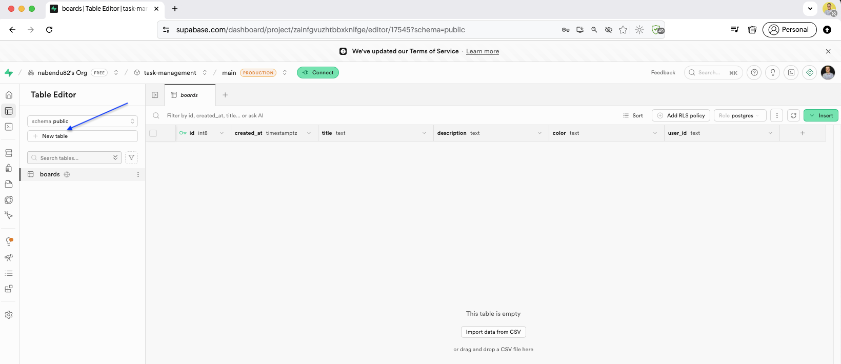
After creating the boards table, the Table Editor shows the empty table with all columns but no data yet. Here click on New table button.
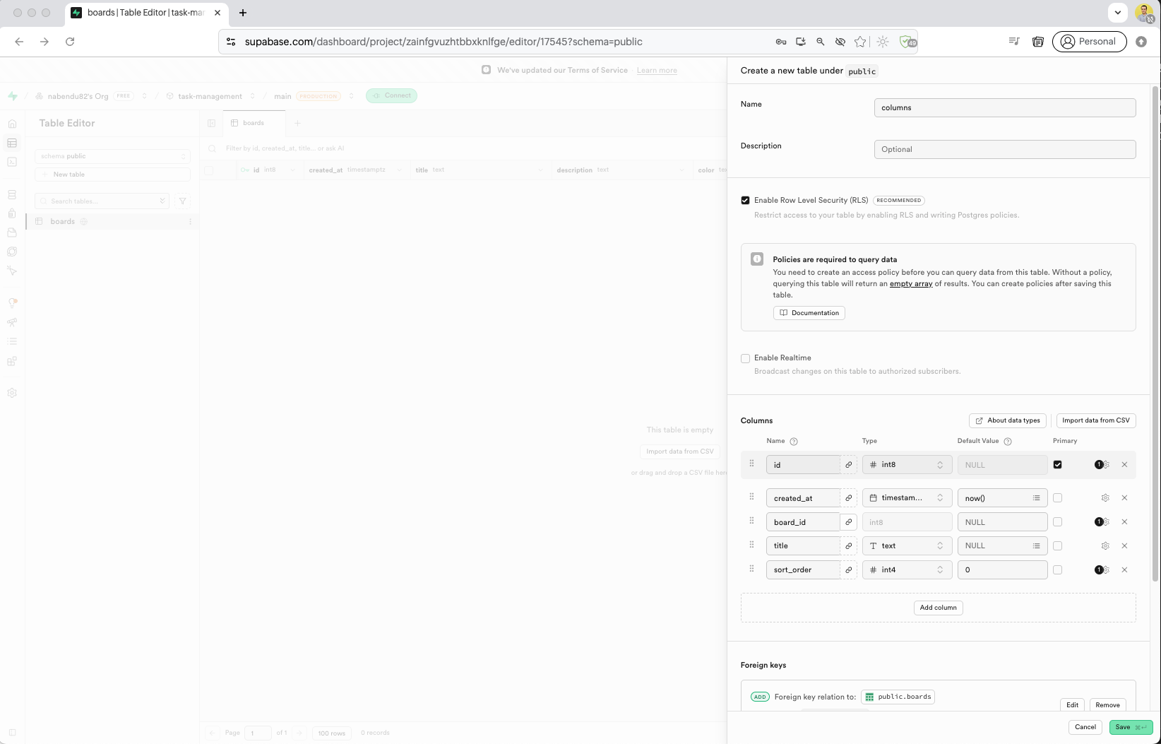
We create the columns table (for board columns/lists). It has board_id as a foreign key referencing boards.id, title (text), and sort_order (int4). The foreign key relationship is configured with Cascade on delete.
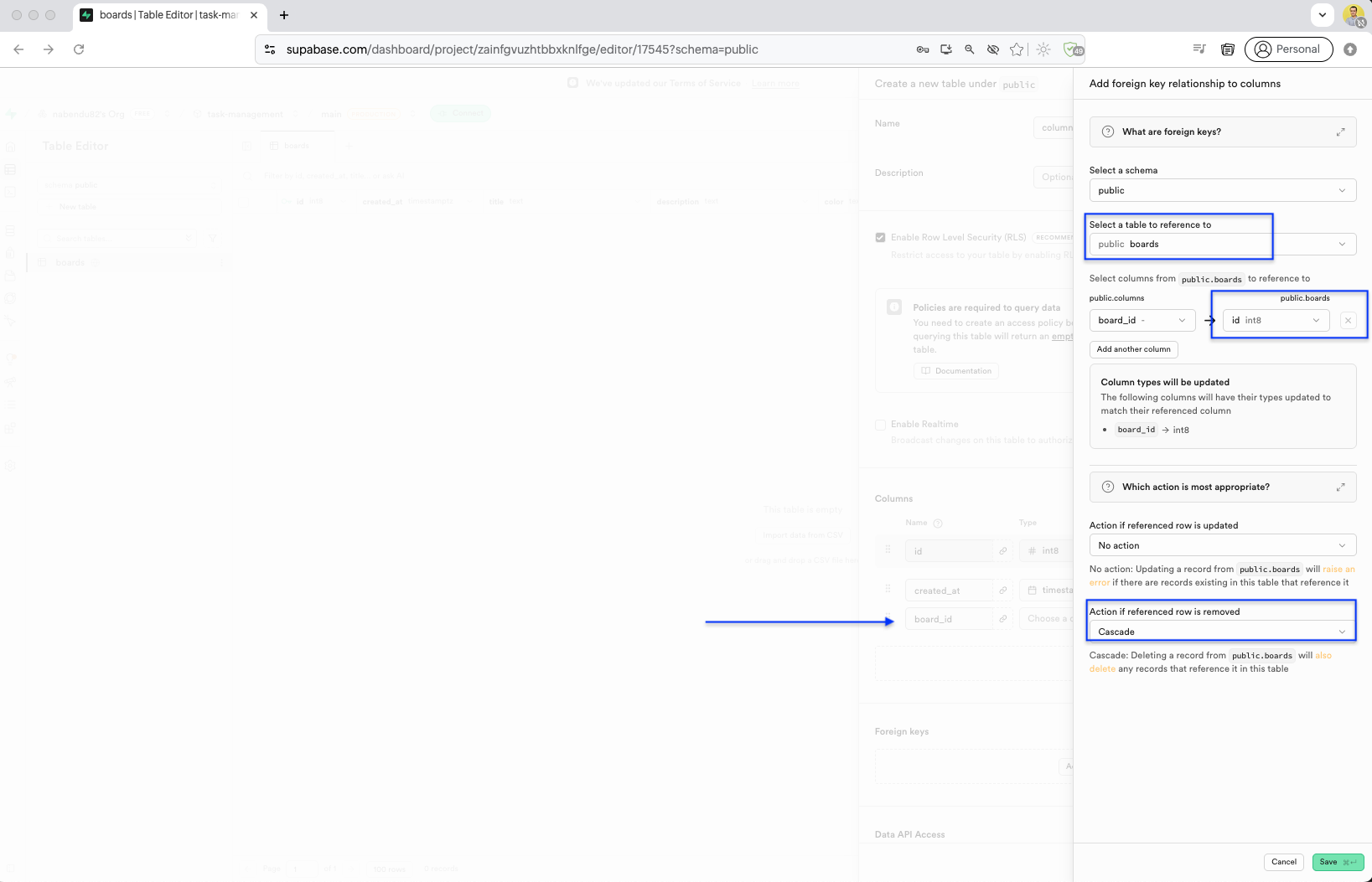
The columns table is created with a foreign key relation to public.boards. The board_id column references boards.id, and the action on referenced row removal is set to Cascade.
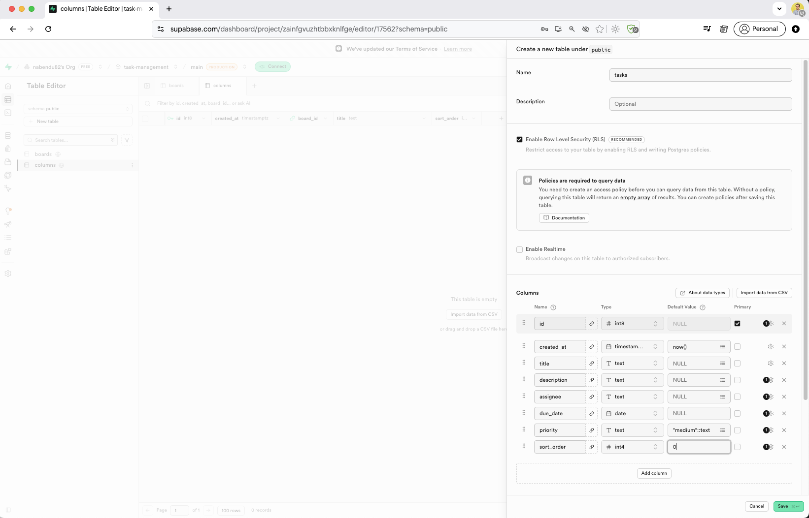
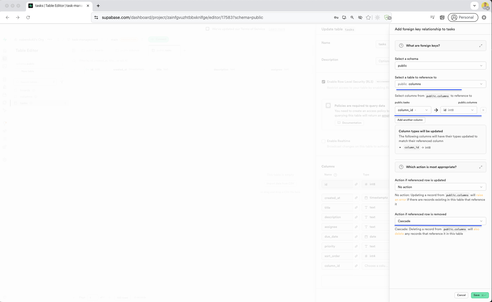
We create the tasks table with columns: id (int8, primary key), created_at (timestamptz), board_id (int8, FK to boards), title (text), sort_order (int8).
Now, we need to add RLS policies and for this we have opened SQL Editor.Here, we will first create rules for boards table. Click on Run to add these rules.
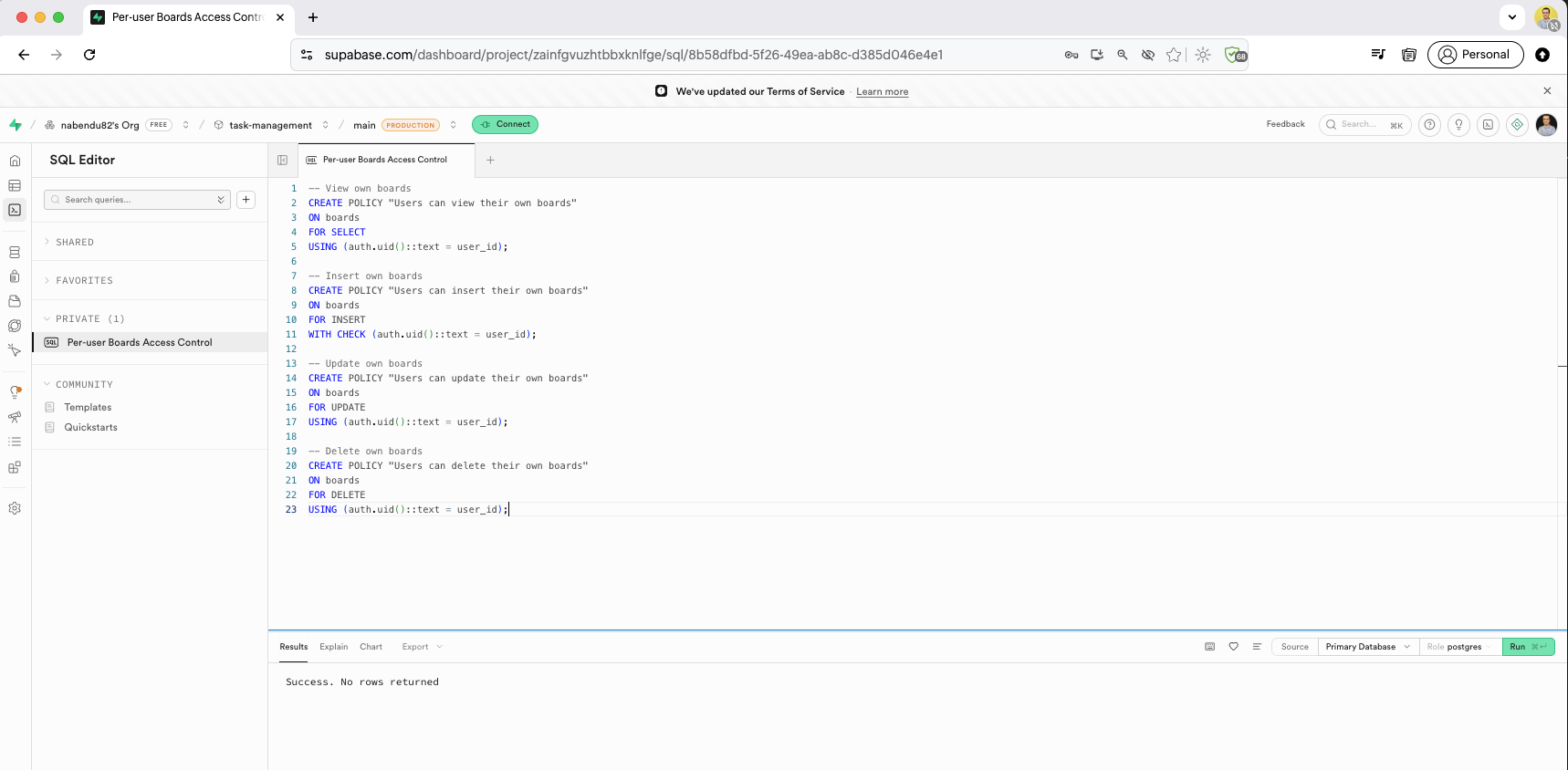
RLS policies are now created for the columns table: "Users can view their own boards", "Users can insert their own boards", "Users can update their own boards", and "Users can delete their own boards" — all using auth.uid()::text = user_id to restrict access.
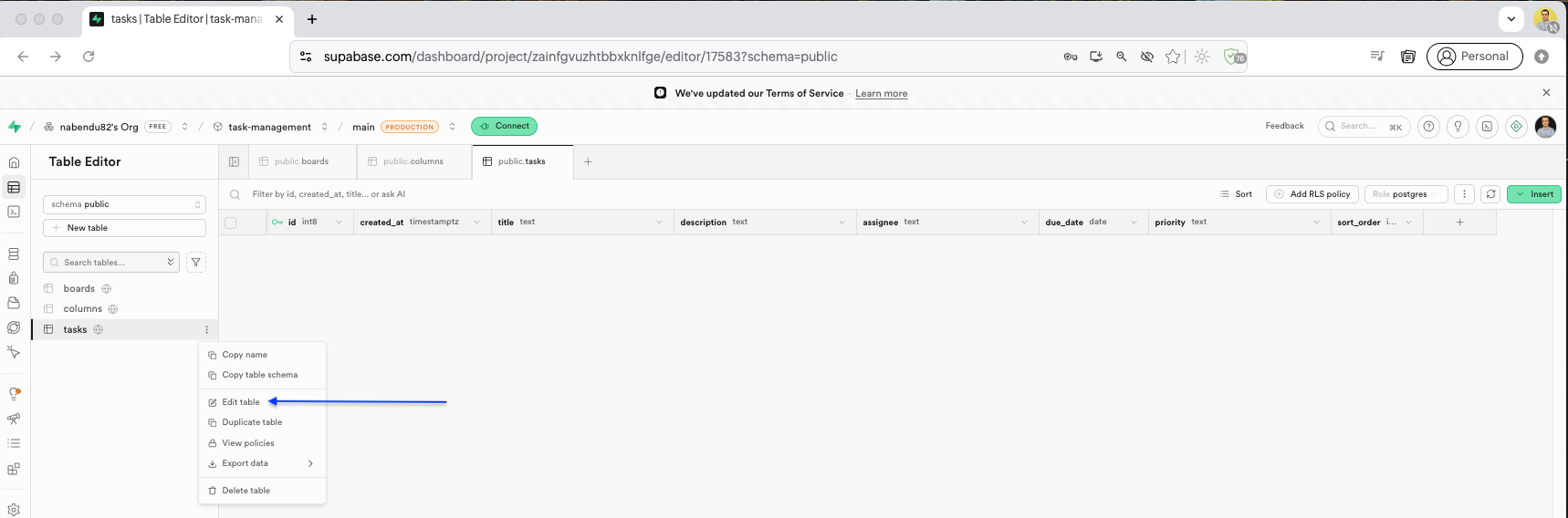
Now, go back to the Table Editor and edit the tasks table.
Here, a foreign key relationship was added to reference the columns table.
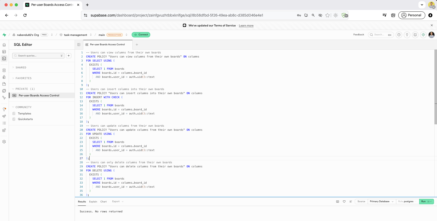
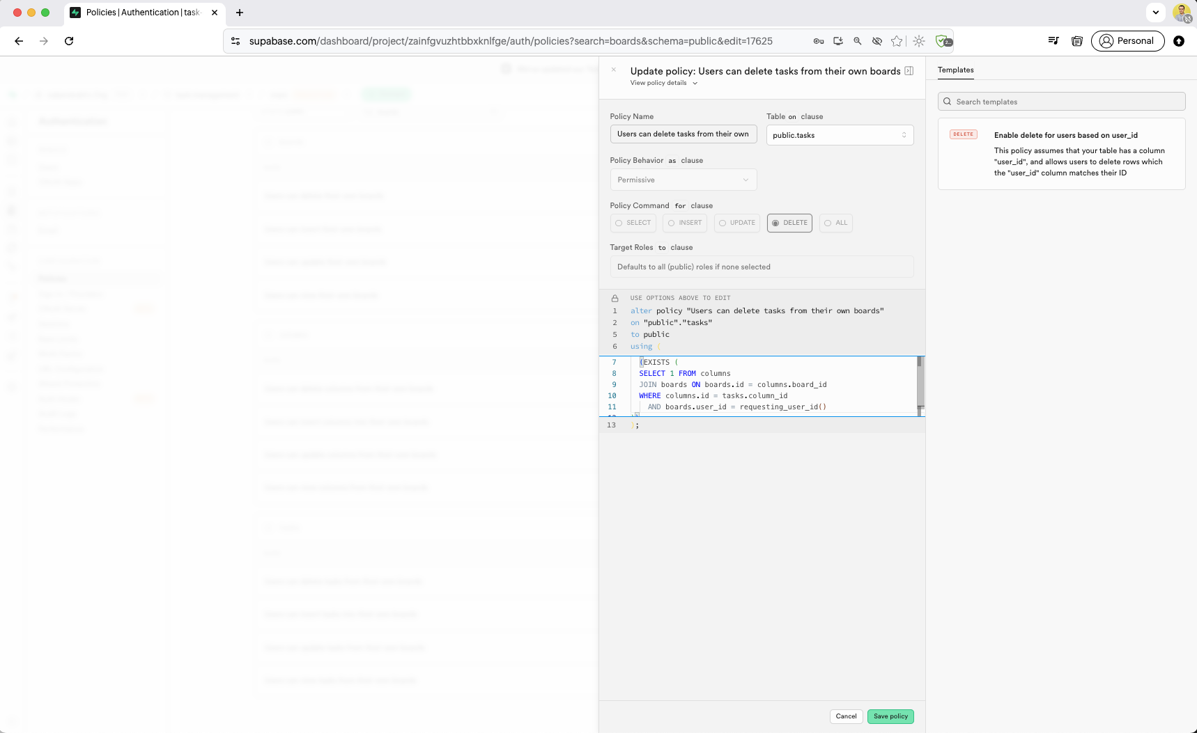
Now we create RLS policies for the tasks table. The SQL policies use JOIN queries: "Users can view tasks from their own boards" checks through columns to boards, "Users can insert tasks into their own boards" verifies the column belongs to the user's board, and "Users can update tasks from their own boards" ensures only the board owner can modify tasks.
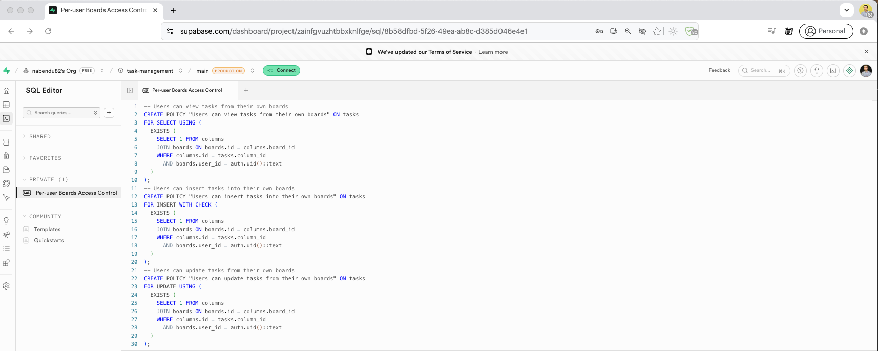
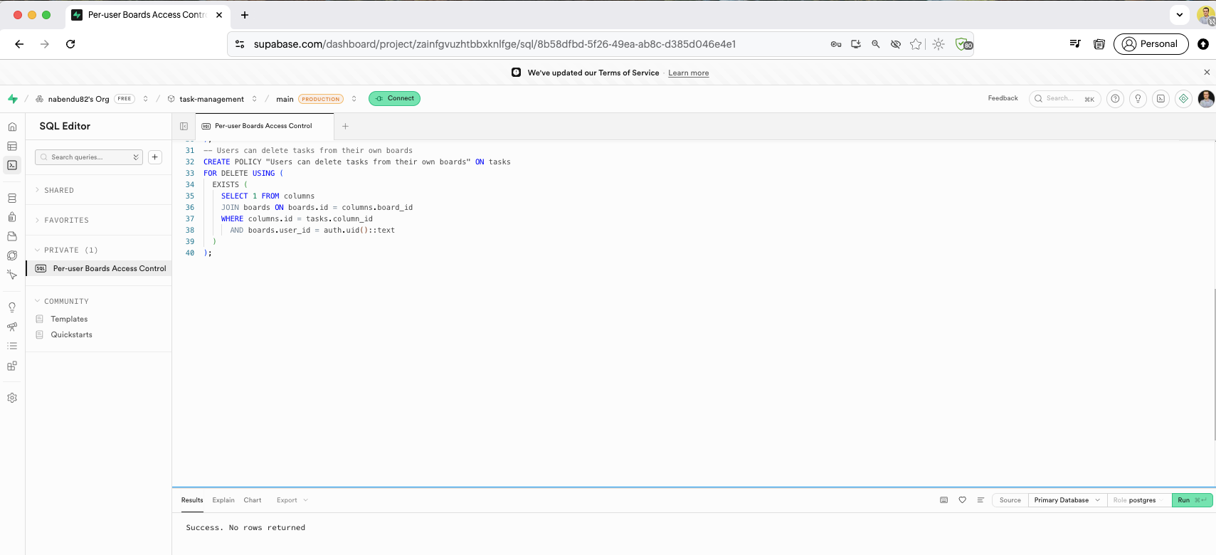
The final policy for tasks is "Users can delete tasks from their own boards", completing the RLS setup. The SQL Editor shows all policies executing with "Success. No rows returned" for each one.
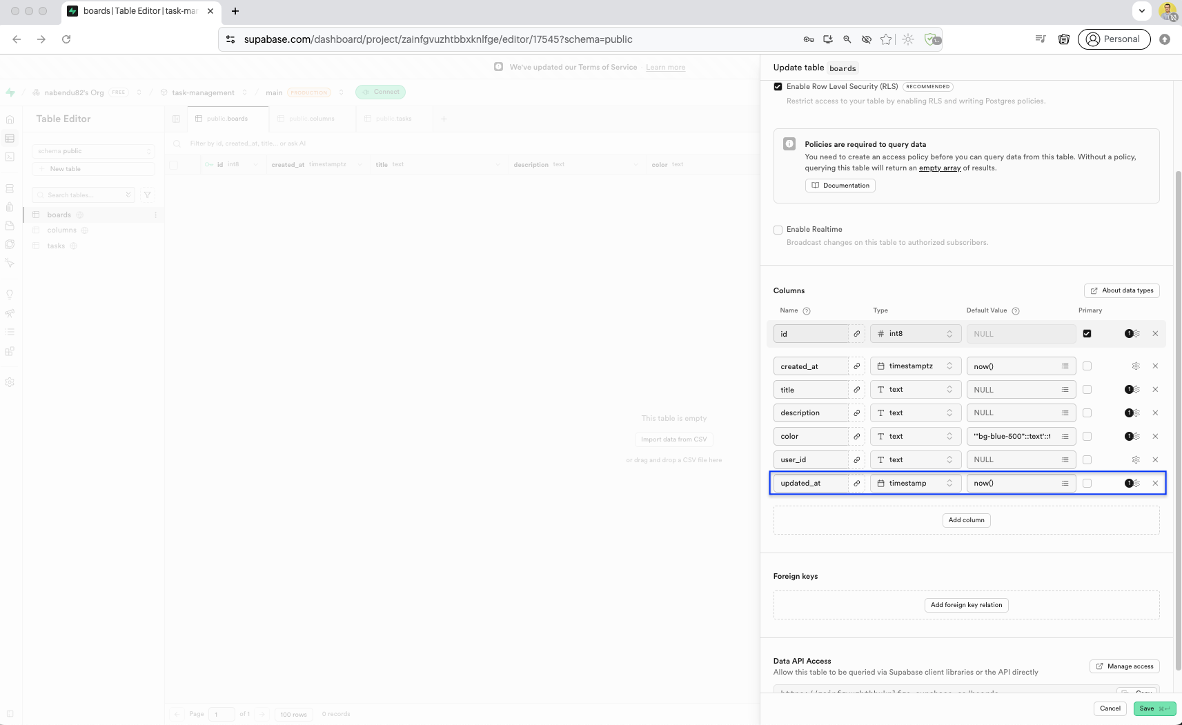
Back in the Table Editor, in the boards table we have added updated_at, which we missed earlier.
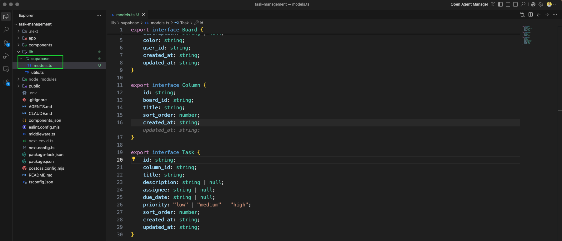
We create the supabase lib folder with models.ts file defining TypeScript types for Board and Column interfaces. This provides type-safe database access in our Next.js app.
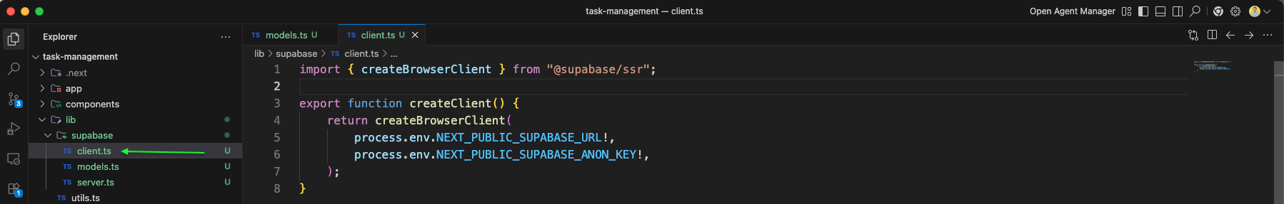
The client.ts file creates a Supabase browser client using createBrowserClient from @supabase/ssr, passing the URL and anon key from environment variables.
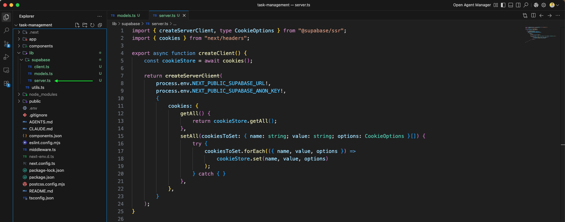
The server.ts file creates a Supabase server client using createServerClient from @supabase/ssr, with cookie handling via getAll and setAll methods for SSR authentication.
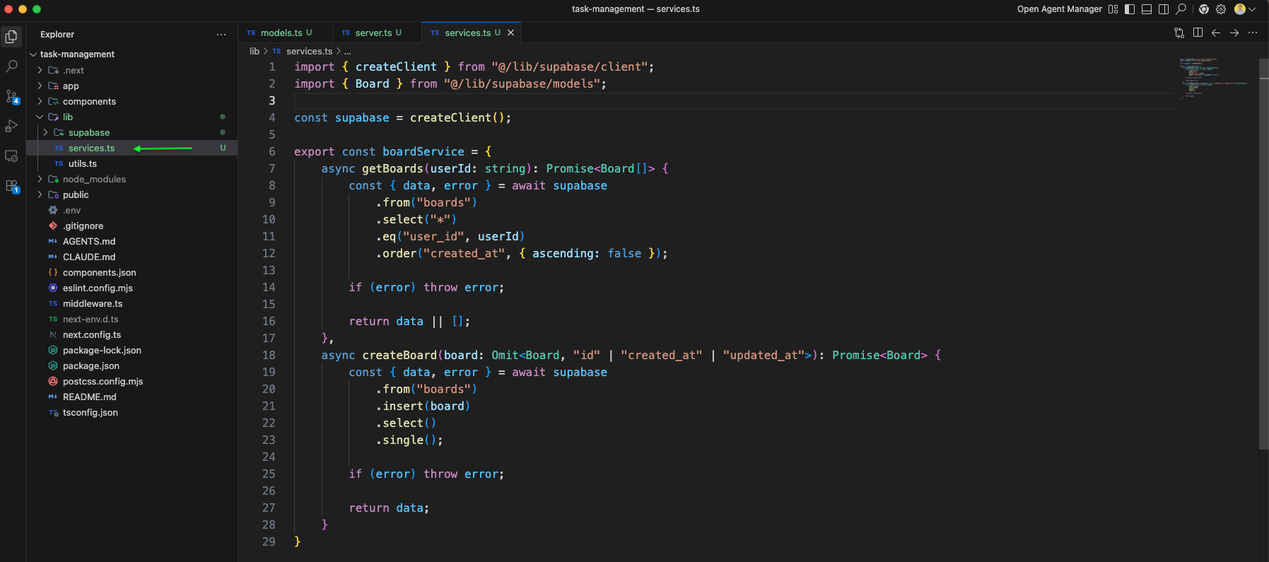
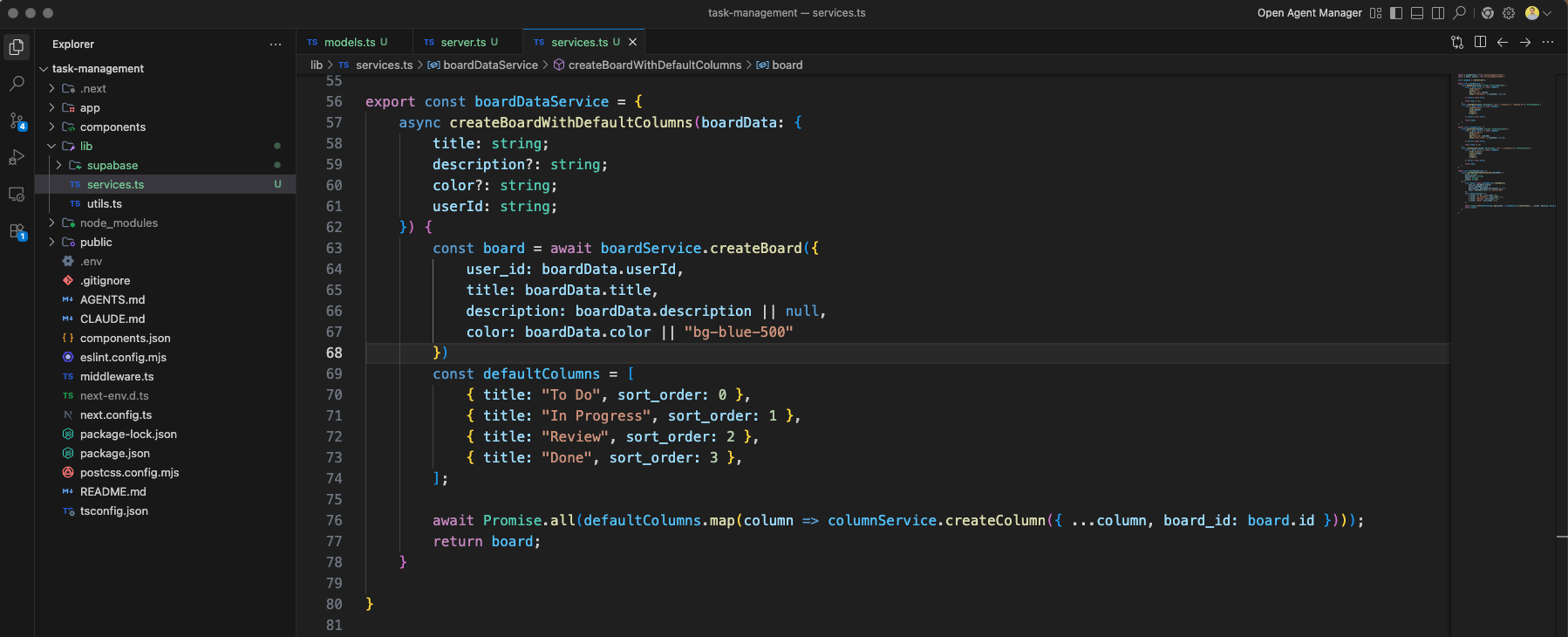
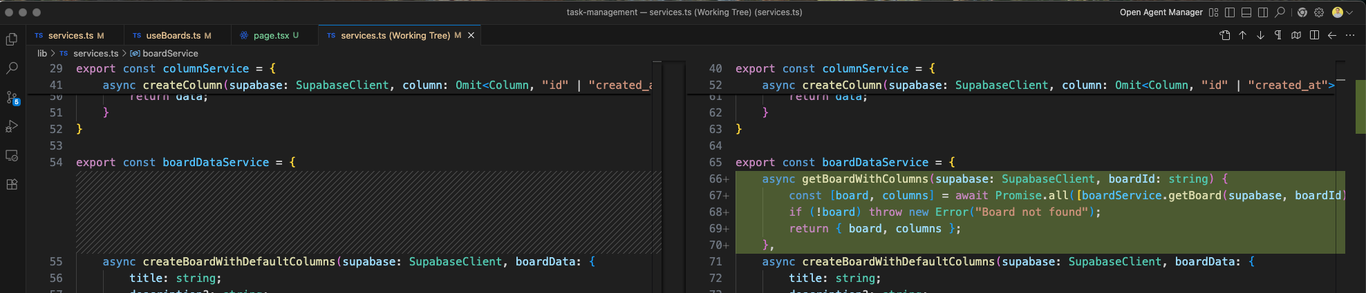
We create the services.ts file in the supabase lib folder to organize our database service functions.
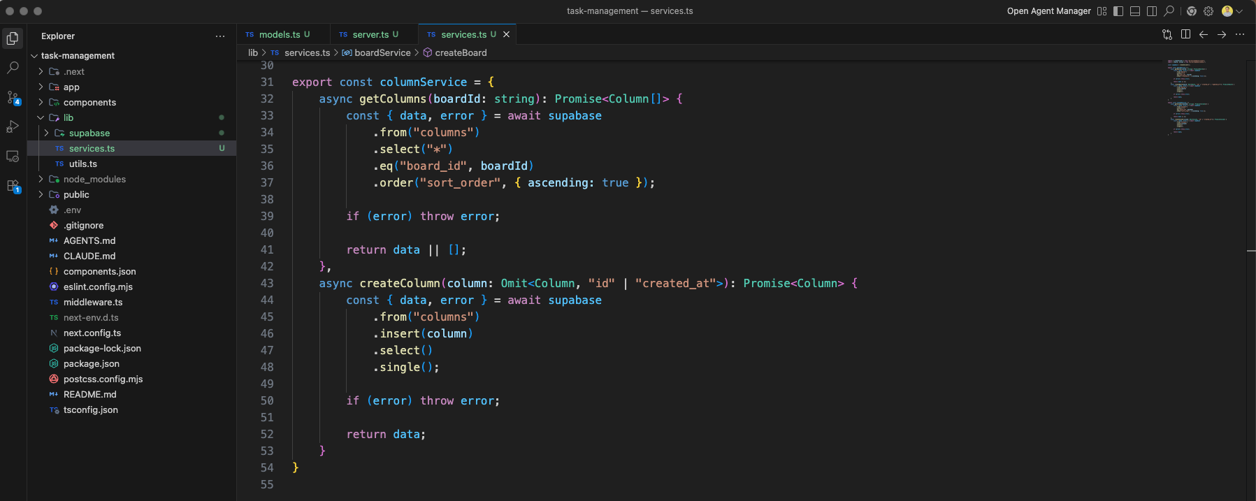
The services.ts file implements the columnService with functions like getColumns that queries the columns table filtered by board_id and sorted by sort_order.
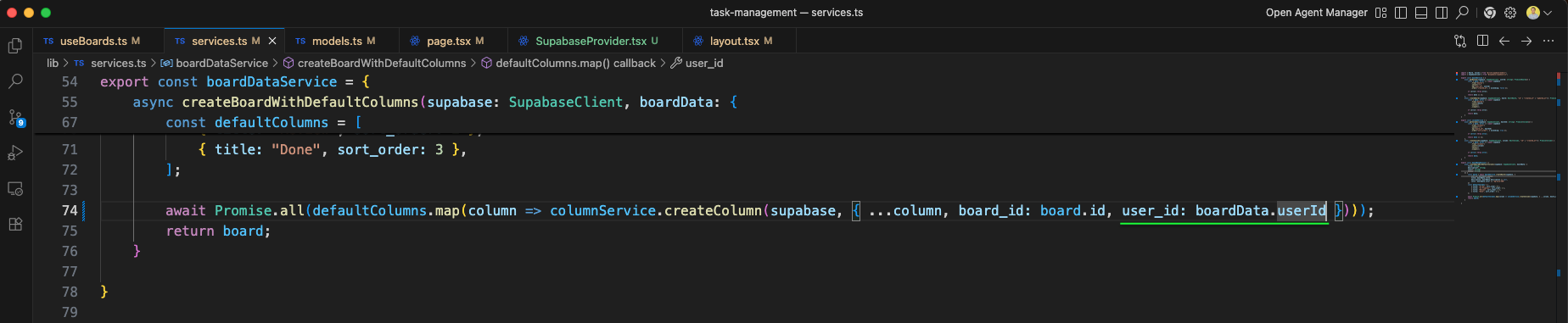
The services.ts also includes a boardDataService with a createBoardWithDefaultColumns function that creates a board and automatically creates four default columns: "To Do", "In Progress", "Review", and "Done".
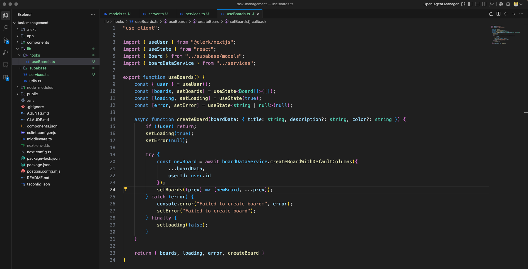
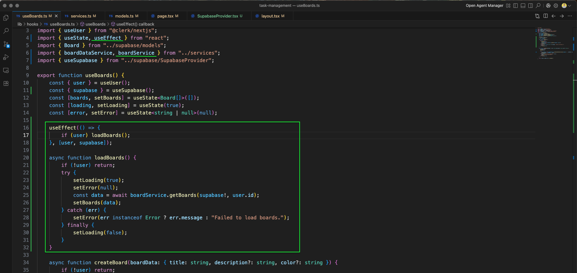
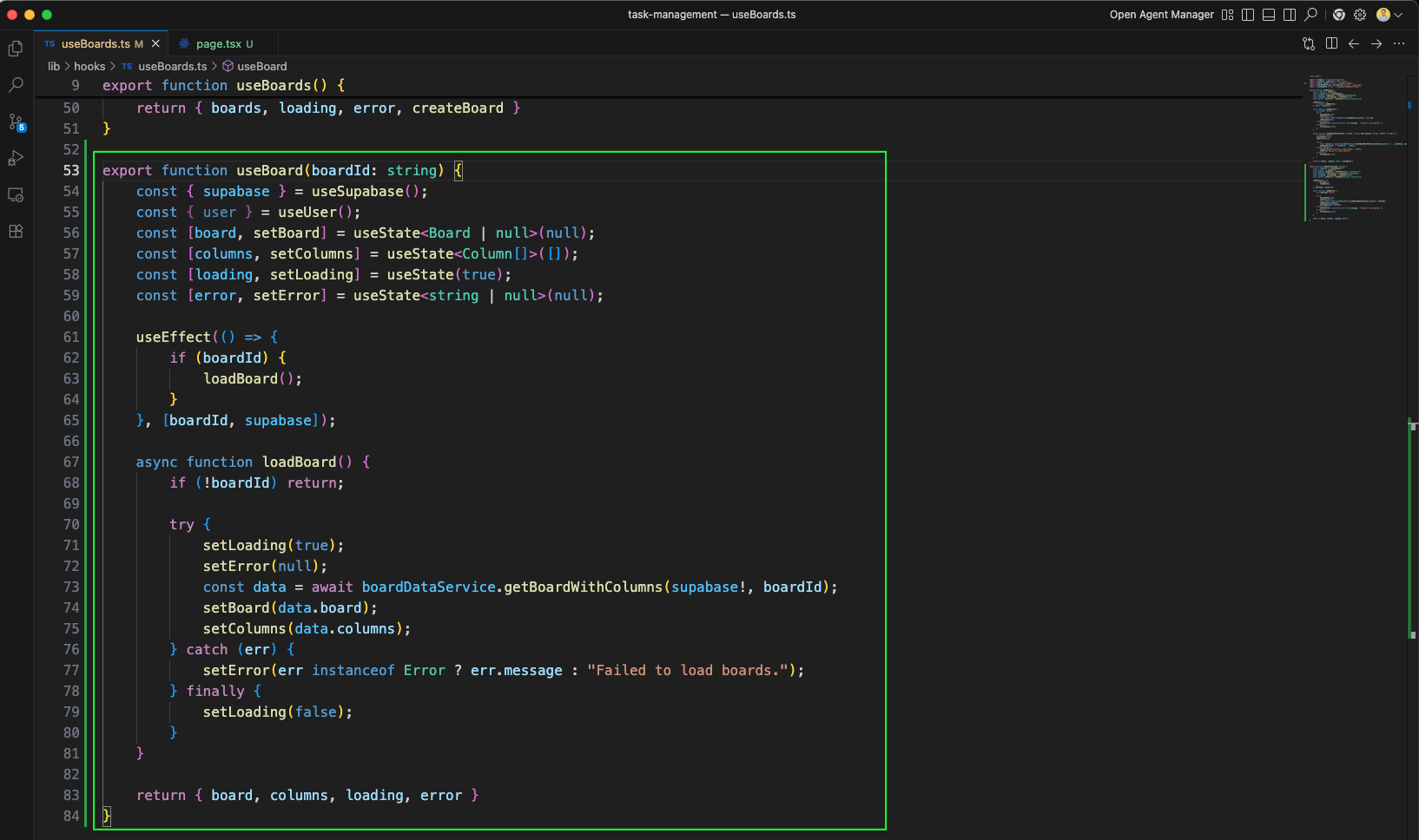
We create a useBoards hook in lib/hooks/useBoards.ts for fetching and managing board data in React components.
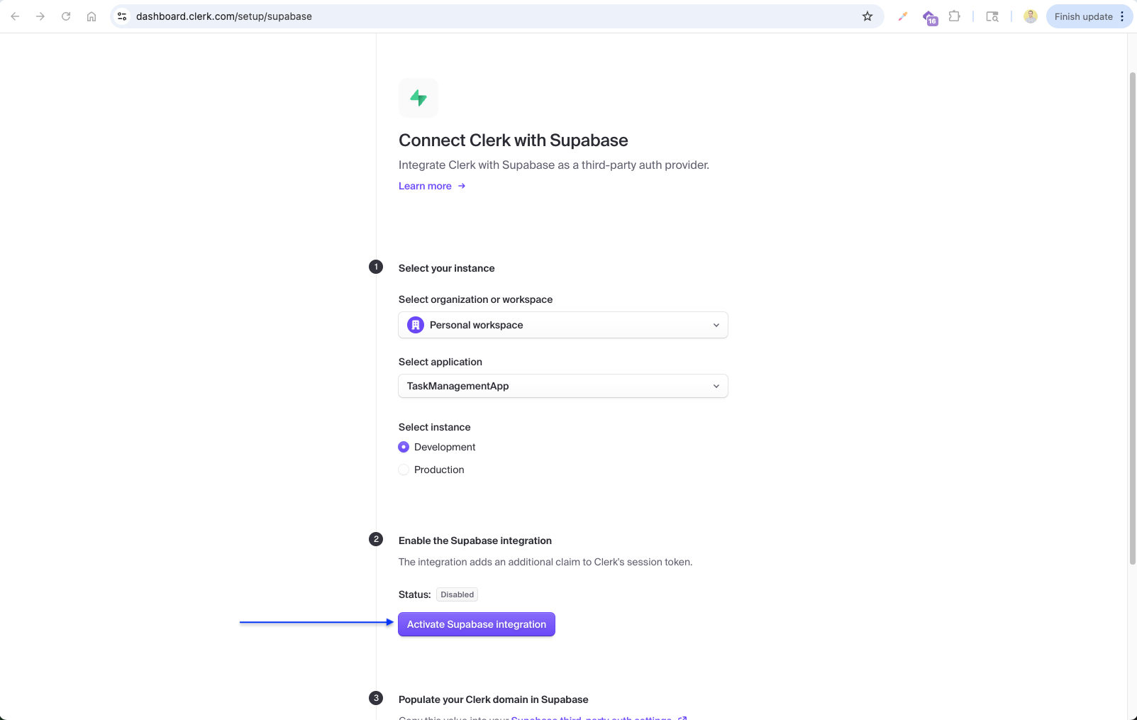
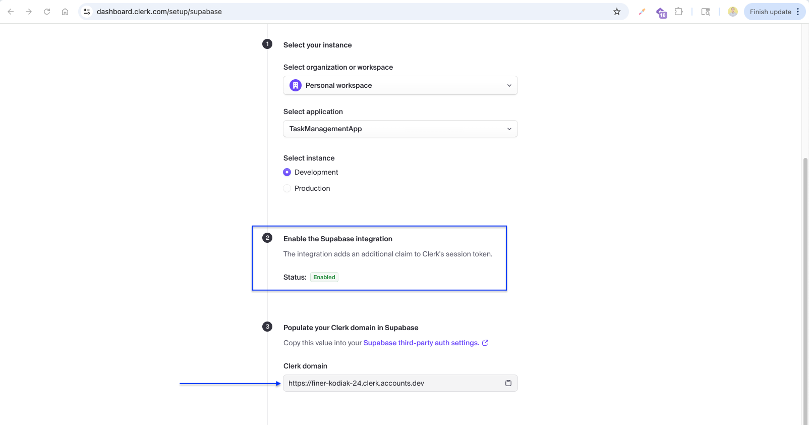
Now we integrate Clerk with Supabase. On the Clerk dashboard, we navigate to Connect with Supabase in the setup page, select our TaskManagementApp and Development instance, and enable the Supabase integration.
After enabling, Clerk provides the Clerk domain URL (https://finer-kodiak-24.clerk.accounts.dev) which we need to copy and paste into Supabase's third-party auth settings.
In the Supabase dashboard, we go to Authentication > Sign In / Providers > Third-Party Auth and add a new Clerk connection by clicking "Add provider".
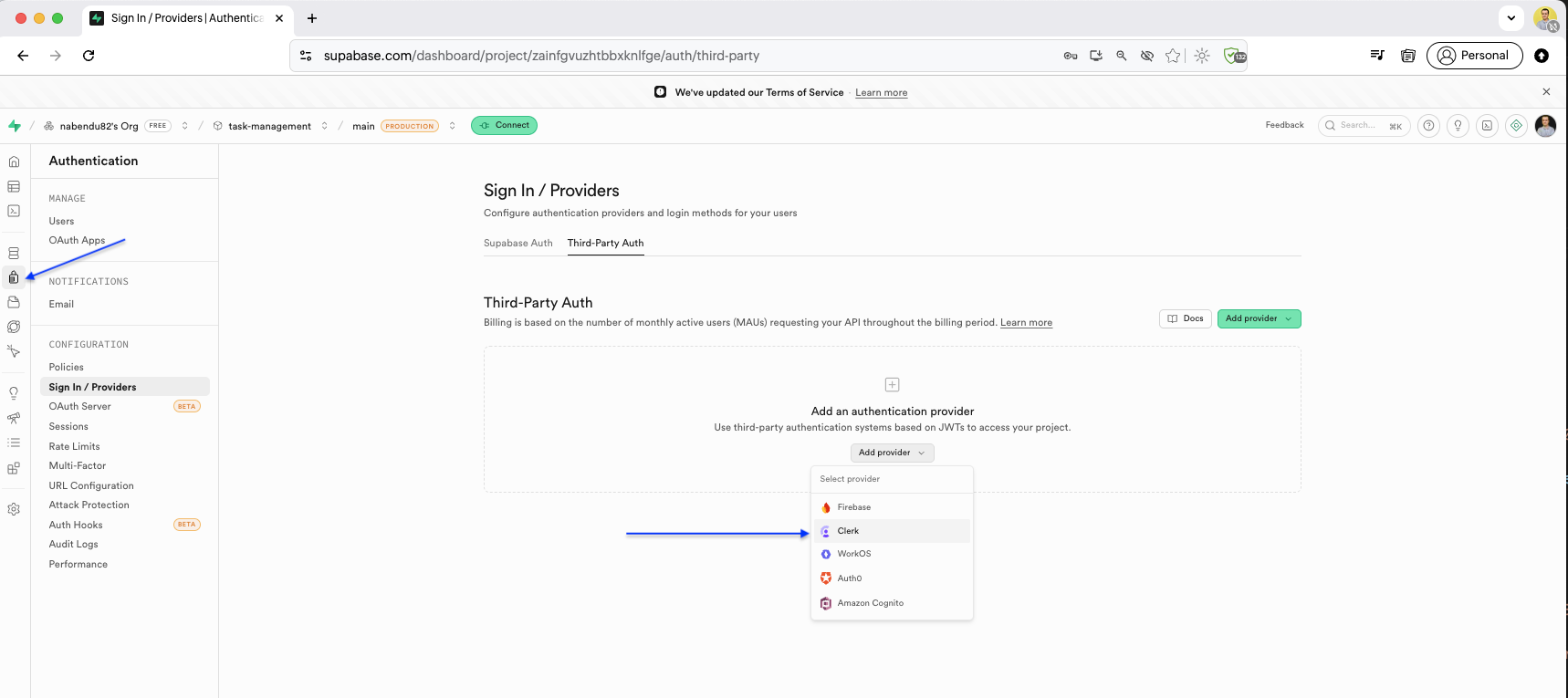
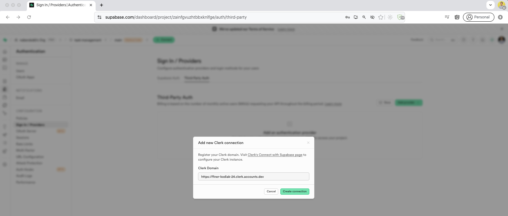
We register the Clerk domain in Supabase by pasting the Clerk domain URL into the Add new Clerk connection form.
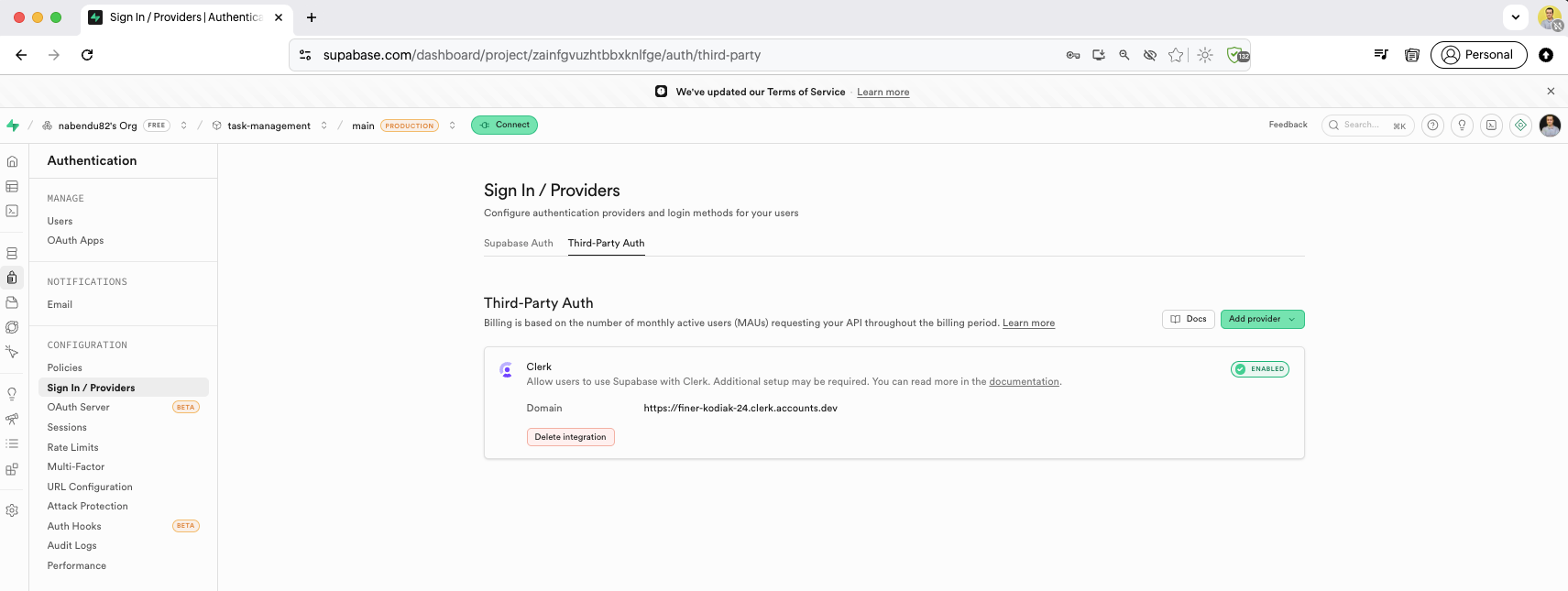
After adding, Supabase shows the Clerk third-party auth configuration with the domain listed and the option to delete the integration if needed.
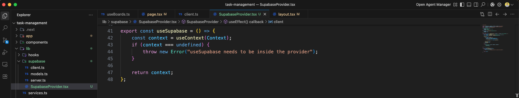
We create a SupabaseProvider.tsx component that uses Clerk's session to create a Supabase client. It uses createContext and useEffect to initialize the Supabase client whenever the Clerk session changes.
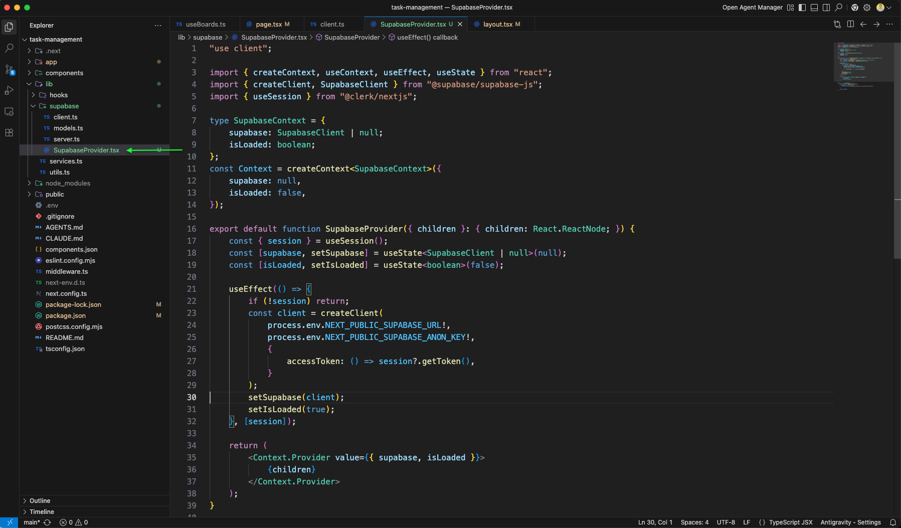
The SupabaseProvider.tsx continues with the context setup, providing supabase client and isLoaded state to all child components through React context.
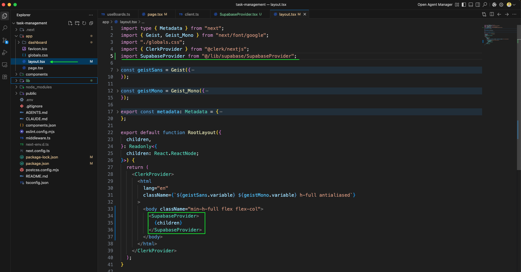
The layout.tsx is updated to wrap the app with SupabaseProvider inside the ClerkProvider, making Supabase available to all pages.
We create the services.ts file in the lib folder that imports the Supabase client and implements the boardService with functions like getBoards that queries boards for a specific user.
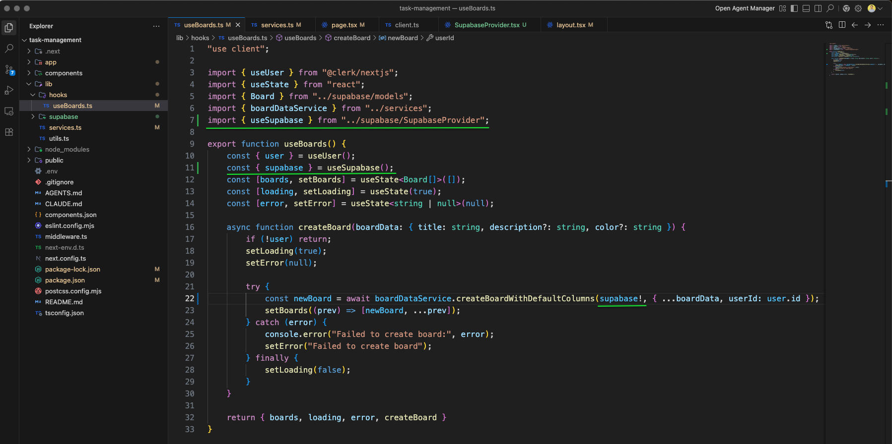
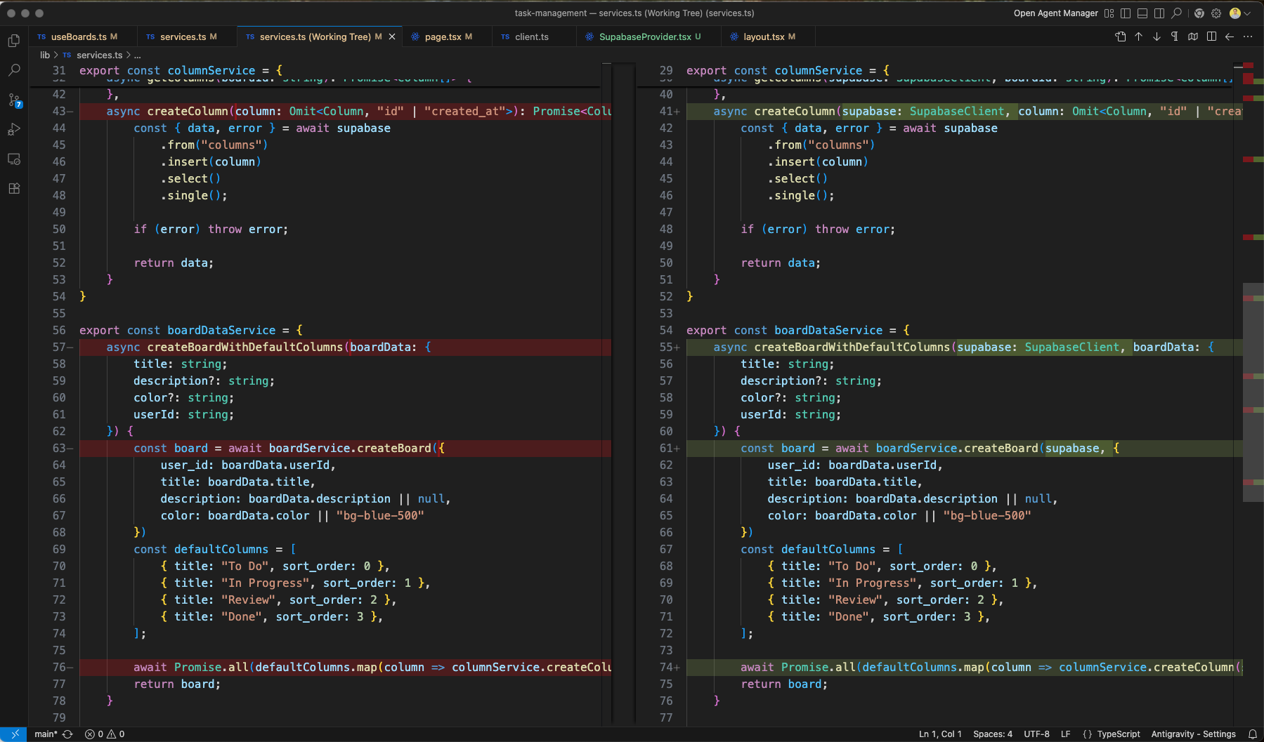
The services.ts we have added SupabaseClient and also updated the getBoards, createBoard and getColumns to use it.
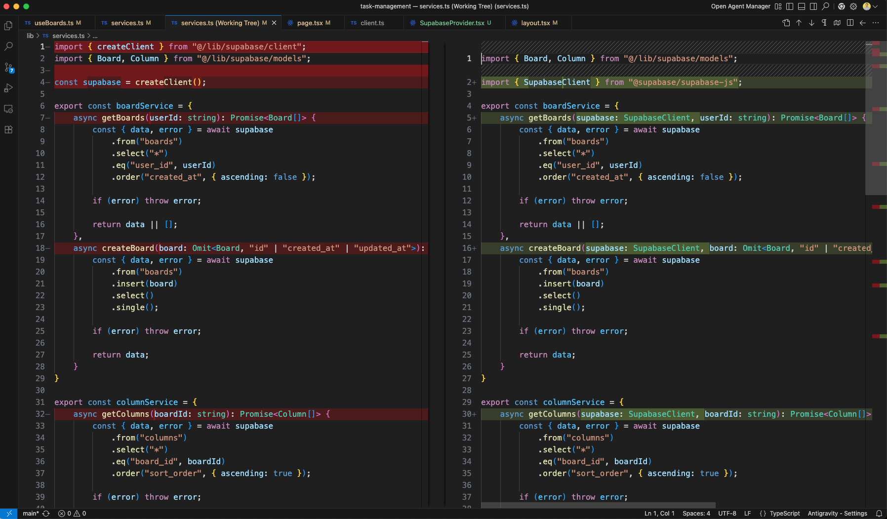
All services.ts functions are updated to accept SupabaseClient as the first parameter. The diff shows columnService.createColumn now takes supabase: SupabaseClient alongside the column data.
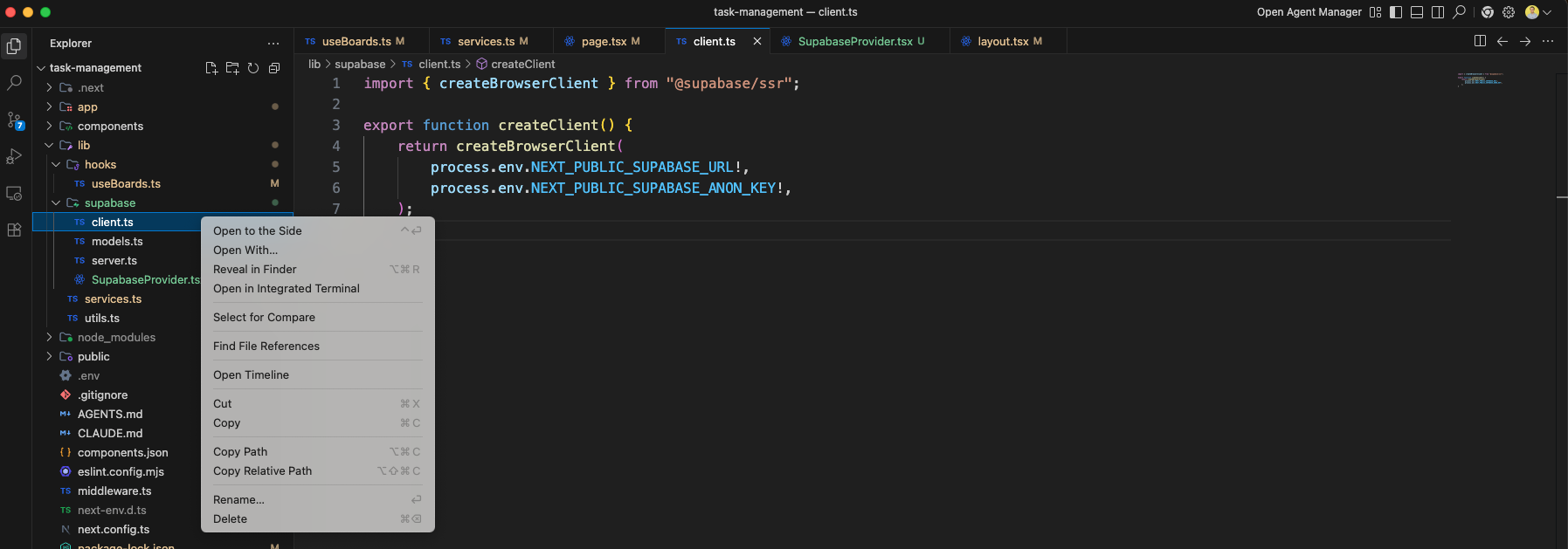
We have deleted the client.ts file, as it is not usd any more.
The Dashboard page.tsx now uses useBoards and also the handleCreateBoard
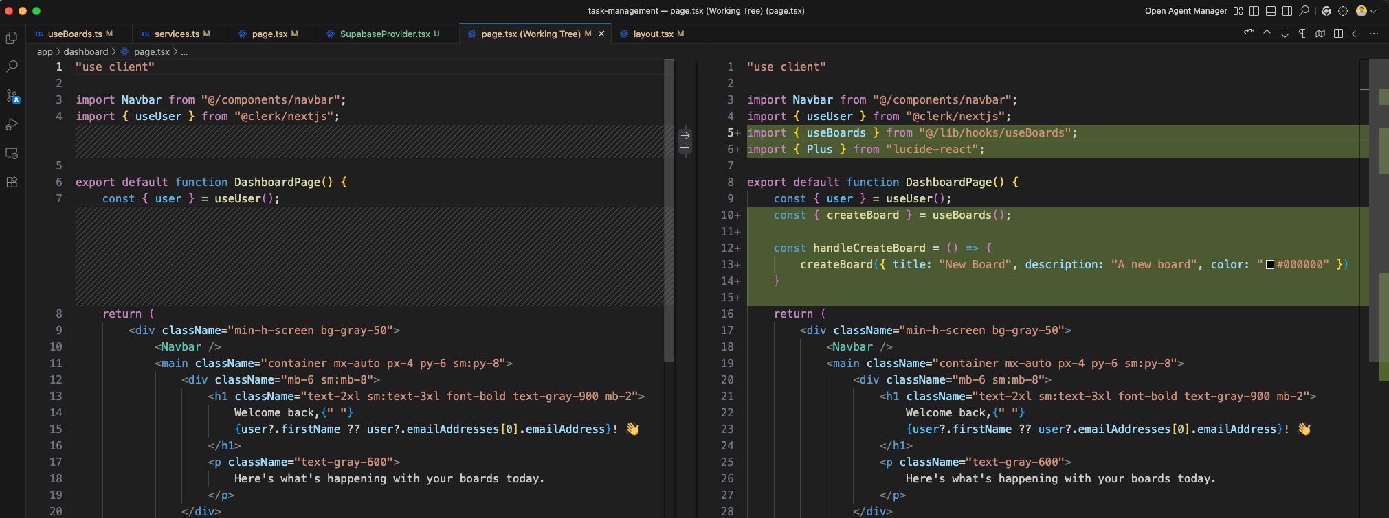
The Dashboard page diff shows the addition of a Create Board card component with a Plus icon from lucide-react, wrapped in a grid layout with responsive columns.
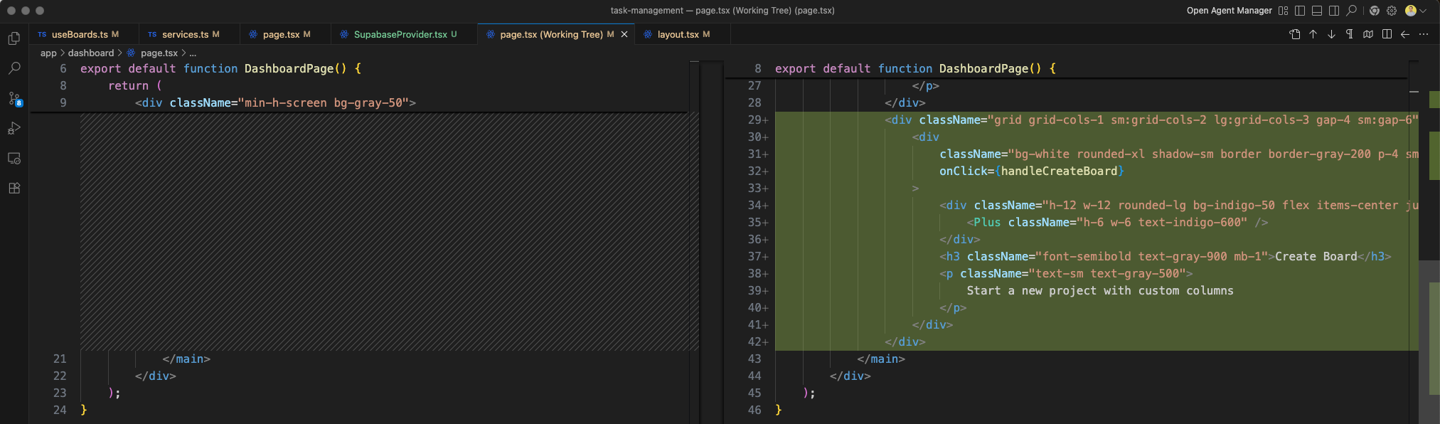
The dashboard at http://localhost:3000/dashboard now shows a Create Board card with a plus icon, description "Start a new project with custom columns", alongside the welcome message.
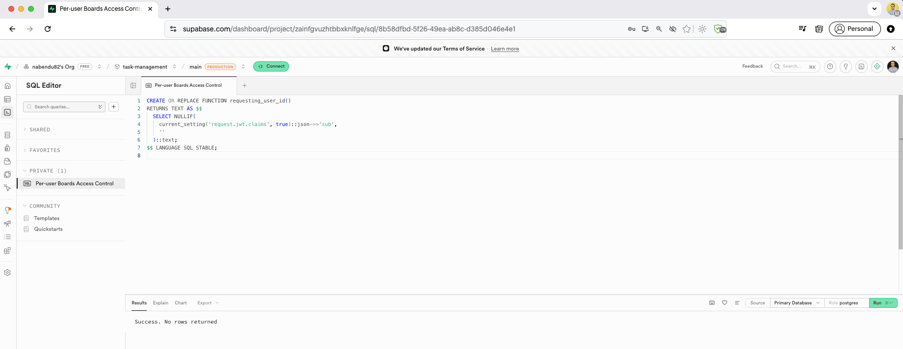
We create the requesting_user_id SQL function in the Supabase SQL Editor. This function extracts the sub claim from the JWT to identify the authenticated user for RLS policies.
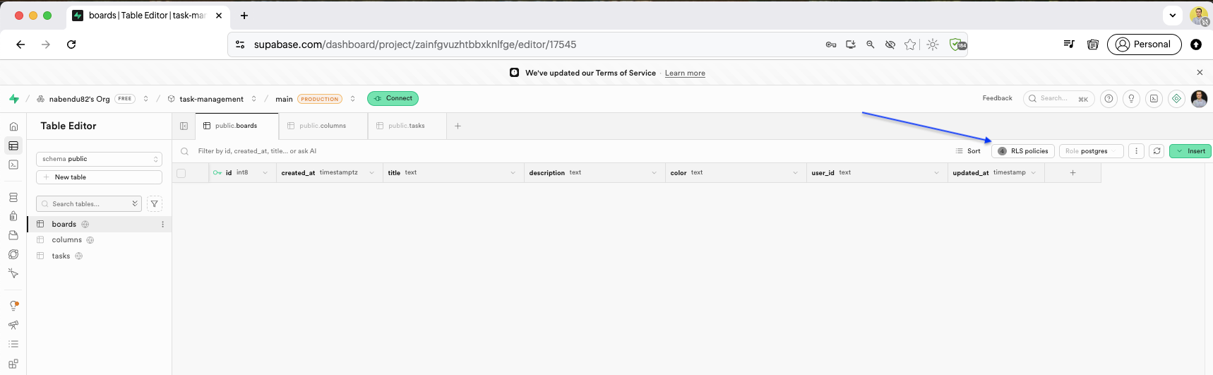
Back in the Table Editor, in the boards table we will click on the RLS policies.
The Authentication Policies page shows the RLS policies for the boards table. Each policy (view, insert, update, delete) is listed with its command and target table. We will Edit policy for update.
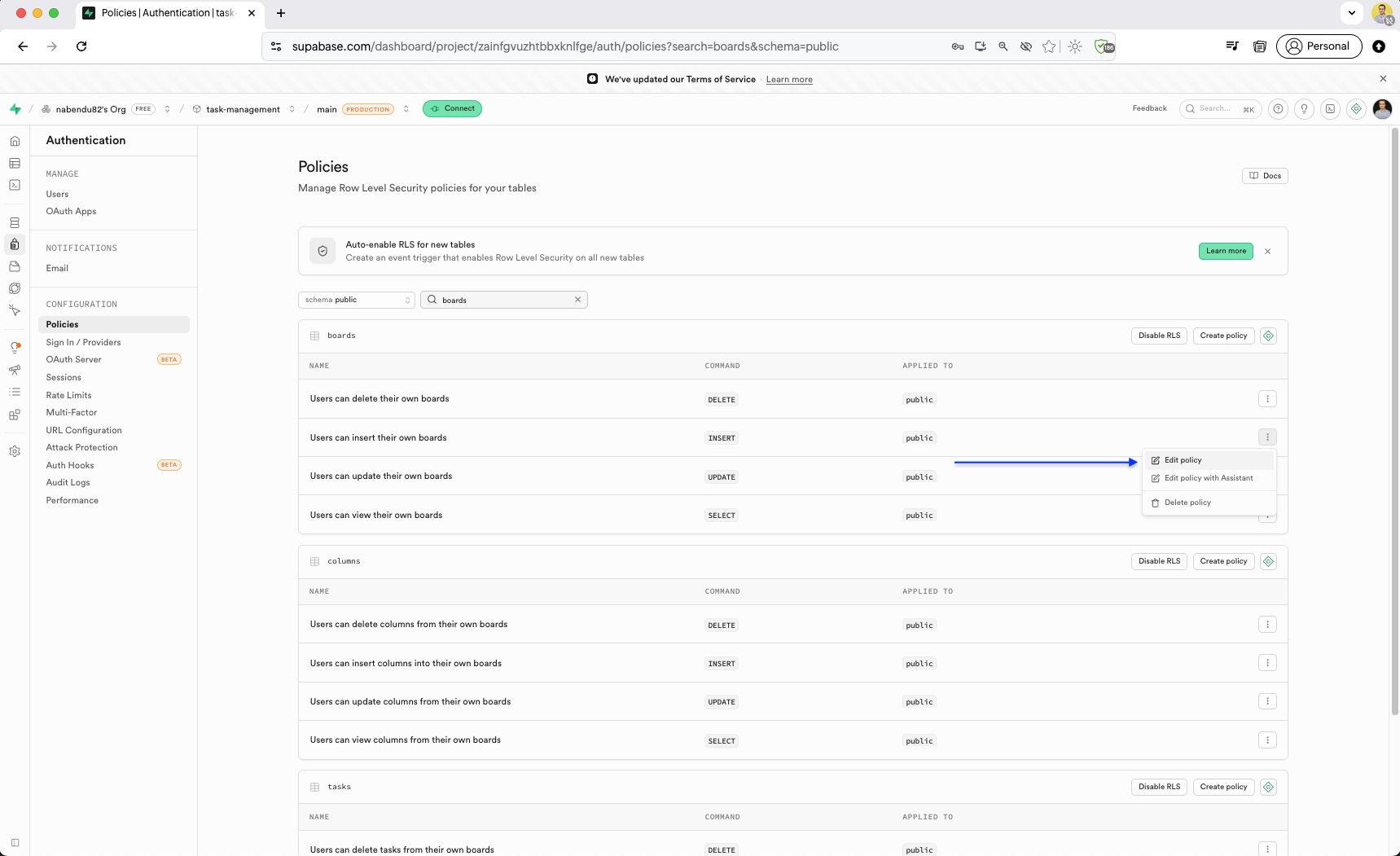
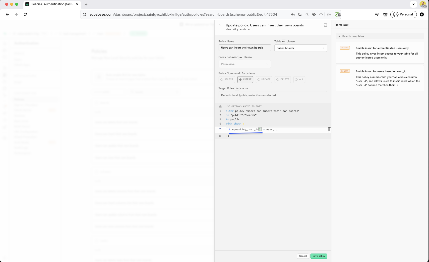
We update the "Users can insert their own boards" policy to use the requesting_user_id() function instead of comparing with raw user_id text.
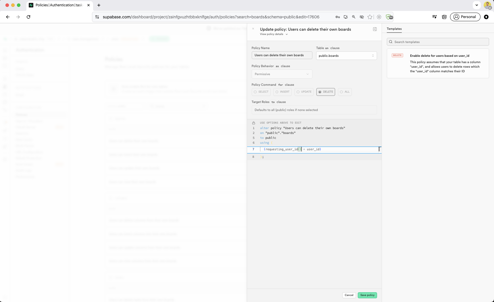
The "Users can delete their own boards" policy is updated to use requesting_user_id() = user_id, leveraging the custom JWT function for auth checks.
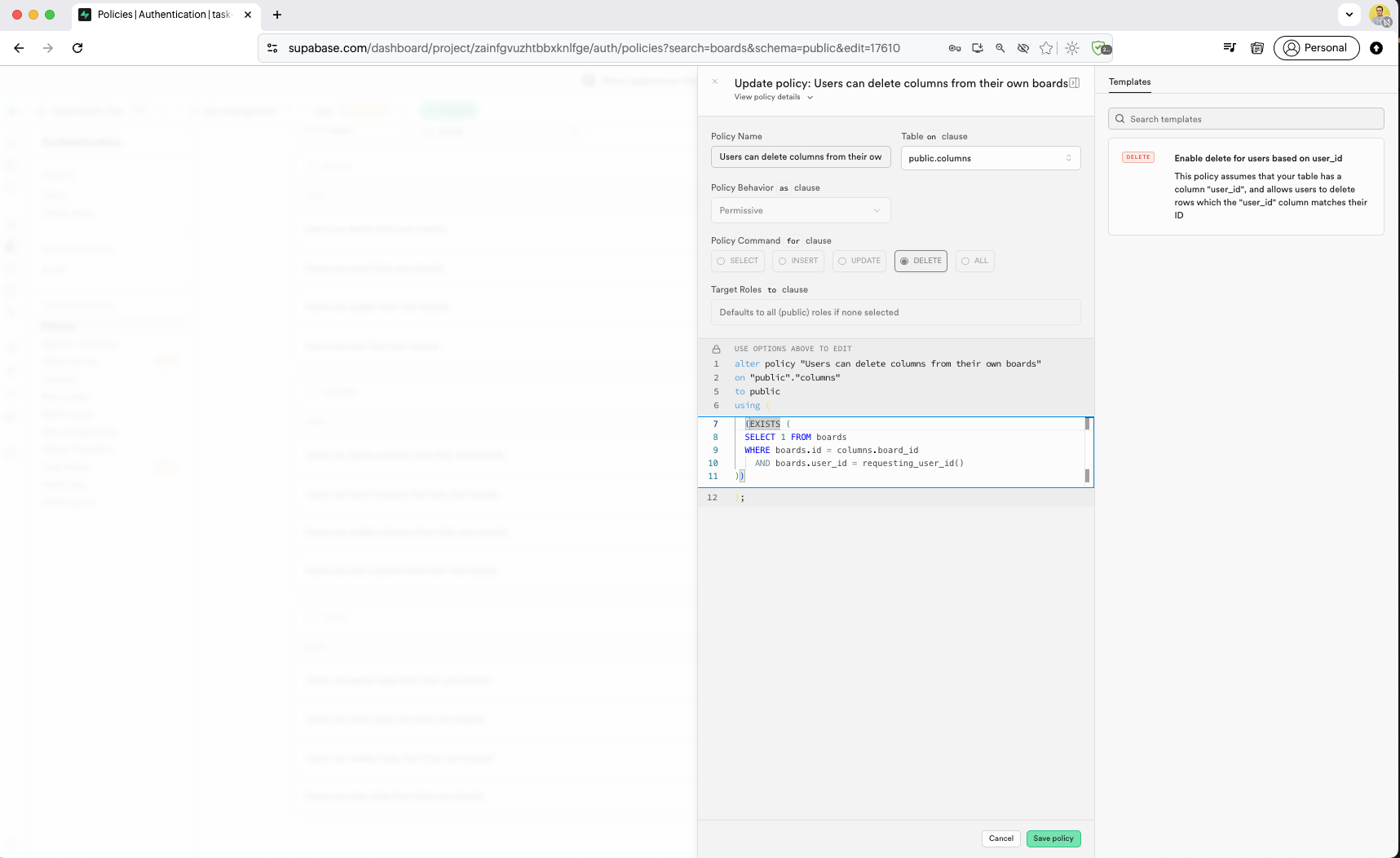
The "Users can delete columns from their own boards" policy is updated with an EXISTS subquery that uses requesting_user_id() to verify board ownership through the boards table.
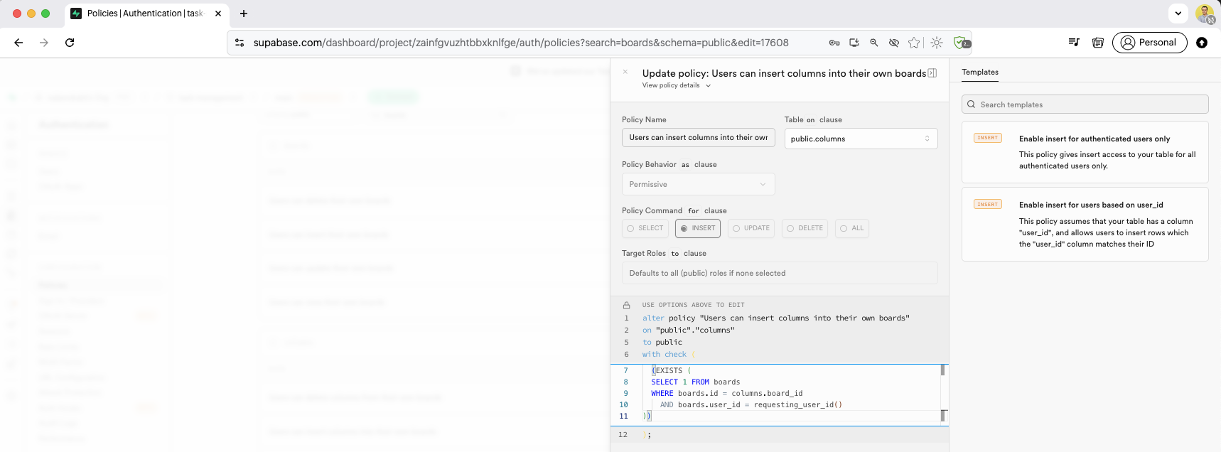
The "Users can insert columns into their own boards" policy uses WITH CHECK with an EXISTS subquery, checking that the column's board belongs to the requesting user.
The "Users can delete tasks from their own boards" policy uses a JOIN from columns to boards, checking requesting_user_id() against the board owner across the full table chain.
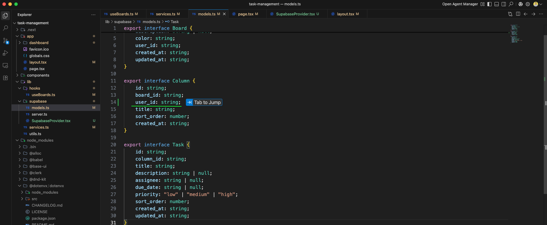
In models.ts file, we have added user_id in interface Column.
The service.ts file we have added function createBoardWithDefaultColumns.
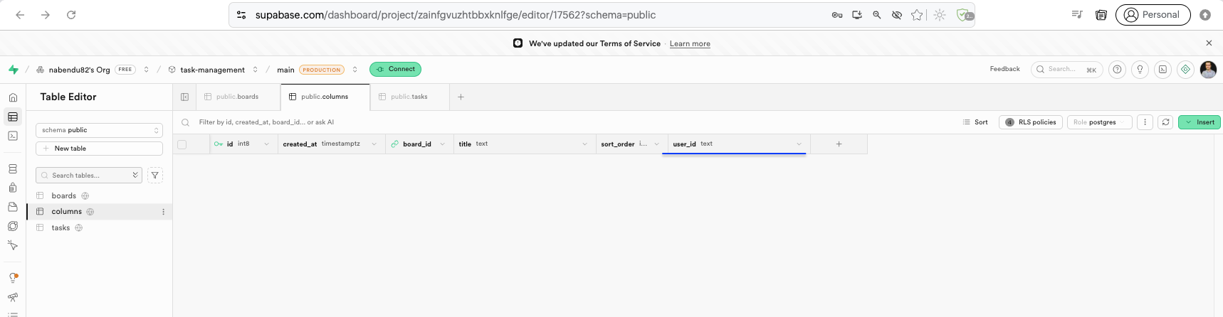
The Table Editor we have added user_id field, which is of type text.
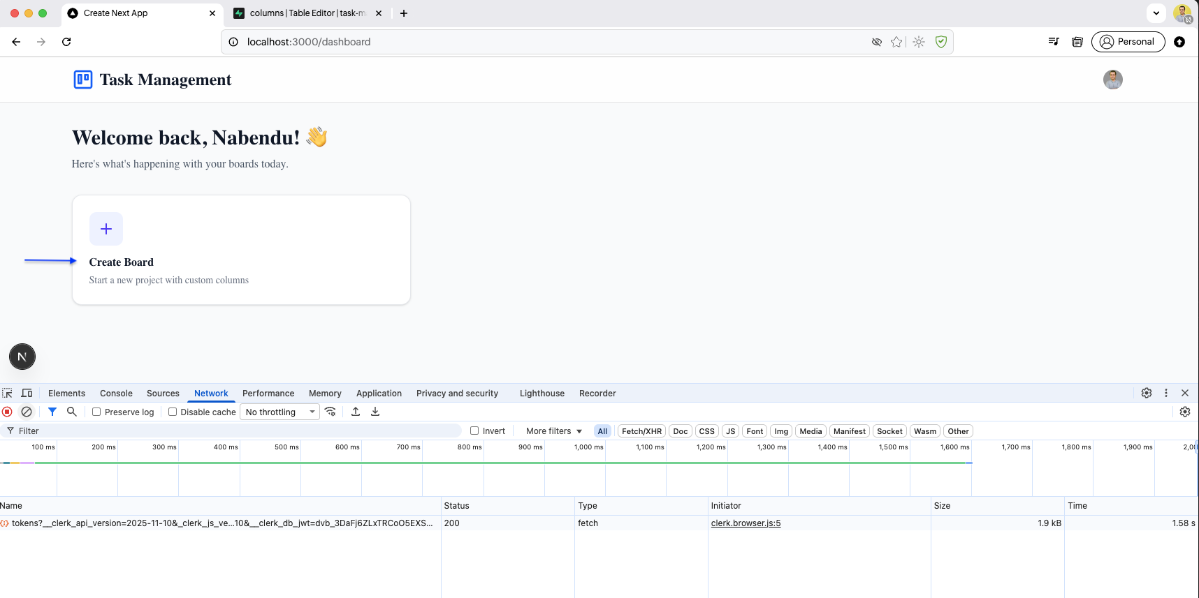
The dashboard page opens with the Chrome DevTools Network tab visible. It shows Clerk authentication requests and Supabase API calls for boards and columns data.
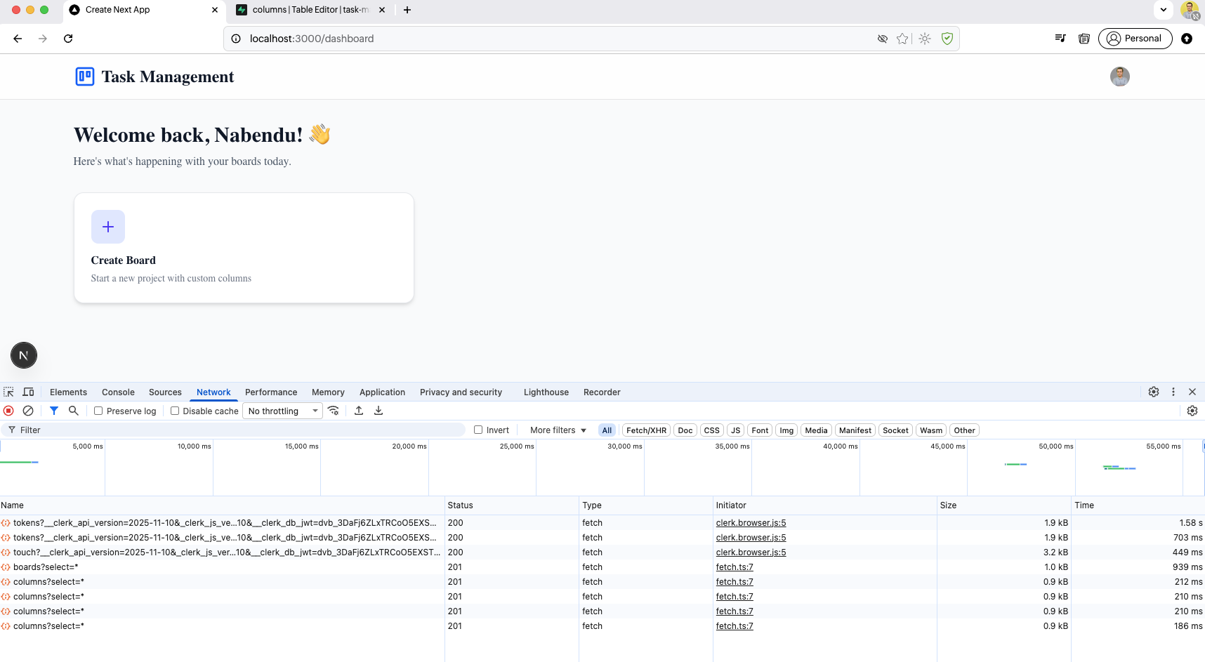
The Network tab shows the full request timeline with successful HTTP 200/201 responses for Clerk tokens, board fetches, and column queries, confirming the API integration works.
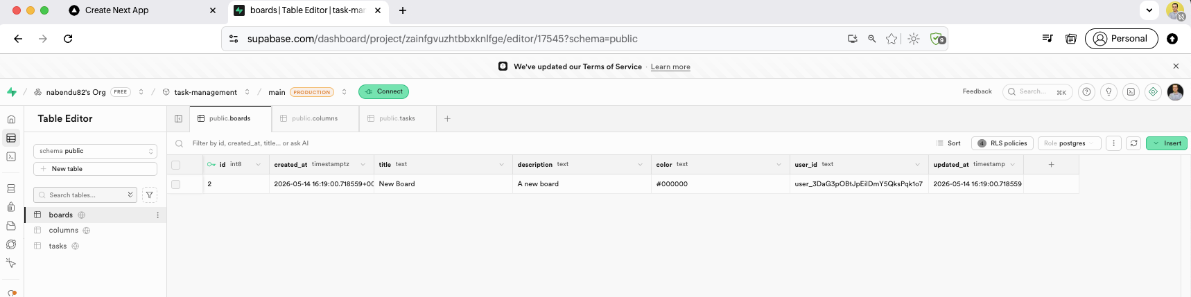
The boards table in Supabase now has a data row: a board titled "New Board" with description "A new board", color "#000000", and the user ID assigned, created at the current timestamp.
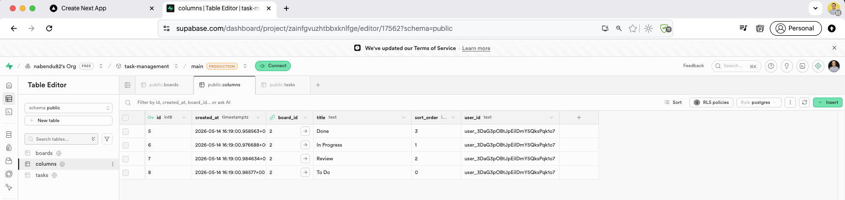
The columns table shows four rows linked to board_id 2: "Done" (sort_order 3), "In Progress" (sort_order 1), "Review" (sort_order 2), and "To Do" (sort_order 0) — each with the user_id.
The useBoards.ts we have added an useEffect, where we are calling the function loadBoards.
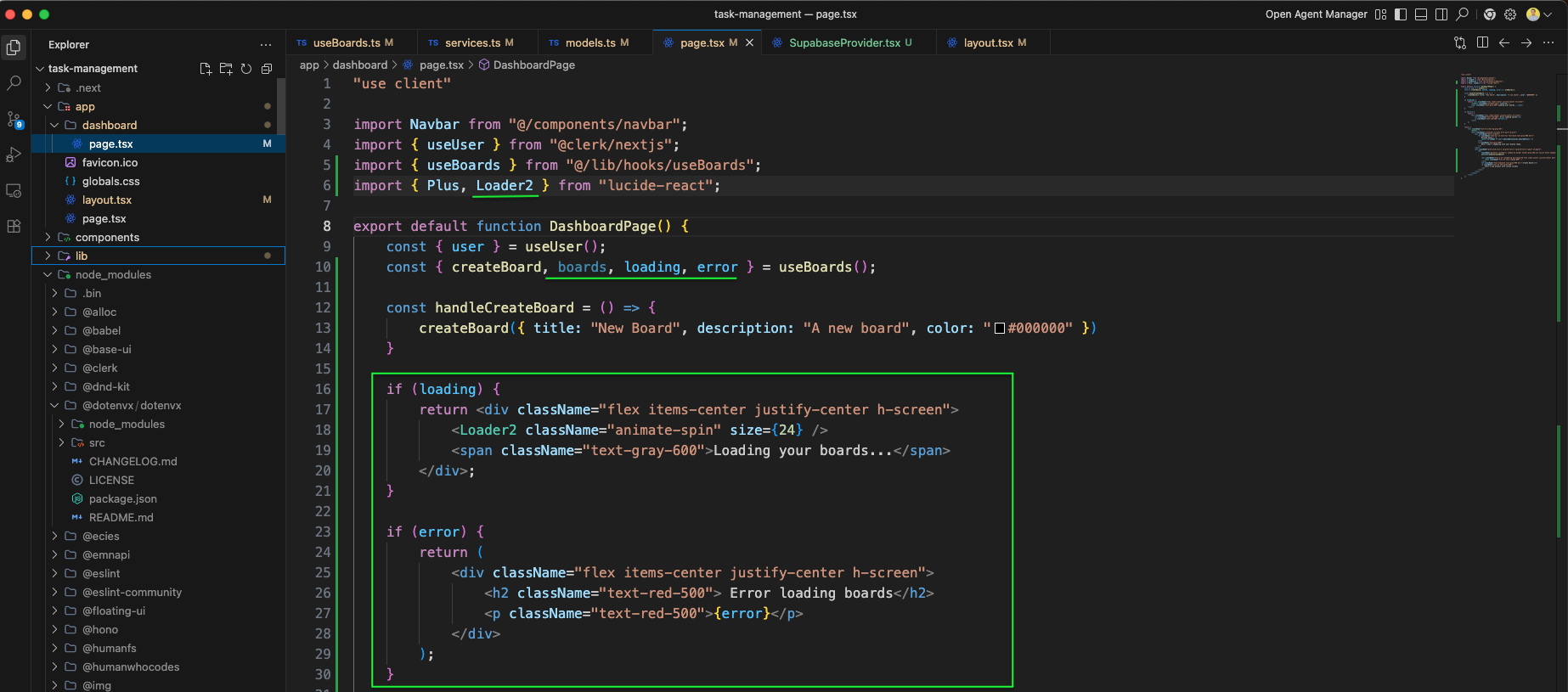
The Dashboard page.tsx ,when loading is true, a full-screen spinner with a Loader2 animated icon and "Loading your boards..." text is shown. When error occurs, a red error message is displayed.
The Dashboard page shows the Stats section with two Cards: Total Boards displaying {boards.length} with a Trello icon inside a blue circle, and Recent Activity showing a count of boards updated within the last week using a date filter.
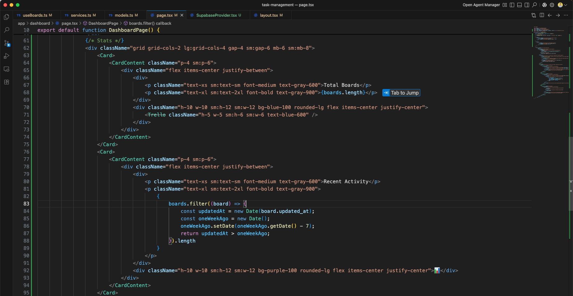
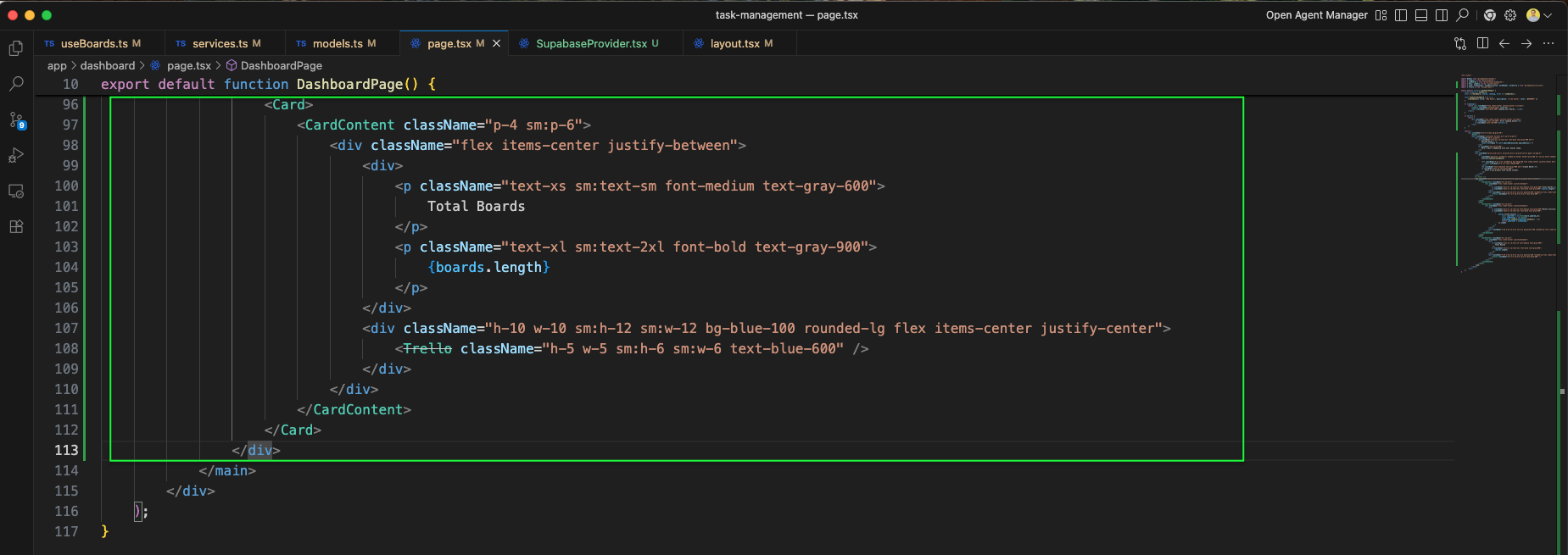
The Total Boards Card component code is shown in the editor, rendering {boards.length} with a Trello icon from lucide-react inside a rounded blue background container.
The dashboard UI now displays Total Boards: 1 and Recent Activity: 1 cards showing the board count after creating the first board.
The page.tsx we have imported some required things. And also commented out loading, as it was causing some issues.
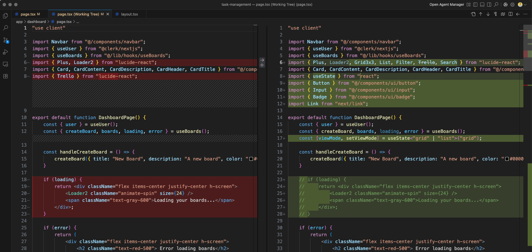
We have also changed the style of a div in page.tsx file.
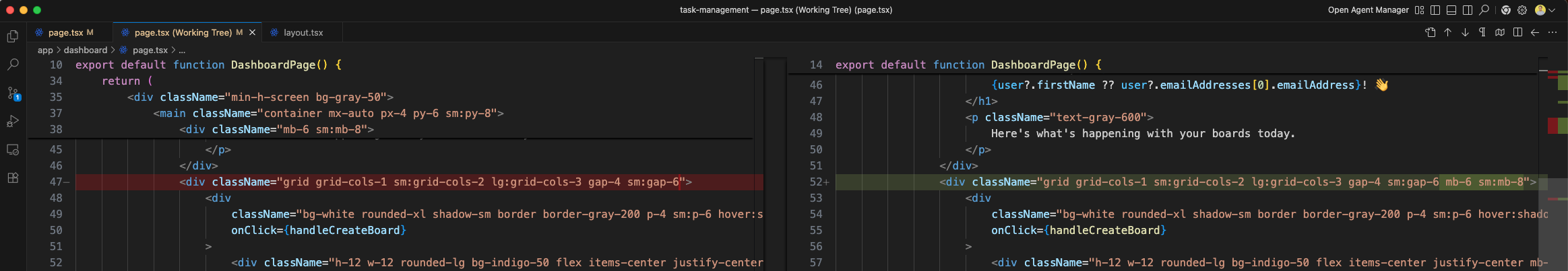
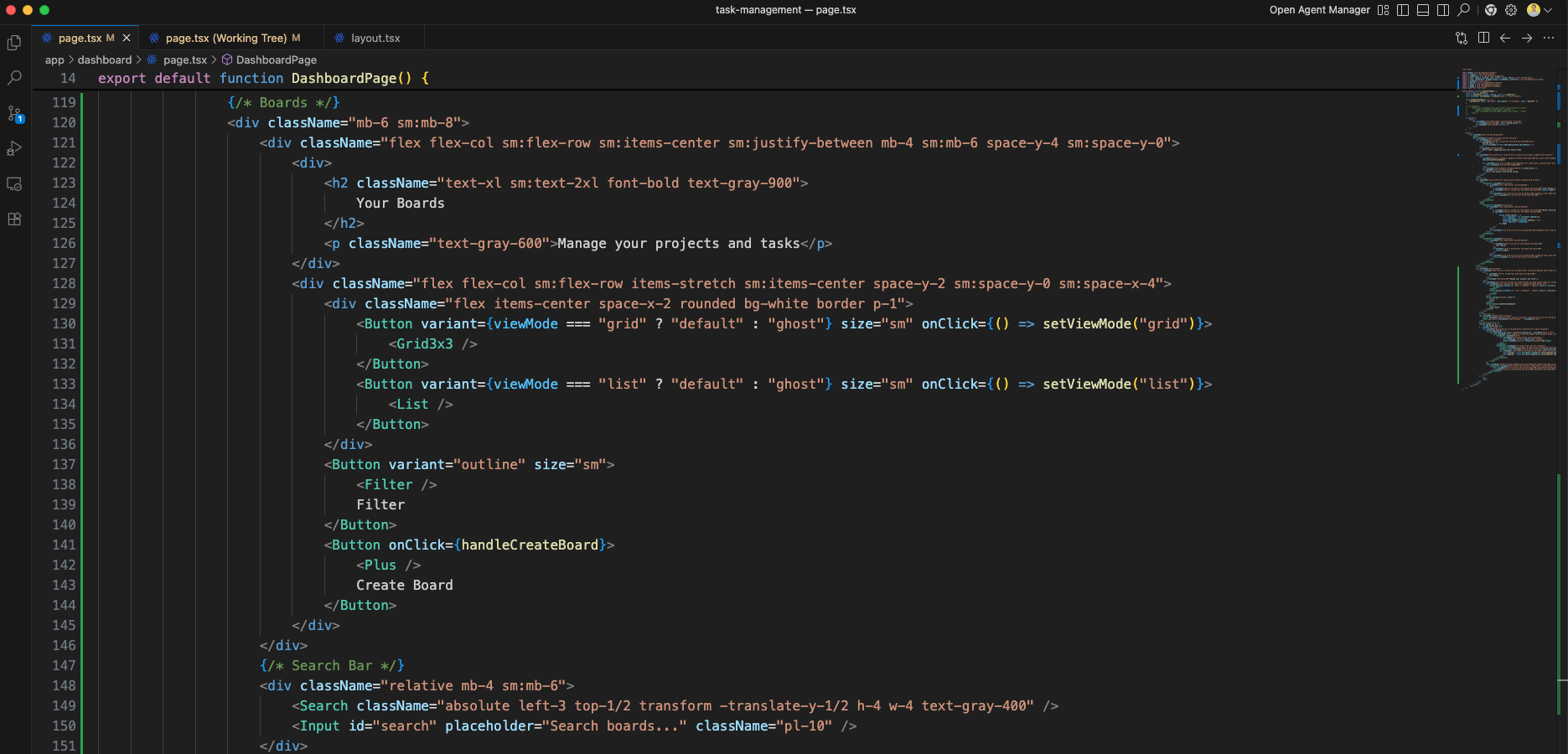
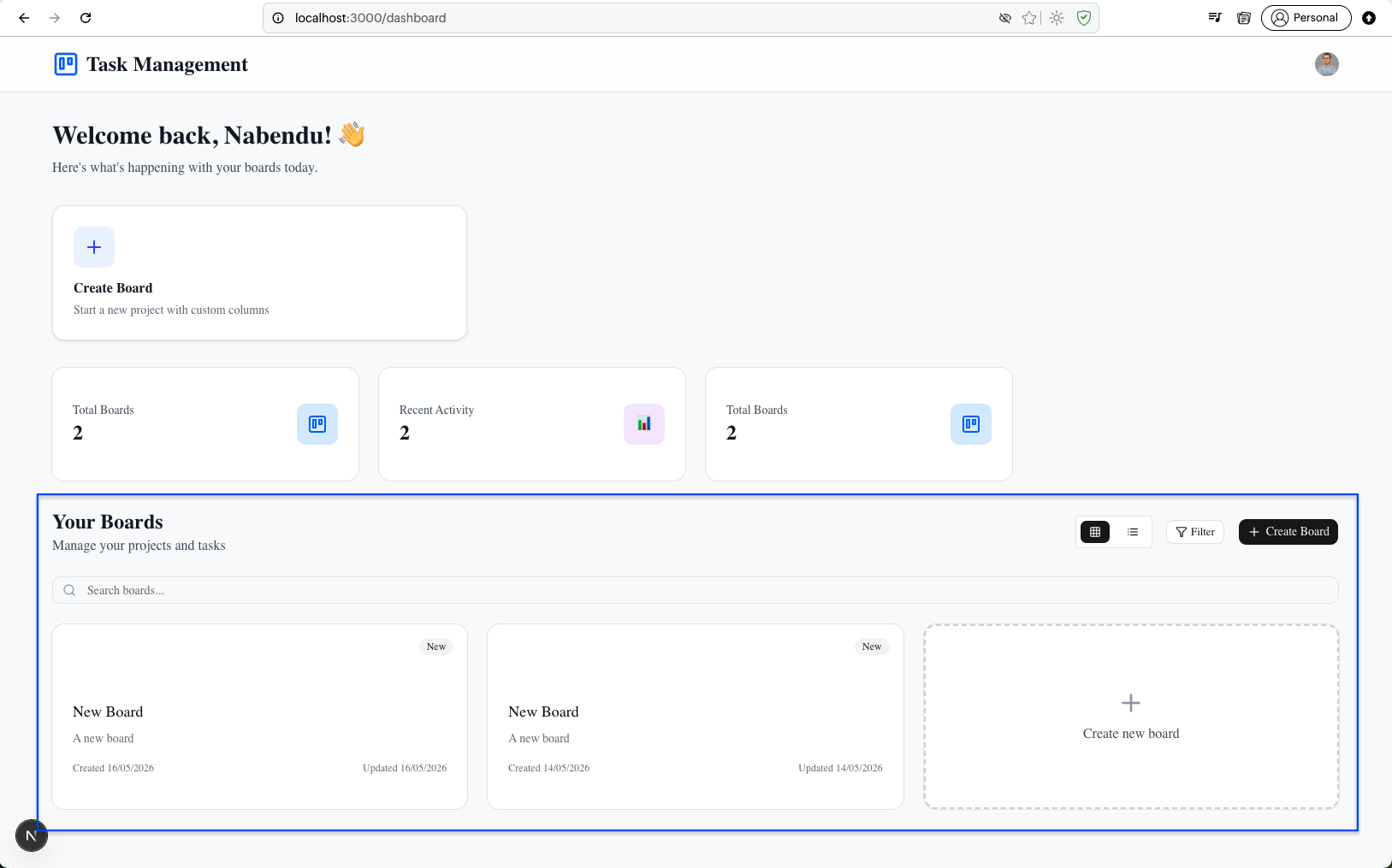
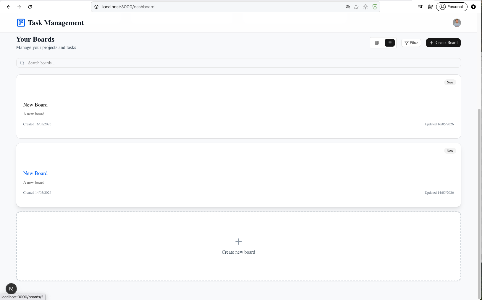
The "Your Boards" section includes a grid/list view mode toggle (Grid3x3 and List icons), a Filter button, a Create Board button with Plus icon, and a Search input bar with a magnifying glass icon.
The Boards Grid section renders board cards using a responsive grid. Each board card shows the board color, a "New" badge, the title, description, created/updated dates, and links to /dashboard/{board.id}. An additional dashed "Create new board" card is included at the end.
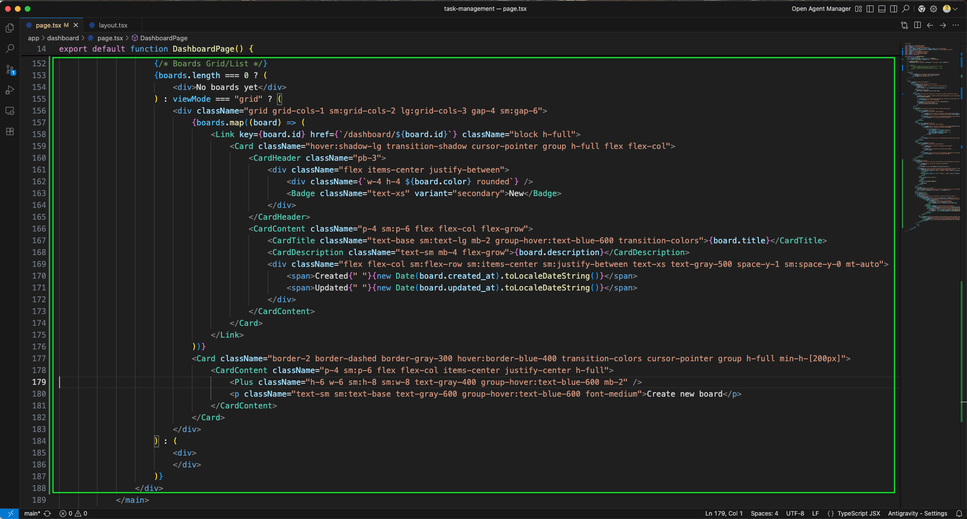
The dashboard now displays Your Boards section showing two "New Board" cards each with "New" badge, created and updated dates. A search bar, filter button, and "Create new board" button are visible in the top toolbar.
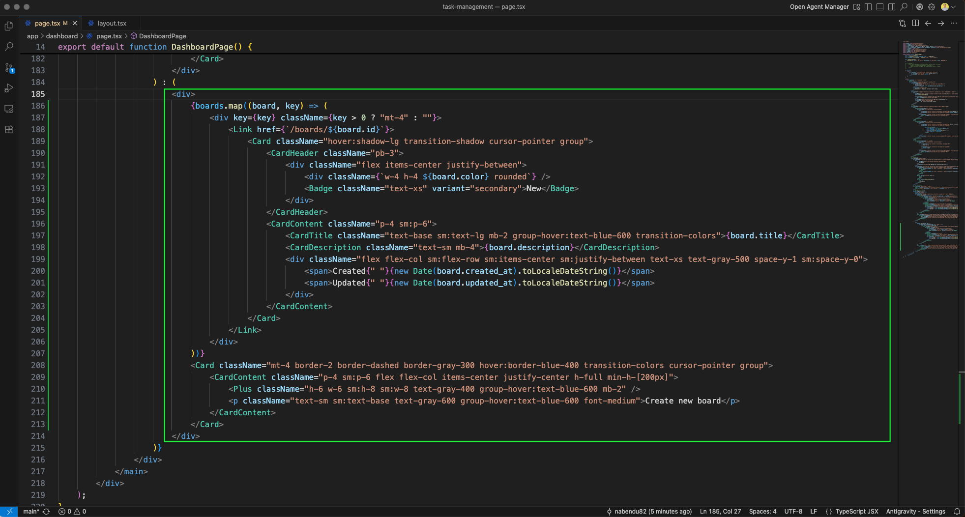
The page.tsx is updated with a List view for boards. The green outlined section shows boards.map using a vertical list layout with div wrappers and mt-4 spacing, each linking to /boards/{board.id}.
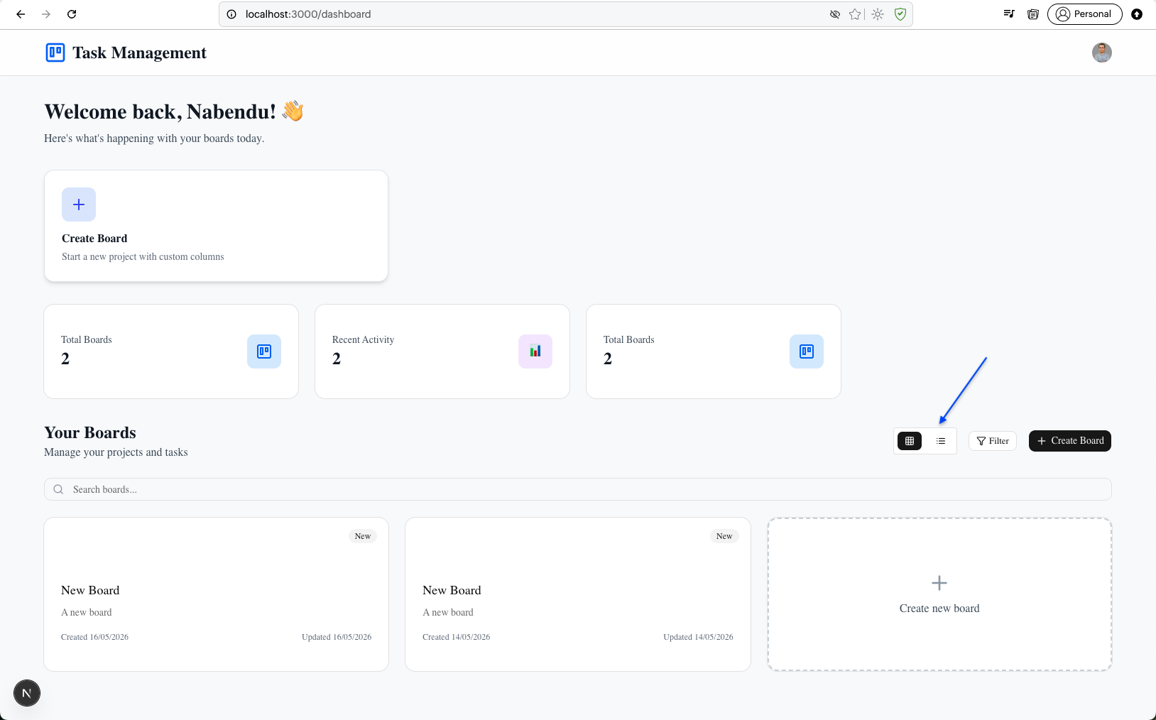
The dashboard now shows Total Boards: 2 and the Your Boards section with two board cards. Clicking on a board card (indicated by the blue arrow) will change the layout.
You can now see the layout is changed for the board and Create new board.
The navbar.tsx working tree shows the updated Navbar component with new imports and functionality for the board page context.
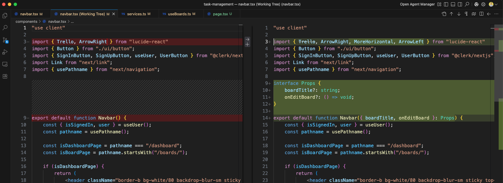
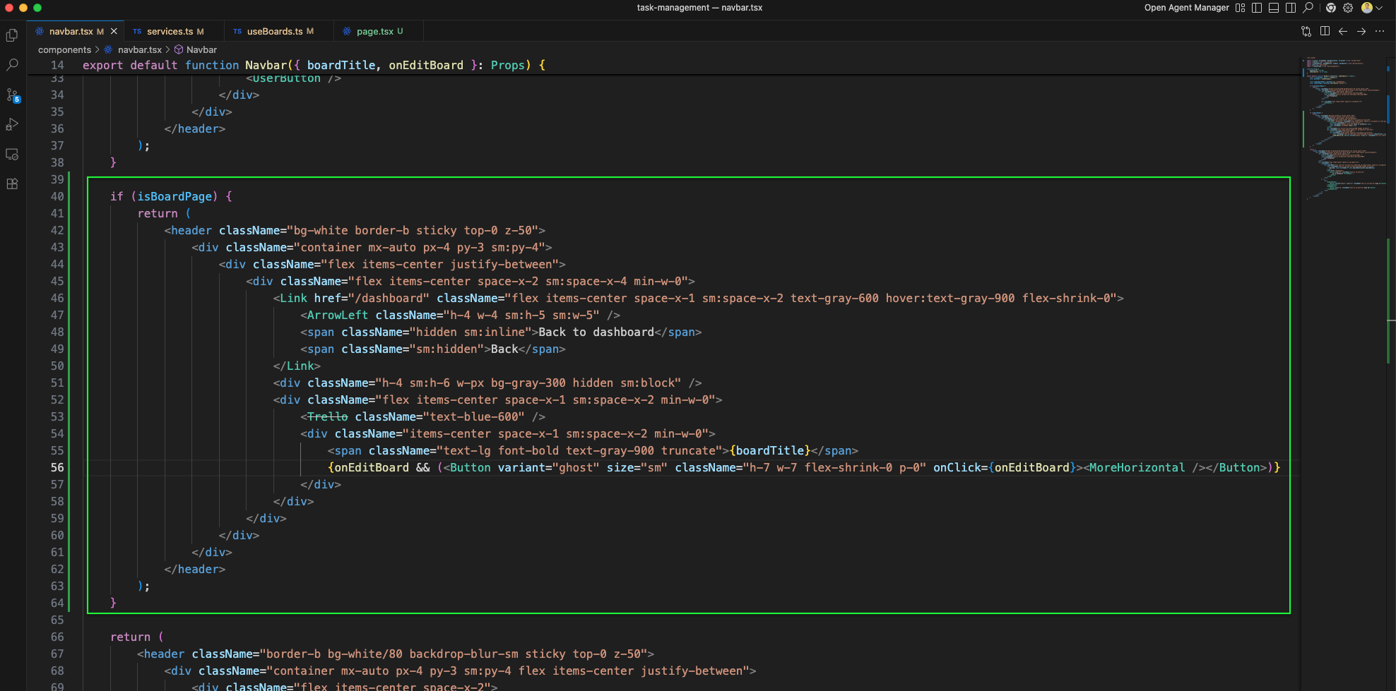
The Navbar component is updated to accept boardTitle and onEditBoard props. For board pages, it shows a Back to dashboard link with ArrowLeft icon, the Trello icon, and the board title. It also includes a UserButton.
The services.ts working tree shows the new getBoard function (green outline) added to boardService. It fetches a single board by ID from Supabase.
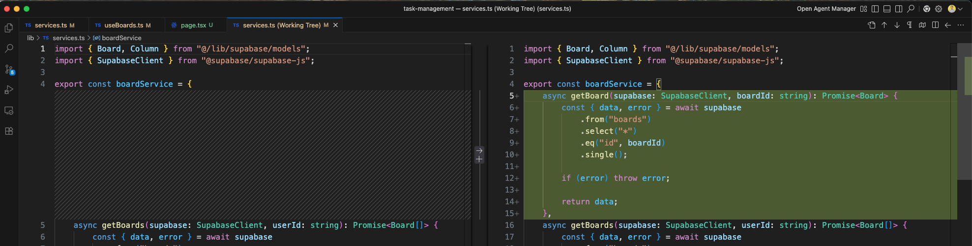
The services.ts working tree also shows the updateBoard function (green outline) being added to boardService. This function will update board properties via Supabase.
A new useBoard hook (green outline) is added in useBoards.ts. It imports useSupabase, useUser, and manages board, columns, loading, and error state for a single board.
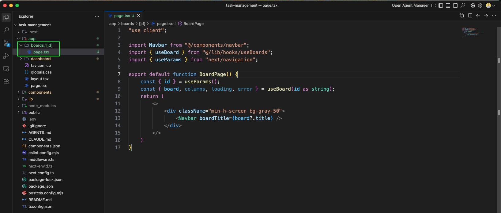
A new BoardPage component is created at app/boards/[id]/page.tsx. It imports Navbar, useBoard hook, and useParams from next/navigation, and renders the board title in the Navbar.
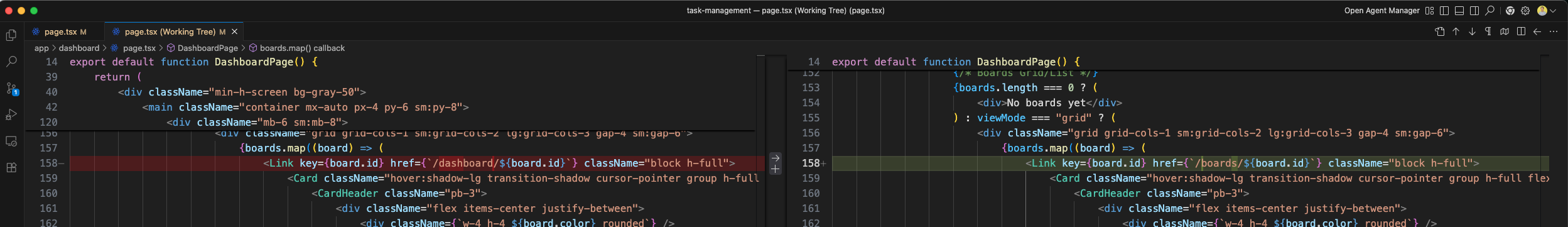
The Dashboard page.tsx working tree shows the board card links are updated: the href is changed from /dashboard/${board.id} to /boards/${board.id} (green outlined).
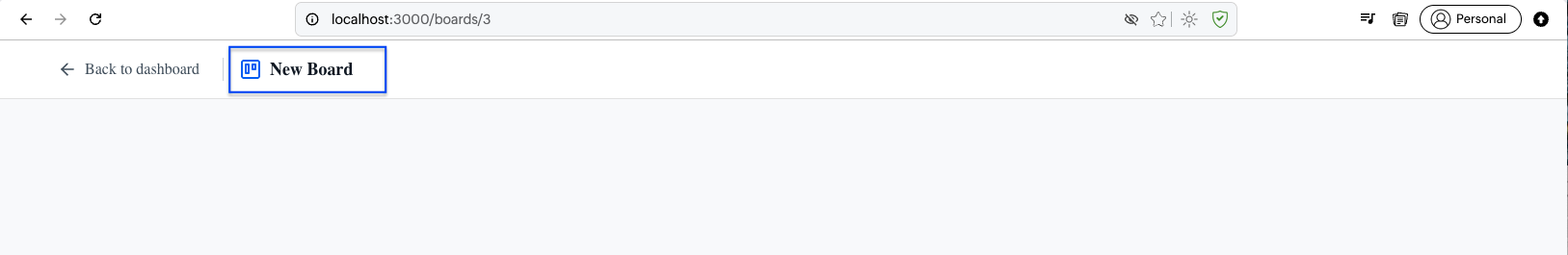
The board page at http://localhost:3000/boards/3 shows "Back to dashboard" link and "New Board" title in the header, demonstrating the navbar's board page layout.
The BoardPage working tree shows the full component code with imports for Navbar, useBoard, useParams, and destructuring board, columns, loading, error from the hook.
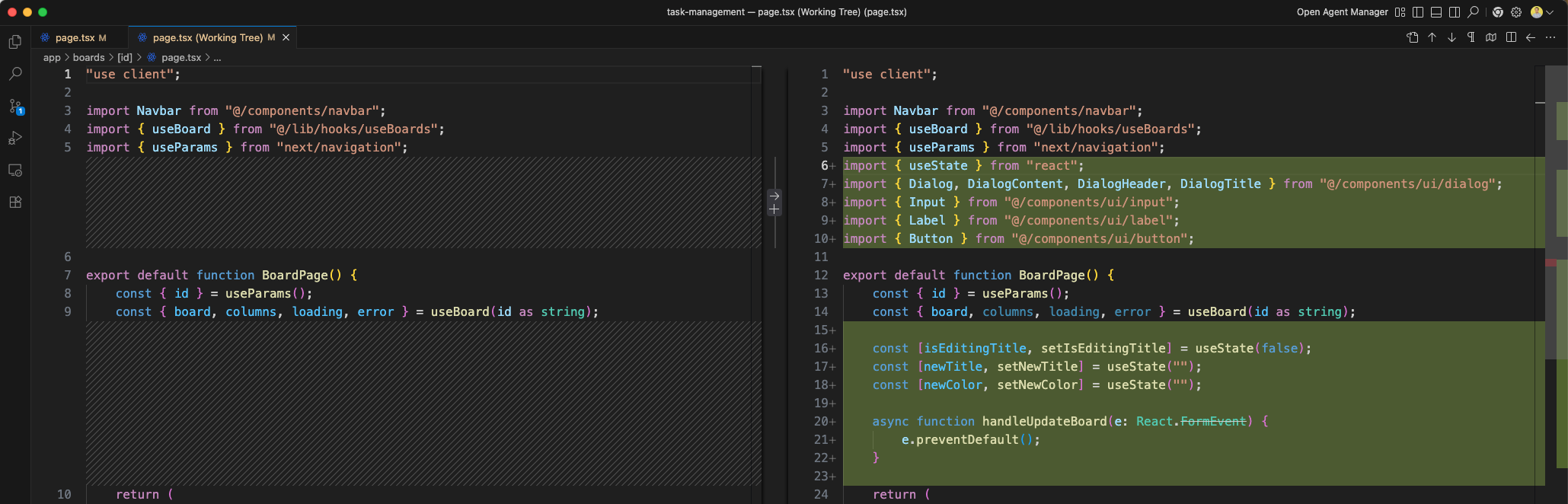
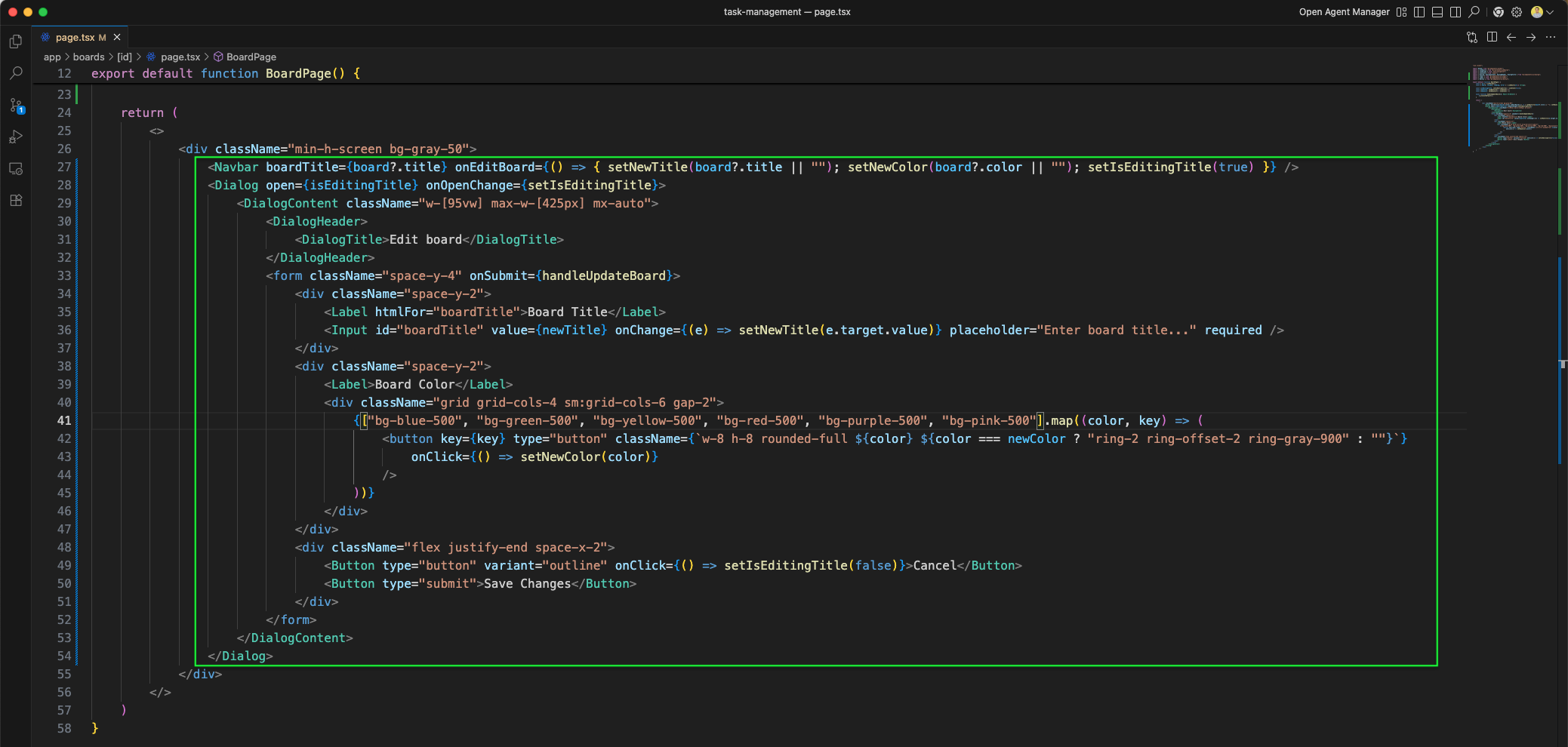
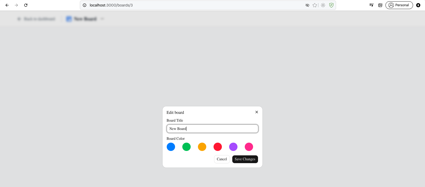
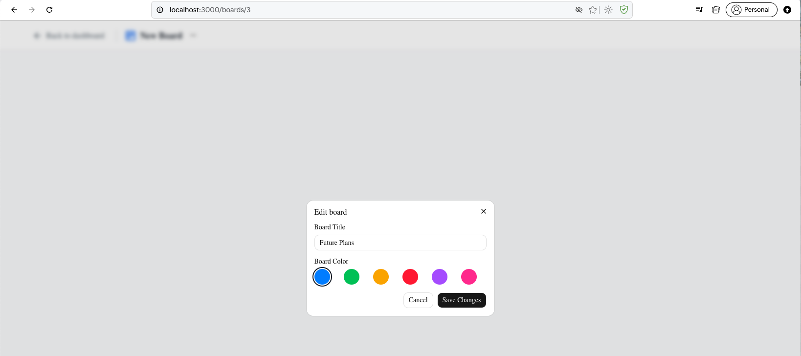
The BoardPage component now includes an Edit board Dialog with a form containing Board Title input and Board Color picker with six color options (blue, green, yellow, red, purple, pink) arranged in a grid.
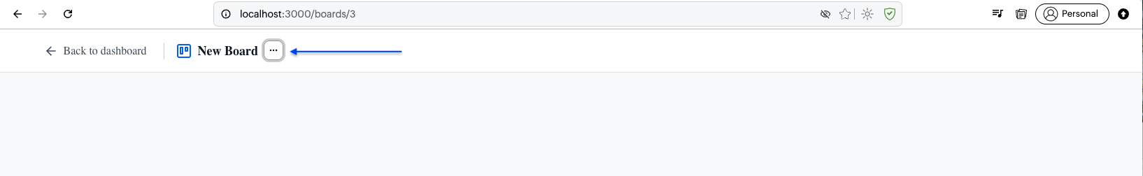
The board page at /boards/3 shows "Back to dashboard" and "New Board" title in the header, now with the edit dialog available.
The Edit board dialog is open with the Board Title input showing "New Board" and six color options displayed as circular buttons below.
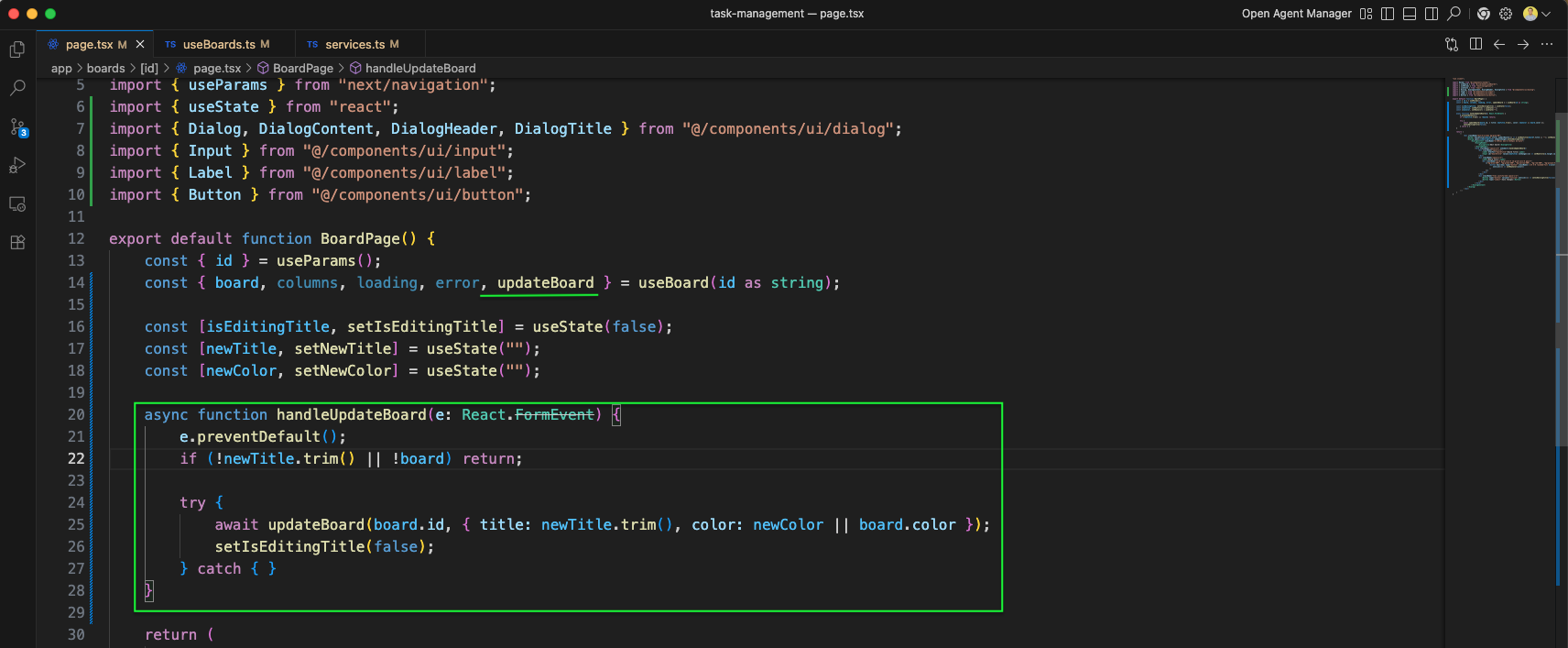
The BoardPage component includes handleUpdateBoard function that calls updateBoard from useBoard with the new title and color. State variables isEditingTitle, newTitle, and newColor manage the dialog form.
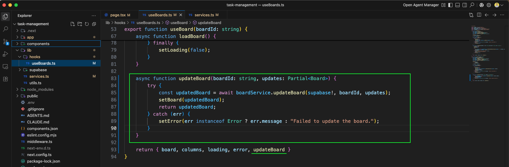
In updateBoards.ts file, we have added a function updateBoard. It calls updateBoard from boardService.
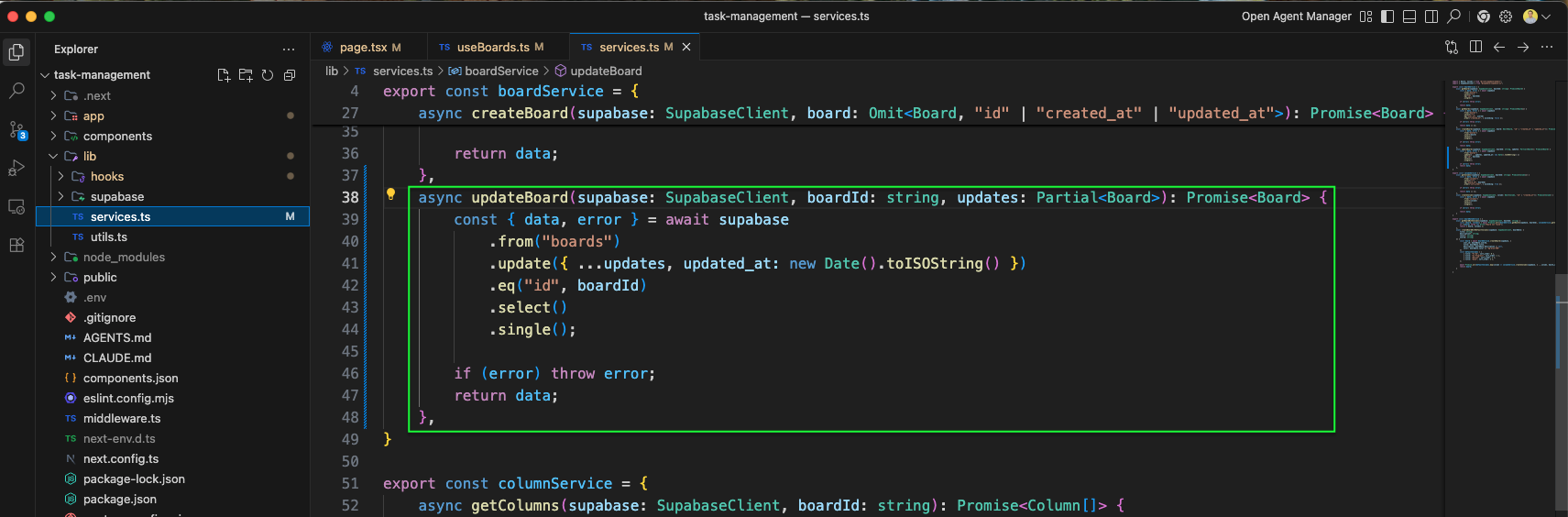
The services.ts file implements the updateBoard function in boardService. It sends a partial update to Supabase with updated_at timestamp, filtering by boardId.
The Edit board dialog now shows "Future Plans" typed in the Board Title input, demonstrating the title editing feature.
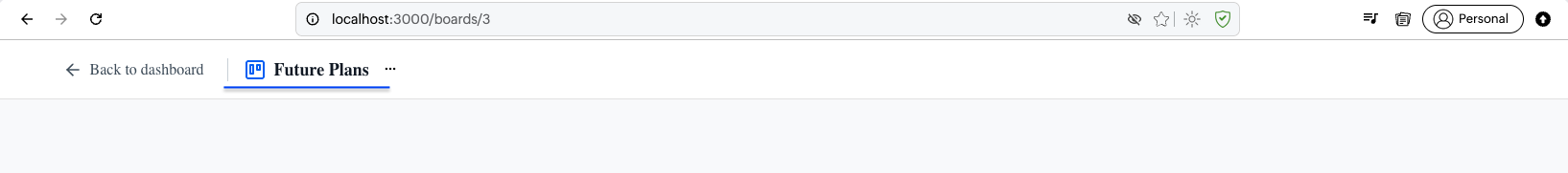
After saving, the board page header updates to show "Future Plans" as the board title, confirming the update was successful.
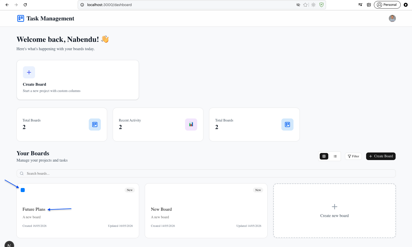
Back on the dashboard, Future Plans board appears in the Your Boards section alongside the update color.
This complete part-1 of the blog. You can find the code here